
dis-moi où tu me plaîs Carte Graphe dis-moi où tu me plaîs exploration des annonces du site croisedanslemetro.com Pierre JdlF a mis tout ça sur Github avec des explications irrationnelles recherche Sélectionner une station A Carefully Selected List of Recommended Tools on Datavisualization When I meet with people and talk about our work, I get asked a lot what technology we use to create interactive and dynamic data visualizations. At Interactive Things, we have a set of preferred libraries, applications and services that we use regularly in our work. We will select the most fitting tool for the job depending on the requirements of the project. Sometimes a really simple tool is all you need to create something meaningful. On other occasions, a more multifaceted repertoire is needed. But how does one choose the right thing to use? That’s why we have put together a selection of tools that we use the most and that we enjoy working with. Let me answer the most likely questions right away: No, not everything find its’ way into this list, so you might not find your personal favorite.
* Datavisualization.ch Selected Tools Map your moves Data This map distills more than 4000 moves from over 1700 people, collected in an informal survey by WNYC, a New York based public radio station. For generating the geo–coordinates from the entered ZIP codes, I used the free bulk geocoder at gpsvisualizer.com. I did not check every single data row in detail, so a few of the moves might be misrepresented. Mapping As most moves occurred from, to or within the New York area, this area displayed enlarged in the white circle at the center of the graphic. Visual markers Each circle corresponds to one zip code area. Actually, it is consists of two overlaid circles: a red one for people moving out of the area, and a blue one for people moving to the area. Interaction Click one of the circles to inspect only moves to or from this area. Details On the right, you can find some statistics on why and when people moved to the selected areas.
spaceengine - Home page Tools to Analyze Delicious Tags, Bookmarks and URLs Delicious is a widely used social bookmarking tools – it stores a wealth of information on people’s web preferences and on how useful they find each web page. There are a few tools that can retrieve that data and represent it to you in more or less comprehensible way. Analyze any site / URL Similicio.us shows which domains your site can be associated with based on the preferences of those who bookmarked it. Delicious URL search will trigger most popular tags the page was associated with as well as recent descriptions members used to bookmark it. Cloudalicious (warning: works very slow) is an interesting tool that will grab all tags associated with the URL and visualize them in a graph. Analyze tags: Delicious Tag Browser is meant to graphically represent relation between tags. Revealicious is a set of graphic visualization tools for your Delicious account that allow you to analyze your tags. TagsCloud is an interactive visualization inspired from del.icio.us own tags cloud. Track Delicious:
Public/Private Public/Private is a game that explores the topic of privacy in our cities by focusing on where we find it. By choosing where in your city you seek privacy most often, you produce a visual graph representing those choices. Your graph is then combined with graphs generated by the rest of the global audience, creating a live data-visualization that illustrates how our experience of privacy changes at a local and global level. As more participants play Public/Private, more of the complexities of privacy in urban settings are illuminated. This game was created to accompany two ongoing research projects undertaken by the BMW Guggenheim Lab in Mumbai in cooperation with Partners for Urban Knowledge, Action & Research (PUKAR) and the Design Cell at the Kamla Raheja Vidyanidhi Institute for Architecture and Environmental Studies (KRVIA). The game experience for Public/Private was designed and developed by Collective Assembly and Tom van de Velde.
Part 1: The essential collection of visualisation resources This is the first part of a multi-part series designed to share with readers an inspiring collection of the most important, effective, useful and practical data visualisation resources. The series will cover visualisation tools, resources for sourcing and handling data, online learning tutorials, visualisation blogs, visualisation books and academic papers. Your feedback is most welcome to help capture any additions or revisions so that this collection can live up to its claim as the essential list of resources. This first part presents the data visualisation tools associated with conducting analysis, creating effective graphs and implementing business intelligence operations. Please note, I may not have personally used all tools presented but have seen sufficient evidence of their value from other sources. Microsoft Excel Find out more information | Cost: Trial > under £100/$150 per license | Tags: Spreadsheet, Office, Graphing Status: Ongoing (July 7, 2011) Open Office Calc Tableau Desktop
Presenteren met Prezi | Blog rondom het nieuwe boek Presenteren met Prezi van Hedwyg van Groenendaal Audio Room I can't get data from your microphone. Have you enabled Web Audio Input in Credit where it's due: the look and feel of this demo is heavily inspired by the talented Robert Hodgin's EYEO demos. Go and look, they are so nice! 22 free tools for data visualization and analysis You may not think you've got much in common with an investigative journalist or an academic medical researcher. But if you're trying to extract useful information from an ever-increasing inflow of data, you'll likely find visualization useful -- whether it's to show patterns or trends with graphics instead of mountains of text, or to try to explain complex issues to a nontechnical audience. There are many tools around to help turn data into graphics, but they can carry hefty price tags. The cost can make sense for professionals whose primary job is to find meaning in mountains of information, but you might not be able to justify such an expense if you or your users only need a graphics application from time to time, or if your budget for new tools is somewhat limited. If one of the higher-priced options is out of your reach, there are a surprising number of highly robust tools for data visualization and analysis that are available at no charge. Data cleaning DataWrangler
Explore 13.7 Billion Years Of Cosmic History In Your Browser With ChronoZoom Sometimes I feel like we of the tech community tend to get bogged down in the little stuff. Hardware specs, OS choices, rumor after endless rumor — it can be nice to just take a step back and stop sweating the small stuff. For a bit of perspective, why not take a few minutes this fine Friday afternoon and explore the nearly 14 billion year history of the cosmos as we know it? There are plenty of ways to do it — randomly clicking through Wikipedia could get the job done — but why not do it with a little pizzazz? With ChronoZoom, we can do just that. ChronoZoom splays out the entirety of cosmic history in a web browser, where users can click into different epochs to learn about about the events that have culminated to bring us to where we are today — in my case, sitting in an office chair writing about space. The ChronoZoom project is the brainchild of Professor Walter Alvarez and a former student of his named Roland Saekow.
Wind Map An invisible, ancient source of energy surrounds us—energy that powered the first explorations of the world, and that may be a key to the future. This map shows you the delicate tracery of wind flowing over the US. The wind map is a personal art project, not associated with any company. We've done our best to make this as accurate as possible, but can't make any guarantees about the correctness of the data or our software. If the map is missing or seems slow, we recommend the latest Chrome browser. Surface wind data comes from the National Digital Forecast Database. If you're looking for a weather map, or just want more detail on the weather today, see these more traditional maps of temperature and wind.
DIVA: Dynamic Interactive Visualization The Thanksgiving white-paper Introduction Diva is a software infrastructure for visualizing and interacting with dynamic information spaces. Our specific area of interest is the visualization of complex hardware and software systems during the design process. This encompasses a wide variety of systems, ranging from software-only systems to embedded hardware-software systems to giga-scale VLSI designs. We characterize the design process, particularly in the early stages of design, as one of exploration of the design space. In later stages of the design process, the problem changes becomes, in some ways, "larger but simpler." High-level goals Diva came about through the convergence of several key factors. One of the problems we see with conventional approaches to visualization in systems design is that "visualization" tends to mean after-the-fact, impoverished summaries of an execution or simulation. And most of all, we want to produce something that's useful. Architecture Driving projects
Je sais mais elle a travaillé à Rio pendant 30 ans sur la photo et la vidéo.
Je vais essayer de la retrouver pour l'amener sur generative Midjourney by reel Apr 14
>> Je voudrais bien qu'elle me sorte un graphe des "labos" Reel.
Ce sont des espaces vidés pour l'instant; j'ai mis les docs à part. by reel Apr 14
@izabelgoudart
ES = Puedes hacerlo indicando solamente laboratorios ?
FR = Tu peux sortir un graphe spécialisé "laboratoires" ?
EN = After I would like this map just "cognitive science" ! by reel Apr 14
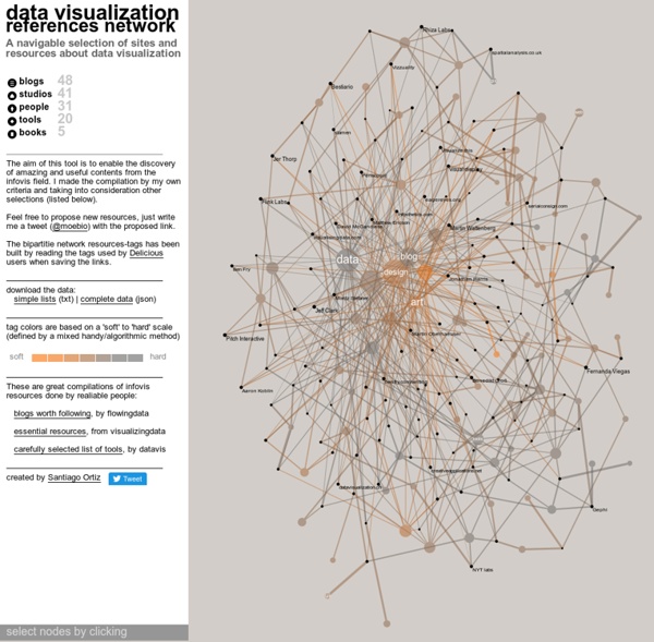
Visualização desenvolvida por Santiago Ortiz que agrega dados sobre visualização de dados, possibilitando acessar um vasto banco de dados de referências mundiais neste campo. by izabelgoudart Aug 25