
100 Ideas That Changed Photography by Maria Popova From the camera obscura to the iPhone, or why photography is an art of continuous reinvention. Earlier this year, British publisher Laurence King brought us 100 Ideas That Changed Graphic Design, 100 Ideas That Changed Film, and 100 Ideas That Changed Architecture. Now comes 100 Ideas That Changed Photography (public library) — an equally concise and intelligent chronicle of the most seminal developments in the history of today’s most prevalent visual art. From technical innovations like the cyanotype (#12), the advent of color (#23), the Polaroid (#84), and moving pictures (#20) to paradigms like photojournalism (#66) and fabrication (#93) to new ways of looking at the world like aerial photography (#54), micro/macro (#55), and stopping time (#49), each of the ideas is accompanied by a short essay contextualizing its history and significance. Syracuse University fine art professor Mary Warner Marien writes in the introduction: Images and captions courtesy of Laurence King
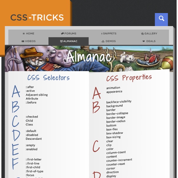
Cheat Sheet Download cheat sheet as printable PDF A5 Syntax Child: > nav>ul>li Sibling: + div+p+bq Climb-up: ^ div+div>p>span+em^bq div+div>p>span+em^^bq Grouping: () div>(header>ul>li*2>a)+footer>p (div>dl>(dt+dd)*3)+footer>p Multiplication: * ul>li*5 Item numbering: $ ul>li.item$*5 h$[title=item$]{Header $}*3 <h1 title="item1">Header 1</h1><h2 title="item2">Header 2</h2><h3 title="item3">Header 3</h3> ul>li.item$$$*5 ul>li.item$@-*5 ul>li.item$@3*5 ID and CLASS attributes #header .title form#search.wide p.class1.class2.class3 Custom attributes p[title="Hello world"] td[rowspan=2 colspan=3 title] [a='value1' b="value2"] Text: {} a{Click me} <a href="">Click me</a> p>{Click }+a{here}+{ to continue} <p>Click <a href="">here</a> to continue</p> Implicit tag names .class em>.class ul>.class table>.row>.col All unknown abbreviations will be transformed to tag, e.g. foo → <foo></foo>. Alias of html:5 <! a a:link a:mail abbr acronym, acr base basefont br frame hr bdo bdo:r bdo:l col link link:css link:print link:favicon link:touch link:rss link:atom meta meta:utf img c
Troubleshooting CSS Sometimes CSS can be frustrating. Learn about some tricky properties, the common issues they can cause and how to solve them. CSS is a mess. First introduced in ~1995, it was meant to style basic text documents. Not websites. A lot of things were not intended in the first place like multi-column layouts, responsive web design and more; this is why it has become a language full of hacks and glitches, like some kind of odd steam machine with a bunch of extensions. On the bright side, this is what makes CSS fun (or kinda)! Photo credits Anyway, I’m not here to talk about my convictions but about CSS. Among others, I picked some really common yet annoying issues: Float clearing, an old battle I think this has to be the most common wat? Basically, when an element only contains floated elements, it collapses on itself. There are a number of ways to fix this. Then Nicolas Gallagher came with a new way to clear floats from the parent without touching the markup at all. Hey, it’s better! Why? Why?
nelletorr : New Features in Perception v5 Now it's easier than ever to deliver assessments to multiple different types of devices (including smartphones and internet-connected handhelds such as the Apple iPhone), or to create learning and assessment mash-ups by embedding quizzes or surveys within wikis, blogs and web pages. Perception Version 5's new auto-sensing, auto-sizing delivery features take the guesswork out of blended delivery, enabling you to author an assessment once, schedule it once and then deliver it in as many different ways as they like. When delivering an assessment, Perception v5 auto-senses the participant’s device and browser, then delivers the assessment formatted appropriately for the device/browser’s requirements. Perception’s “on the fly” auto-sizing dynamically adjusts and sizes the “screen furniture” and “skin” of an assessment – the buttons, controls and template graphics — so they fit (and look great) on just about any screen size or resolution imaginable.
The Definitive Guide to CSS Transitions Back in the golden days of the web, we had a little thing called Flash to help us make the web a dynamic, fun, interactive place. But, Flash is being used less and less. Of course, in certain environments it can still be put to amazing use, but in today’s web environment you need CSS to get the job done. One of the easiest ways to give your site a near-instant facelift is to bring CSS3 transitions to the table (pun intended). As users interact with various elements on your page, transitions allow for a delayed response that is far more natural and engaging than a jarring, instant response. Case in point, hover over these two boxes and tell me which is more interesting to you. Drop this into an HTML document and check it out: Yeah, I know gray boxes aren’t all that exciting, but the point is that the transitions on the box to the right are more interesting and give the design a more polished feel. Pseudo-Classes for CSS Transitions Introducing CSS Transitions Properties of the CSS Transition
Stuck In Customs | HDR Photography, Travel Photography and Camera Reviews jQuery API Documentation Flexible CSS cover images I recently included the option to add a large cover image, like the one above, to my posts. The source image is cropped, and below specific maximum dimensions it’s displayed at a predetermined aspect ratio. This post describes the implementation. Demo: Flexible CSS cover images Known support: Chrome, Firefox, Safari, Opera, IE 9+ Features The way that the cover image scales, and changes aspect ratio, is illustrated in the following diagram. The cover image component must: render at a fixed aspect ratio, unless specific maximum dimensions are exceeded;support different aspect ratios;support max-height and max-width;support different background images;display the image to either fill, or be contained within the component;center the image. Aspect ratio The aspect ratio of an empty, block-level element can be controlled by setting a percentage value for its padding-bottom or padding-top. Changing that padding value will change the aspect ratio. Maximum dimensions Background image Final result
2013 July 13 - Sunspot at Sunset Discover the cosmos! Each day a different image or photograph of our fascinating universe is featured, along with a brief explanation written by a professional astronomer. 2013 July 13 Explanation: Reddened rays of the setting Sun flooded the skies over Cedar Creek Lake, southeast of Dallas, Texas, planet Earth on July 6th. And while sunsets may be the most watched celestial event, this one even offered something extra.
Free Programming and Computer Science Books Adapt.js - Adaptive CSS 50 Beautifully Designed Book Covers for Inspiration Books displayed on a shelf in a shop need to attract prospective buyers, and the first and most important way that can be done is with an eye-catching cover design. Whether it is very significant to the content of the book, or completely 'off the wall' in its design, it is what is going to make people pick the book up and read the back cover. There are many articles advising designers to look around them and to look everywhere for inspiration, and perhaps some do walk into bookshops and browse the book and magazine cover designs, but I am guessing most don't often have either the time or the inclination to do that, so today we are bringing you a collection of beautifully designed book covers for your inspiration – some new, some old, and in many and varying styles of design, just like browsing a book store. Beautifully Designed Book Covers for Inspiration Empire Rising Wall Street And Then There's This Exit A Triangular Road Super Sad True Love Story Uncommon Sense An Ethics of Interrogation
WTF, HTML and CSS?