Color Psychology - The Psychology of Color
Do you feel anxious in a yellow room? Does the color blue make you feel calm and relaxed? Artists and interior designers have long believed that color can dramatically affect moods, feelings, and emotions. "Colors, like features, follow the changes of the emotions," the artist Pablo Picasso once remarked. Color is a powerful communication tool and can be used to signal action, influence mood, and even influence physiological reactions. Certain colors have been associated with increased blood pressure, increased metabolism, and eyestrain.
» How to Add Depth to a Photo
When we take a photo with our cameras, we turn a 3D image into just 2D, and that can cause problems when you’re trying to display depth. It has it’s advantages and disadvantages, depending on what you’re trying to convey with your photo, but ultimately it holds you back when you’re trying to add depth to a photo. If you’ve read many of my tutorials on composition, then you’ll know by now that by implementing some of these techniques, that you can add depth quite easily, and we’re gonna have a look at them now. Rule of Thirds
Color » Design Festival
If you are designing, or re-designing your web site, it is time well spent running your website through the color accessibility tools below to ensure that your site can be seen correctly by as many people as possible. Most of these tools use WC3 guidelines to perform their various operations. If you can actually read and understand them, the Web Content Accessibility Guidelines (WCAG) 2.0 requires, amongst other things, that there is sufficient contrast between text and background color. For a person with a color disability, the colors used on a web site can mean the difference between being able to read text and images or not. 1 in 12 people have some sort of color deficiency. Vischeck allows you to see your website or an image, as a person with color disabilities would see it. The Gray Bit web site comes with the tagline, “Experience Color, Wearing Shades of Gray”.
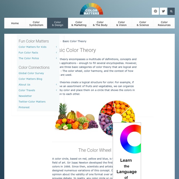
Color Theory Quick Reference Poster - Paper Leaf Design
It’s always good to be able to articulate design choices to your clients; why you put something where, why you chose the color scheme you did, etc. This knowledge is one of the biggest differences between a designer and a non-designer. But there is a lot to remember when it comes to the realm of graphic design – so much so that it’s pretty much impossible to remember everything from all the theories of graphic design, to web design best practices to Photoshop keyboard shortcuts.
Starfall Download Center
Phonics Puzzle Activities The Exercises and printable activities below will help you make the most of the Starfall's High-Quality Phonics Puzzles. Each of these heavy duty, 24-piece jigsaw puzzles (10"x13") focuses on a short-vowel sound. Short A Short E
Color Schemes, Color Palettes, Color Theory
Color in Motion Available in English and Spanish, this flash presentation presents an animated, interactive demonstration of the symbolism and emotions associated with various colors, including the best uses of these colors. Colors on the Web Color theory, color combinations, color physics, and the use of colors on web pages are discussed, and a color wheel allows users to test out what they have learned. Other tools include color names, a color wizard, and a color scheme tool. ColorExplorer
Using Focal Points in Photography
By Robert Parviainen Next time you take your digital camera out and line it up for a shot pause before you press the shutter button and ask yourself: “What is the Focal Point in this Picture?” Some other ways to ask the same question might include – What is the central point of interest?
30 Sample Company Letterhead Design Pieces for Inspiration
by admin | June 7, 2010 | Design The core of an identity package, to me, is letterhead design. It is where your unique branding can speak the best, alongside all your company’s correspondences.
25 Awesome Tools for Choosing a Website Color Scheme
As a designer, color management should be an integral part of your workflow. A website’s color scheme helps shape its identity and therefore should not be carelessly thrown together. Here are 25 online, desktop and iPhone applications to help you live and breathe color management no matter where you are. Online Tools
The Psychology of Color
Reprinted from Vol 5-1 of the BT Journal In wildlife photography, I think the psychology of color plays an overwhelming role in the success of an image to communicate. I've waited a long time to present this piece and I can't think of a better time than with the Journal's first color issue to bring you what I think are critical concepts for success. Advertising-grabbing the attention of the buyer to buy one's product.
Improving your photography: Composition
IMPROVING YOUR PHOTOGRAPHYLesson Two: Composition by Peter Ensenberger,Arizona Highways Director of Photography In a recent "Photography Talk" column, I discussed developing an awareness of light and its relationship to the subjects in your photographs.
Typeface Anatomy and Glossary
Here’s a glossary of common type terminology, which along with the FAQs may answer many font related questions. If the information you need isn’t here, call us. Abbreviations Many fonts have abbreviations in their names. Some relate to glyph sets and font formats, others to design traits and foundries, and so on.

An understanding of color theory can help send your project from decent to outstanding. Learn the story behind color theory and discover which colors work best together. by baileykretz Oct 1