
40 Free Online Tools and Software to Improve Your Workflow. Jun 08 2011 Charts and graphs are the most effective ways to show the relationship between two different and interlinked entities. On a web page, a comprehensively designed flowchart, diagram or graph can be worth a thousand words. Creating such charts that inform your visitors about all the necessary details is a daunting task, and many designers find creating charts, diagram and graphs a difficult job to accomplish. Here, you will discover some of the best available free web services that let you create copious amounts of charts, diagrams and graphs. A majority of these services are easy to use; and will produce results that will be comparable to what you saw on the screen. The Showcase ChartDemoIf you need to create a stacked area chart along with complete labels and legends, then ChartDemo is for you.
FlowchartThis tool not only lets you create charts and diagrams but also provides you a platform to collaborate with your colleagues. (rb) Nousheen Aquil is a web graphic designer. D3.js - Data-Driven Documents.
The Grove. We offer consulting services, design services, workshops and do-it-yourself tools that enable you to visualize and implement change.
Based on more than 30 years experience in organizational consulting and visual facilitation, these services and tools provide an integrated, creative approach to the perennial challenges of engaging people and organizations around a vision. Services Consulting, design services and customized trainings for organizations and business leaders needing help with strategy, organizational transformation, team performance and other challenges.
Learn more about our services › Workshops One- to five-day sessions where participants learn visual planning, facilitation and other Grove methodologies that can be employed in business or personal settings. Products Visual Planning Systems™, Team Performance System™ tools, facilitation guidebooks and other materials to help individuals and teams work more effectively. Visual Notetaking. JESS3. Newsilike: Latest & Archived Infographics Blog. Graphic World: 3D Infographics Projected in NY Grand Central Terminal. We are crossing the next frontier: putting animated infographics within the public, physical space.
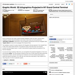
Infographic journalist David McCandless, also known as also known as the man behind the "Information Is Beautiful" phenomenon, has just released a spectacular and life-size infographic titled "Graphic World" [ft.com] for the newspaper The Financial Times. The installation consists of a series interactive 3D infographics that are projected in the Vanderbilt Hall in New York's Grand Central Terminal. The projection shows 3 short films that cover business, economic and technological topics, in order to demonstrate the global breadth and expertise of the financial newspaper. If you are not living or working in New York, you can experience the projected infographics in the movie documentaries below. Via @blprnt and Mashable. Treemap for Comparisons. When to use a tree map A tree map is a visualization of hierarchical structures.
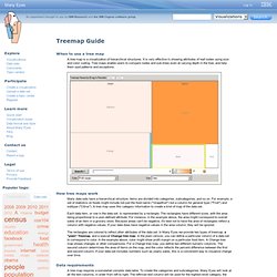
It is very effective in showing attributes of leaf nodes using size and color coding. Tree maps enable users to compare nodes and sub-trees even at varying depth in the tree, and help them spot patterns and exceptions. How tree maps work Many data sets have a hierarchical structure: items are divided into categories, subcategories, and so on. Each data item, or row in the data set, is represented by a rectangle. The rectangles are colored to reflect other attributes of the data set. Data requirements A tree map requires a somewhat complex data table. An example data set suitable for a treemap is: This table would be appropriate for a plain treemap. Expert notes Treemaps are a complex but powerful information visualization technique. Over 100 Incredible Infographic Tools and Resources (Categorized)
This post is #6 in DailyTekk’s famous Top 100 series which explores the best startups, gadgets, apps, websites and services in a given category.

Total items listed: 112. Time to compile: 8+ hours. Follow @DailyTekk on Twitter to make sure you don’t miss a week! Update: Be sure to check out our latest post on infographics: Infographics Are Everywhere – Here’s How to Make Yours Go Viral. I love a good infographic! Gephi, an open source graph visualization and manipulation software. Draw a Stickman. Home. Ushahidi.