
9 Design websites to bookmark if you love data - “If data journalism is about anything, it’s the flexibility to search for new ways of storytelling.”
Simon Rogers, Facts are Sacred. There are a lot of people out there trying to visually explain information they have obtained through data. They are using their own skills and tools to display the story they want to convey. We have compiled a list of designers and design studios who are sharing the best new ideas to improve the way we tell stories. 1. Jennifer Daniel is a visual journalist at The New York Times, where she designs diagrams, interactive graphics and maps. 2. Accurat is an information design agency founded by Giorgia Lupi, Gabriele Rossi and Simone Quadri. 3. Catalogtree is a dutch design studio based in Arnhem, Netherlands. 4.
Nicholas Felton is an information designer based in New York City. 5. Interactive Things is a design studio based in Zurich, Switzerland, which designs interactive products and visualises information. d3list/ About Datascape. …a virtual world for your data Datascape provides an easy to use, install and manage immersive 3D environment in which users can visualise and interact with data from almost any source, from financial Excel spreadsheets to live social media feeds.
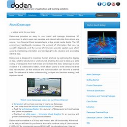
The 3D environment significantly increases the amount of information that can be sensibly displayed, and the sense of immersion provide spatial cues which assist in maintaining orientation and identifying trends, clusters and anomalies with the data. Datascape is designed to maximise human analysis by optimising the display of data, whether structured or unstructured, enabling the user to take up a wide variety of viewpoints from both inside and outside the data. Global Forest Watch. Visualize any Text as a Network - Textexture. Mozilla Lightbeam Shows Who's Watching You Online. In the spirit of online transparency, and for those paranoid about organizations watching your every move, a new tool from Mozilla lets you monitor who is following your digital footprint.
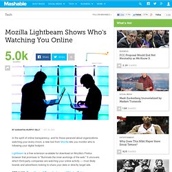
Lightbeam is a free extension available for download on Mozilla's Firefox browser that promises to "illuminate the inner workings of the web. " It uncovers which third-party companies are watching your online activity — most likely brands and advertisers looking to share your data or directly target ads. "As a part of Lightbeam, we're creating a big-picture view of how tracking works on the Internet, and how third-party sites are connected to multiple other sites," Mozilla said in a statement.
The company aims to give web users control of their data and privacy by using interactive visualizations in the form of graphs, clocks and lists. Lightbeam users can sift through this collected data to see the sources of images and other information. To download the extension on your Firefox browser, click here. Information Is Beautiful. Gapminder: Unveiling the beauty of statistics for a fact based world view. 15 Tools to Make Amazing Infographics. Infographics are all the rage at the moment, particularly with the rise in popularity of sites like Pinterest where visuals and images of statistics are being shared.
Infographics are visual representation of data with small, relevant and clearly displayed nuggets of information. But infographics are not just useful to consume, they are also useful to produce for your business. People want their information quicker and using visuals are an excellent way to do this. Their eye-catching appeal draws more attraction than your average blog. Comprising interesting facts presented in a concise nature will maintain the attention of your readers, plus it’s good to break up your blog with different types of content (video, articles, visuals etc) I recently shared an infograhic (Know Thy Internet Marketing Commandments) and found that generated a lot more shares than an average blog post.
Think of a good idea or something relevant to what you often write about. Are you using Infographics? Connect: Visualizing and communicating data. Visual.ly - Create, Share, Explore Great Visualizations. Data finders. David McCandless: The beauty of data visualization. A visual exploration on mapping complex networks. Data Visualization: Modern Approaches - Smashing Magazine. About The Author Vitaly Friedman loves beautiful content and doesn’t like to give in easily.
When he is not writing or speaking at a conference, he’s most probably running … More about Vitaly Friedman … Data presentation can be beautiful, elegant and descriptive. There is a variety of conventional ways to visualize data - tables, histograms, pie charts and bar graphs are being used every day, in every project and on every possible occasion. However, to convey a message to your readers effectively, sometimes you need more than just a simple pie chart of your results. Data presentation can be beautiful, elegant and descriptive. So what can we expect? Let’s take a look at the most interesting modern approaches to data visualization as well as related articles, resources and tools. 1. Trendmap 2007 Informationarchitects.jp presents the 200 most successful websites on the web, ordered by category, proximity, success, popularity and perspective in a mindmap.
v3 - Infographic Editor. Visualising Data » Resources. LOD_Cloud_Diagram_as_of_September_2011.png (1700×1121)