
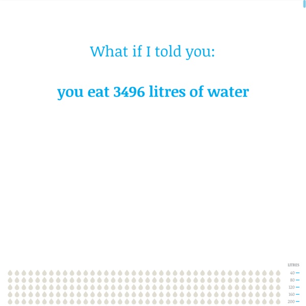
http://www.angelamorelli.com/water/
Related: Reducing food wasteInstitution of Mechanical Engineers Feeding the 9 Billion: The tragedy of waste By 2075, the United Nations’ mid-range projection for global population growth predicts that human numbers will peak at about 9.5 billion people. This means that there could be an extra three billion mouths to feed by the end of the century, a period in which substantial changes are anticipated in the wealth, calorific intake and dietary preferences of people in developing countries across the world. Such a projection presents mankind with wide-ranging social, economic, environmental and political issues that need to be addressed today to ensure a sustainable future for all. One key issue is how to produce more food in a world of finite resources. Viral: Photo-Sharing Explosions This is a series of videos that visualizes a single piece of content being shared between hundreds of thousands of individuals on Facebook. We've tried to capture the frenetic energy surrounding three of the most shared images, all of which were photos published on George Takei's Page. Each visualization is made up of a series of branches starting from a single person. As the branch grows, re-shares split off on their own arcs, sometimes spawning a new generation of re-shares, sometimes exploding in a short-lived burst of activity. The two different colors show gender, and each successive generation becomes more and more white as time goes by.
Counting the cost: the hidden price of coal power Each year, the US sets off the equivalent of 20-30 atomic bombs worth of explosives, effectively obliterating entire features of its own landscape. Why? To get at the coal that's inconveniently located beneath the mountains of Appalachia. That jaw-dropping figure came towards the end of a session at last month's meeting of the American Association for the Advancement of Science called "The True Cost of Coal." Most methods of resource extraction and use come with various forms of what are called externalities, or costs that aren't included in the final product, but distributed across society as a whole in the form of things like environmental degradation and damage to health. Calculating these hidden costs is obviously a challenge, and the researchers involved doing so tend to produce a range of values to reflect the uncertainty.
Peer to Peer Fundraising Infographic by Blackbaud Average Online Donation Amount+ Includes both participants and fundraisers Average Online Value of Participants+ Includes both participants and fundraisers Average Online Value of Fundraisers At This Free Food Festival, All The Ingredients Are Food Waste At the Feeding the 5000 food festival in New York City, the first thing people walking by may notice is that all the food is free. It isn't obvious, though, that all the offerings are made from food waste. A torte is made with trimmings and peelings from a food distributor; a "quick pickle salad" is made with surplus greens and vegetables. Dan Barber, head chef and co-owner of Manhattan's Michelin-starred Blue Hill, will offer a limited number of cookies made with the almond flour left over when manufacturers make almond oil. Other chefs will also offer cooking demonstrations with food that might otherwise be thrown out. "I like the idea of changing people's habits and minds through pleasure and hedonism and enjoyment," says Barber.
Wind Map An invisible, ancient source of energy surrounds us—energy that powered the first explorations of the world, and that may be a key to the future. This map shows you the delicate tracery of wind flowing over the US. The wind map is a personal art project, not associated with any company. We've done our best to make this as accurate as possible, but can't make any guarantees about the correctness of the data or our software. Please do not use the map or its data to fly a plane, sail a boat, or fight wildfires :-)
The myth of renewable energy "Clean." "Green." What do those words mean? When President Obama talks about "clean energy," some people think of "clean coal" and low-carbon nuclear power, while others envision shiny solar panels and wind turbines. And when politicians tout "green jobs," they might just as easily be talking about employment at General Motors as at Greenpeace. Half of all US food produce is thrown away, new research suggests Americans throw away almost as much food as they eat because of a “cult of perfection”, deepening hunger and poverty, and inflicting a heavy toll on the environment. Vast quantities of fresh produce grown in the US are left in the field to rot, fed to livestock or hauled directly from the field to landfill, because of unrealistic and unyielding cosmetic standards, according to official data and interviews with dozens of farmers, packers, truckers, researchers, campaigners and government officials. From the fields and orchards of California to the population centres of the east coast, farmers and others on the food distribution chain say high-value and nutritious food is being sacrificed to retailers’ demand for unattainable perfection. “It’s all about blemish-free produce,” says Jay Johnson, who ships fresh fruit and vegetables from North Carolina and central Florida. “What happens in our business today is that it is either perfect, or it gets rejected.
a blog by victor powell May 29, 2013 In probability theory, the central limit theorem (CLT) states that, given certain conditions, the mean of a sufficiently large number of independent random variables, each with a well-defined mean and well-defined variance, will be approximately normally distributed. -- Central Limit Theorem - Wikipedia which is what we see here. at every triangle, the ball has a 50/50 shot of going to the left or to the right. you can also think of it like coin flips, where the number of coin flips is (bins -1) if we assign heads to 0, and tails, 1 (or 0 for left, 1 for right as in the case of the visualization above) for 1 coin flip, the possible sums of coin flips are: so for 1 coin flip, there are 2 different possible outcomes, each equally likely. the expected percentage of the possible outcomes is then:
Deaths per TWH by energy source Comparing deaths/TWh for all energy sources I wrote this back in 2008 and with one new death that is somewhat nuclear energy related (a death at one of the japanese nuclear plants following the 8.9 earthquake) the statistics are not changed. Japan should have had sealed backup diesel generators or updated some of their designs. However, nuclear still compares very, very well to the other energy sources. The air pollution data is mainly from the World Health Organization and the european study Externe. How Americans Die By Matthew C. Klein / Bloomberg View / April 17, 2014How Americans Die The mortality rate fell by about 17 percent from 1968 through 2010, years for which we have detailed data.Almost all of this improvement can be attributed to improved survival prospects for men. It looks like progress stopped in the mid-1990s… Mortality rate per 100,000 people …but that’s only because the population has aged a lot since then. Share of population This has a big effect on the overall mortality rate, because old people die sooner than the young. Mortality rate per 100,000 people by age If you divide the population into separate age cohorts, you can see that improvements in life expectancy have been broad-based and ongoing.Looking at mortality for each age cohort since 1968, we see that Americans under 25 have made the most progress. Mortality rate per 100,000 people by age (1968 = 100) But one line in this chart looks unusual!