
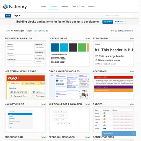
http://patternry.com/patterns/
Displaying data: hipmunk.com Add to set New and innovative way of display search results at hipmunk.com – in this case it’s results for an airplane trip from Copenhagen to Los Angeles. See it live at: hipmunk.com (source) Current collection: Displaying data Added by toxboe Added Dec 19, 2010 1944 views Part of these user collections: Displaying Data, test, Dashboard Idees, Dashboard Idees, Data Display, Displaying a lot of Data, Dados, Minimalist Set, Data Display Ideas, Data Display Ideas, Samples
Interaction Design Pattern Library - Welie.com Suggest a pattern Have you seen new examples of patterns out there that have not been described on this site? Send me a link to an example and I'll add it to my to-do list. Suggest a pattern Design Pattern Library View the most recent patterns added to the library. Accordion There are too many items to fit into a limited space without overwhelming the user. 35 Best Dashboard Designs Nowadays,more and more web applications are trying to take their stake from the internet,coming in your help and trying to make your internet`s life easier. The front end design is the main element to make our client satisfied and impressive. Dashboards have very important role so, In design there are many dashboards available with colourful design so today i made list of best 35 Dashboard Designs.CHECK IT OUT!! 1- Equinox Admin Panel This is a cool admin template that can also be used for business or general purpose sites. It contains all the possible elements you need.
4 Best User Interface Design Pattern Libraries by anthony on 09/13/10 at 2:45 pm As designers, sometimes we need a little inspiration to get our creative juices flowing. Looking at examples of different user interface patterns could give us the ideas we need to design something amazing. That’s why I put together four of the best user interface design pattern libraries around the web. I have searched and looked at dozens. But these four, I believe, offer the best examples with the best navigations for browsing.
5 Really Useful Responsive Web Design Patterns Responsive web design requires a very different way of thinking about layout that is both challenging and exciting. The art of layout was already complex enough for the centuries that it was defined by fixed elements, now things are becoming exponentially more complicated as layouts become increasingly adaptive. To help reprogram your brain to consider layouts in new ways, we’re going to take a look at some interesting responsive design patterns that are being implemented by talented designers all over the web.
HTML5 - Responsive Web Design It all started with Responsive Web Design, an article by Ethan Marcotte on A List Apart. Essentially, the article proposed addressing the ever-changing landscape of devices, browsers, screen sizes and orientations by creating flexible, fluid and adaptive Web sites. Instead of responding to today’s needs for a desktop Web version adapted to the most common screen resolution, along with a particular mobile version (often specific to a single mobile device), the idea is to approach the issue the other way around: use flexible and fluid layouts that adapt to almost any screen. Core Concepts Three key technical features are the heart of responsive Web design: Media queries and media query listenersA flexible grid-based layout that uses relative sizingFlexible images and media, through dynamic resizing or CSS
Responsive Web Design Patterns Responsive Patterns A collection of patterns and modules for responsive designs. Submit a pattern Layout 16 Top Tools for Responsive Web Design With the exponential adoption of mobile devices and smart phones, savvy web designers are turning to responsive design as a panacea for all things layout and typography related. Not only does this save time, money and effort in the long run, but it also gives mobile users the interaction and ease of use they crave. But if you’ve been tasked with creating a mobile responsive design and aren’t sure where to start, this checklist of must-have resources and tips is sure to give you the spark you need to create a fluid, friendly design that accommodates nearly every mobile device – past, present and future. Layout, Wireframes and Prototyping The first step of any good design is to sketch out your ideas and determine the placement of all the different elements on a page. These tools can help you do just that:
Building fluid grid layouts in Adobe Dreamweaver CS6 With the ever-increasing use of mobile devices, it has become necessary to design online content that appears on multiple screen sizes and a myriad of desktops, laptops, tablets, and smartphones. The challenge involves designing sites that adapt to fit a variety of different resolutions and use the available screen real estate effectively. Previously, these goals have proven to be time-consuming.