
Frame of Reference — Design/UX. Now that skeuomorphism is a thing, and “flat design” is busy becoming the next flavor of UI styling, I’d like to provide a deeper perspective of the issues we’re facing with digital products.
We’ve all seen the posts and videos of children subjected to items that were familiar to us growing up, but have no place in the modern world. Dial-up modems, landline telephones, cassette players—the list of outdated technology grows daily. This means that the generations ahead are losing affordances daily as well. What are affordances? Affordances, simply put, are a common visual understanding of how an item should be used. The legacy we’ve established in interface design is built upon physical affordances, an issue that has been brought into the harsh spotlight by Apple’s software designs. How to build user confidence in your UI. Effective Presentation of a Website's Navigation - UX Booth. Users obtain information on the web in one of two ways: searching or browsing.
Browsing – moving through a multi-faceted content structure – is made easier when information architects present users with an intuitive navigation hierarchy. This article discusses two techniques to that end. Principles of User Interface Design. Clarity is job #1 Clarity is the first and most important job of any interface.
To be effective using an interface you've designed, people must be able to recognize what it is, care about why they would use it, understand what the interface is helping them interact with, predict what will happen when they use it, and then successfully interact with it. While there is room for mystery and delayed gratification in interfaces, there is no room for confusion. Clarity inspires confidence and leads to further use. One hundred clear screens is preferable to a single cluttered one. Interfaces exist to enable interaction Interfaces exist to enable interaction between humans and our world. 10 Heuristics for User Interface Design. Visibility of system status The system should always keep users informed about what is going on, through appropriate feedback within reasonable time.
(Read full article on visibility of system status.) Match between system and the real world The system should speak the users' language, with words, phrases and concepts familiar to the user, rather than system-oriented terms. Follow real-world conventions, making information appear in a natural and logical order. (Read full article on the match between the system and the real world.) User control and freedom. Augmented Paper. For most of my life, I’ve struggled to quantify what constitutes an enticing interface.
There are certain basic aims from which you can take your pick – intuitiveness, attractiveness, clarity, simplicity, consistency, and more – but those are general guidelines. I’ve had trouble defining what an enticing interface is for me. Whatever progress I’d made was very nearly reset by the advent of the iPhone, and touch-screen devices generally. With the arrival of the iPad, however, I’ve noticed an increasingly-prevalent UX aesthetic that I think gets close to the natural role of these devices in our lives – or at least in mine. I’ve already written about my aesthetic preferences, and they strongly inform my preferences in software. iOS Apple’s iOS is already the father, if not quite the grandfather, of modern user experiences for mobile touch-screen devices. iOS on iPhone - Home screen and Safari Contacts on iPad Calendar on iPad Windows Phone (Metro) Windows Phone 7 Android Android Ice Cream Sandwich.
Browser and GUI Chrome. The best interface is no interface. The actual work-flow of the NFC enabled Google Wallet is actually already much simpler than what you present. 1.
Unlock phone, 2. Tap NFC enabled payment device with your phone, 3. Wallet auto starts, enter Wallet PIN, 4. Pay using default payment method" @Matthew: Thanks. The opportunity for No UI in automobiles is ripe, and already pretty rich. @Nate Thanks! No to NoUI – Timo Arnall. ‘The best design is invisible‘ is the interaction design phrase of the moment.
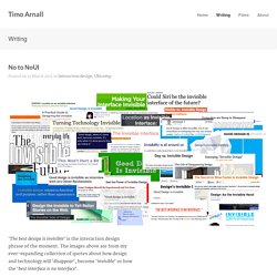
The images above are from my ever-expanding collection of quotes about how design and technology will ‘disappear‘, become ‘invisible‘ or how the ‘best interface is no interface‘. The Verge has recently given both Oliver Reichenstein and Golden Krishna a platform to talk about this. This has spawned manifestos, films, talks, books, #NoUI hashtags and some debates about what it might mean. Calling your bull$%!#: the best interface is no interface. A thoughtful article by Golden Krishna of Cooper came out a few months back which has picked up some steam recently.
Its title reads “The best interface is no interface” which I think is one sided, flawed and so here are a few of my thoughts on it out in the open. Reductionism and minimalism do not guarantee a good interaction. Progressive Disclosure in User Interfaces. As designers, we’re always trying to get the most out of our interfaces and maximize whatever space is made available to us.
While many solutions have been devised over the years, one above all others has consistently influenced the way visitors access the content they seek. From simple techniques, such as tooltips and drop-down menus, to complex single-page websites powered by Ajax, progressive disclosure has become a formidable force. Emulating Microsoft’s Metro Design Language. Over the past few years, Microsoft has adopted its incumbent design language to a significant extent.
Metro is the aesthetic basis of Windows 8; Microsoft's next operating system shipping this October. Let's take a look at what Metro is, how we can emulate some of its desirable principles and take a look at where it's being used already. What is Metro? Metro is the name given to the design language used in Microsoft's current and next-generation operating systems, including the upcoming Windows 8, the current Xbox 360 dashboard and in some of their websites. Aspects have already been evident in some of the company's earlier work, back in Windows XP and the Zune.
Microsoft's design team have revealed that the language is partly influenced by public transport signs which places a significant emphasis on typography and a visual hierarchy consisting of text with varying properties. Pinned Sites in Windows 8 - IEBlog. The Windows 8 Start screen is the best place to find and stay connected to all your favorite apps and content. App tiles are alive with activity and show you fresh and tailored content so you know what’s new in your world. We’ve written about Internet Explorer 10’s Metro style browsing experience on Windows 8.
This post describes in detail IE10’s pinned sites and their availability on the Windows 8 Start screen—complete with site-centric visuals and badge notifications to let you know there is new content. We’ll also walk through the Web developer details to support pinned sites. The following video shows pinned sites in action on Windows 8 Consumer Preview. 16 Of The Year's Best Ideas In UI Design.
Half the world hasn’t even realized it yet, but we’re facing one of the greatest design challenges in humanity’s history: How do we connect this cloud-based digital world we’ve so quickly inhabited with the analog world we’ve inhabited for so long? It’s a problem greater than any one microchip, wireless standard, or ingenious gadget: It’s a problem of melding meat and bits. It’s a problem of interface. Already, we’re seeing the best and brightest repositioning themselves for this murkier hybrid world.
With Windows 8, Microsoft adopted a universal interface with the realization that the PC was dead. Yet a mere Kickstarter project called Twine may be even more important in the grand scheme, as it leverages smart sensors and a clever web UI to keep track of dumb, analog objects in the big data cloud. Indeed, 2012 was a very big year for the future of UI. INTERFACE SKETCH.