Over 100 Incredible Infographic Tools and Resources (Categorized) This post is #6 in DailyTekk’s famous Top 100 series which explores the best startups, gadgets, apps, websites and services in a given category.

Total items listed: 112. Time to compile: 8+ hours. Follow @DailyTekk on Twitter to make sure you don’t miss a week! Update: Be sure to check out our latest post on infographics: Infographics Are Everywhere – Here’s How to Make Yours Go Viral. I love a good infographic! There’s more to this article! 10 Awesome Free Tools To Make Infographics.
Advertisement Who can resist a colourful, thoughtful venn diagram anyway?

In terms of blogging success, infographics are far more likely to be shared than your average blog post. This means more eyeballs on your important information, more people rallying for your cause, more backlinks and more visits to your blog. In short, a quality infographic done well could be what your blog needs right now. Designing An Infographic Some great tips for designing infographics: Keep it simple! Ideas for infographic formats include: Timelines;Flow charts;Annotated maps;Graphs;Venn diagrams;Size comparisons;Showing familiar objects or similar size or value.
Here are some great tutorials on infographic creation: Creating Your Infographic Plan and research.If required, use free software to create simple graphs and visualisations of data.Use vector graphic software to bring these visualisations into the one graphic. Free Online Tools For Creating Infographics Stat Planet Hohli Creately New York Times Many Eyes Wordle. 10 significant visualisation developments: 2011.
Back in July I published a collection of the 10 most significant visualisation developments from the first half of 2011.
These were a very personal view of the most prominent, memorable, significant, progressive and appealing developments of the year so far. As we prepare to bid farewell to 2011 I am now looking back over the latter half of the year with a follow up collection of developments that I perceive to have had most significance during the period July to December.
As I made clear in the previous post, there will be selections here that won’t or wouldn’t make other peoples’ top 10s but I wouldn’t expect them to. These are just things that struck a chord with me and fulfill my basic criteria that they further the progress of data visualisation in their own particular way. And so, in no particular order… 20 Great Visualizations of 2011. As the popularity of visualizations grows, so does their range and quality.
Here’s a list of 20 of the best Static Visualizations, Interactive Visualizations, and Information Videos from 2011. (Note: while they are numbered for your convenience, the entries are not ranked.) Static Visualizations Often, static infographics are created without much thought, just as fodder to get clicks on the web. These eight, however, are well-considered visualizations that do a fantastic job of conveying information.1. 2. 3. 4. 5. 6. 7. 8.
Interactive Visualizations. 10 New Google Analytics Features You Need to Start Using. Rachael Gerson spearheads the Analytics division at SEER Interactive.

Follow her on Twitter @rachaelgerson. Over the past eight months, Google has steadily released one revolutionary new feature after another. On March 17, the company announced a new version of Google Analytics. Up until this point, users could decide whether they preferred to stick with the old interface or switch to the new one. However, Google recently announced that the old version of GA will be turned off in January 2012. If you're not already familiar with the new version, take the next few weeks to get comfortable with it. 1. Dashboards got a much needed overhaul in the new GA. At a minimum, these four widgets would benefit the average user. Visits - Timeline (can also include Metric)Goal Completions and/or Transactions - TimelineSource/Medium - TableBounce Rate - Timeline 2. Rather than viewing a long list of keywords to spot trends, users can now evaluate a keyword cloud. 3. 4.
Why is this important?
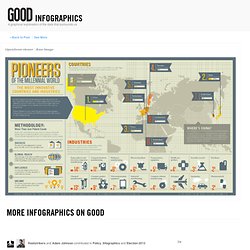
The World's Leading Innovators. More Infographics on Good.