
The Anatomy Of An Infographic: 5 Steps To Create A Powerful Visual. Information is very powerful but for the most bit it is bland and unimaginative.

Infographics channel information in a visually pleasing, instantly understandable manner, making it not only powerful, but extremely beautiful. Once used predominantly to make maps more approachable, scientific charts less daunting and as key learning tools for children, inforgraphics have now permeated all aspects of the modern world. I designed a couple of infographics back in college, the need arising especially around the time Soccer World Cup fever spiked. It was a fun process representing the different groups, predicting winners in each group at each stage and creating a mock pairing of teams that would clash all the way leading upto the finals. I was a devout Argentinian supporter at the time. Infographics can appear daunting to some with the sheer amount of data they present, but designed in the right manner and step by step, they can actually be one of the most fun things you will ever create. 1. 2.
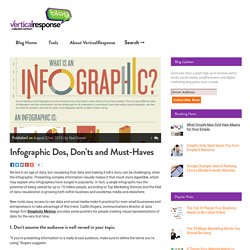
Infographic Dos, Don’ts and Must-Haves. Infographics Published on August 22nd, 2013 | by Yael Grauer We live in an age of data, but visualizing that data and making it tell a story can be challenging: enter the infographic.
Presenting complex information visually makes it that much more digestible, which may explain why infographics have surged in popularity. In fact, a single infographic has the potential of being viewed by up to 15 million people, according to Top Marketing Schools and the field of data visualization is growing both within business and academia, media and elsewhere. New tools, easy access to raw data and social media make it practical for even small businesses and entrepreneurs to take advantage of this trend. 1. “If you’re presenting information to a really broad audience, make sure to define the terms you’re using,” Rogers suggests. For example, if you’re creating an infographic about heart disease, you may wish to define exactly what heart disease is before delving into how many people it affects. 2. 3. 4.
How To Create Outstanding Modern Infographics. In this tutorial you will learn that data doesn't have to be boring, it can be beautiful!

Learn how to use various graph tools, illustration techniques and typography to make an accurate and inspiring infographic in Adobe Illustrator. Start by using the Rectangle Tool (M) to draw a shape. Give it a subtle radial gradient too. The entire design is based on a grid of four columns. To make the columns first select the rectangle and drag a guide onto the centre of the shape. 20 Color Combination Tools for Designers. Being able to select the right colors is key in designing an effective and intriguing design, whether for the web or for print.
If you’re able to achieve a good balance within your design, then it’ll communicate a stronger message much more easily to the users or readers because certain colors “activate” certain types of emotions. If you’d like to read more about choosing the right color scheme and the psychology of colors, I invite you to read the following articles: Color Combination Tools Below we’ve compiled a list containing 20 Color Combination Tools for Designers. You can use this list to chose the tool that better fits your needs or that you’re most comfortable using.
Have we missed any? Kuler The web-hosted application for generating color themes that can inspire any project. Color Scheme Designer Color Scheme Designer has been around for some time and was recently re-written and designed. Contrast-A: Find Accessible Color Combinations Infohound Color Schemer Check My Color Pictaculous. How do You Design Good Infographics? Infographics are an interesting breed of dense information crammed into colorful cartoons and illustrations.
This trend started a few years back on the Internet and has grown into a steady resource for learning. People all around the world are consuming knowledge via these graphics – and they’re perfect for nearly any situation. But how did these things get so popular? It’s a difficult tale to explain how viral trends arise – but the infographic below includes some fantastic examples of how you can utilize this data.
Designers and web developers alike are known for picking up knowledge and sharing with others. Infographics from Scratch. Infographics. Evolution of the Internet Infographic.