10 Steps To Designing An Amazing Infographic
Information can be useful—and even beautiful—but only when it’s presented well. In an age of information overload, any guidance through the clutter comes as a welcome relief. That’s one reason for the recent popularity of information graphics. Infographics are visual designs that help to explain complicated data in a simple way (mental-health emergencies at Burning Man, anyone?). But how are they created? What can we learn from the designer’s process?
10 Outstanding Social Media Infographics
Nobody has time to read anymore, right? Every day we are all inundated with more and more information overload coming from credible and yet to be verified sources. Where can Internet users find relief? Answer: the infographic.
50 Great Examples of Data Visualization
Wrapping your brain around data online can be challenging, especially when dealing with huge volumes of information. And trying to find related content can also be difficult, depending on what data you’re looking for. But data visualizations can make all of that much easier, allowing you to see the concepts that you’re learning about in a more interesting, and often more useful manner.
19 top fonts in 19 top combinations
Sign up and download immediately to take your typography to the next level! This classic contains some great stuff: An exceptional glossary of typography terms Killer tips on establishing typographic color Choosing and using the right typefaces 20 Action-packed info-dense pages!
15 New Extremely Creative Infographics
With the help of evolution and progress, people’s lives become easier day by day. Today everything is simpler than it used to be in the past. Let’s take information for example.
prima guerra mondiale.html
<table width=90% cellpadding=10><tr><td bgcolor=ff4444><span><h1>Warning:</h1><b>JavaScript is turned OFF. None of the links on this page will work until it is reactivated. <p><a href=" If you need help turning JavaScript On, click here.
A Crash Course in Typography: Pulling It All Together
Apr 18 2011 In the first three parts of this series, we covered a lot of information about the anatomy of a typeface, and what kinds of things to look for when actually combining two fonts. Here, we’ll tie it all together.
Learning Visually
Infographics work in the classroom because they grab students and allow an entry point to learning — and because they sum up pages and pages, even chapters, of information that would take a reader hours to process. Interactive infographics make kids want to immediately start clicking around to see what’s what. For a teacher who prioritizes an inquiry-driven classroom, that’s a great starting point. Infographics and Data visualization are not just for consumption though, teachers and students can also challenge the learning process by creating original graphics for themselves. Go here –> Consuming the information is one portion of the equation when discussing data visualization.
60 Seconds - Things That Happen On Internet Every Sixty Seconds
World Wide Web is growing at rapid pace. On average, more than a billion new pages are added to it every day. To give you an idea of how big world wide web is, our Infographic 60 Seconds will cover some really interesting facts about websites that we use on day-to-day basis. Please Check - Things That Happen Every Sixty Seconds Part 2 Infographic by- GO-Globe.com To Publish this Image on your Blog or Website .
The Modern Executives Essential Social Media Toolkit Plus [INFOGRAPHIC]
Privacy on-line is fast disappearing as search engines and social networks publish information in an instant. Conversations about people and brands are searchable with granular advanced search functions that include dates and specific media such as images and videos. In the last century(as far back as the ancient web time of 1995) there was no Google or Bing to help you find information easily on the web. Finding people or brands using primitive search engine technology at the time such as AltaVista was rather hit and miss and finding something relevant was often buried as far back as page 20 of the search results.
Top Tech Trends of 2011 (infographic)
Stay Connected with Us! Follow TechnoBuffalo So what can we learn from 2011? Well for one, according to this infographic, it seems people en masse absolutely do not like being hardwired. On the contrary, our affinity for sharing, streaming and being mobile has become a full-blown obsession. And why not?
Typography
13 Elegant but Free Wedding Fonts Since February is the love month, we decided to come up with a good list of elegant but free script fonts that you can download and use for your romantic-themed designs. For example, in designing materials for weddings, engagements and other important formal events, one of the important aspect for a designer to decide is the choice of font. We have seen a lot of beautiful wedding invitations, posters and websites that use script fonts, some of them look like they were handwritten. Read More
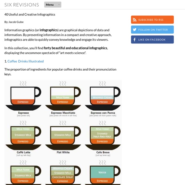
15 Useful Infographics For Designers And Developers
Writen by Bogdan / Comments Off on 15 Useful Infographics For Designers And Developers Information graphics or infographics are graphic visual representations of information, data or knowledge. These graphics present complex information quickly and clearly,[1] such as in signs, maps, journalism, technical writing, and education. With an information graphic, computer scientists, mathematicians, and statisticians develop and communicate concepts using a single symbol to process information. In this article you will find 15 useful infographics for designers and developers.
What Drives Brand Sociablity? [INFOGRAPHIC]
By now, most marketers agree that engaging their brands in social media is a good thing, but they also feel that they could be doing it better According to a survey of 1,897 senior executives conducted by Weber Shandwick in partnership with Forbes Insights, 84% of the execs believe their brand's sociability is not up to world-class standards. What does it take to get there? In the infographic below, Weber Shandwick offers nine tips, including creating your own content for social media and planning social media activity across all channels. Brands would be wise to take that counsel. As they all agree, sociability is now a key component in driving brand reputation.

Belle quelle del caffè e burning fuel by lucamorbo Oct 2