
The hardest—and easiest—punctuation marks to use. By Kristin Piombino | Posted: July 10, 2014 Which punctuation mark is the hardest to use correctly?
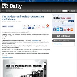
The ellipsis sounds a little intimidating, and people frequently misuse apostrophes. Perhaps you're thinking it's one of those. It's not. The hardest punctuation mark to use correctly is the comma, an infographic from TheVisualCommunicationGuy.com claims. The infographic ranks each punctuation mark according to how many applications it has, and therefore, how difficult it is to learn. While the comma is the most difficult with 15 applications, the period is the easiest—its only job is to end a sentence (except when it ends an abbreviation: Mr., Mrs., Dr., etc.).
Take a look at the graphic to see where the rest of the punctuation marks rank. (View a larger image.) Kristin Piombino is associate editor of Ragan.com. What do you need to be innovative - Infographic »The Bank Blog. INFOGRAPHIE. Etre connecté de la tête aux pieds - L'Express. 30 Compelling Examples of Visual Storytelling on the Web. Storytelling is a powerful approach that can, when done right, compel users to convert more effectively than what any amount of optimization, crazy visual callouts, or awesome interactive elements can do otherwise.
Much like how we expect to see a moral at the end of a book, we expect to find a purpose at the end of a site with a storytelling experience. When the path to the “moral of the story” (or conversion point, to be more specific) is laid out clearly in front of our users’ eyes, the rest of the work lies simply in convincing them that the purpose is really worth grabbing on to… which is great since with storytelling, a user is normally in the mindset of learning more about what the story has to offer.
So take a look at the examples below and experience how their visual storytelling compels you to continue scrolling down their pages! 1. MoMA Century of the Child ( Tools.jpg 900×13,082 pixels. The-blogconomy-infographic-640x5604.png 640×5,604 pixels. Infographic: Social Media Shortcuts Save Time On Social Platforms. Everyone is browsing through social media networks like Facebook, Twitter, YouTube and Google Plus on a daily basis.
But are you stressed up because everything on these platforms feels so slow and you want to speed up your browsing? As many people don’t know, these four social media platforms are all having some nice keyboard shortcuts. With these shortcuts you can move faster, more comfortable and just pick up the pace. We show you how they work. Navigate through Facebook & co. like a real pro! For all those who don’t know what a shortcut is: A shortcut is a specific key combination for a command that would otherwise be available only through a menu or an interface.
Projects / JESS3 Labs - Geosocial Universe 3.0. Project: In August 2010, JESS3 took one giant step for geosocial networking with the introduction of The Geosocial Universe infographic, mapping this new world for the first time.
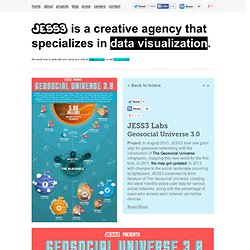
In 2011, the map got updated. In 2013, with changes to the social landscape occurring at lightspeed, JESS3 presented its third iteration of The Geosocial Universe, charting the latest monthly active user data for various social networks, along with the percentage of users who access each network via mobile devices. Methodology: For this JESS3 Labs project, we referenced our past endeavors, but put an even stronger emphasis on mobile user activation in the geosocial universe. We added several networks, including completely mobile apps and a few foreign players. For the first time, we also featured the shuttering of some previous major geosocial networks, rendering their demises as black holes. Another key difference in this version was the inclusion of three snackable graphics along with the full infographic.
10 Awesome Infographics to Guide your Marketing Plan for 2014. 8.1K Flares Filament.io 8.1K Flares × Infographics seem to be getting more and more popular lately.
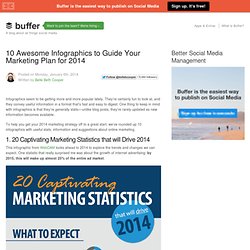
They’re certainly fun to look at, and they convey useful information in a format that’s fast and easy to digest. One thing to keep in mind with infographics is that they’re generally static—unlike blog posts, they’re rarely updated as new information becomes available. To help you get your 2014 marketing strategy off to a great start, we’ve rounded up 10 infographics with useful stats, information and suggestions about online marketing. 10 Awesome Infographics to Guide your Marketing Plan for 2014.