Quadrato semiotico
Da Wikipedia, l'enciclopedia libera. Il quadrato semiotico Il quadrato semiotico è un metodo di classificazione dei concetti pertinenti ad una data opposizione di concetti quali maschile-femminili, bello-brutto, ecc. e di classificazione dell'ontologia pertinente. È stato introdotto dal linguista e studioso di semiotica lituano Algirdas Julien Greimas, derivato dal quadrato logico di Aristotele. A partire da un'opposizione data di concetti S1 e S2, il quadrato semiotico per prima cosa presuppone l'esistenza di altri due concetti, ossia ~S1 and ~S2, che stanno tra loro nelle seguenti relazioni:
10 Great Tools for Tech Savvy Teachers
Prezi A fantastic tool to liven up presentations, Prezi does away with traditional, crowded slides by allowing you to zoom in and out, so you can create an entire presentation on one slide and guide your audience through it step-by-step. Zoom in to the details, but zoom out to show how your ideas fit together as a whole. Edmodo
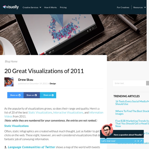
50 Great Examples of Data Visualization
Wrapping your brain around data online can be challenging, especially when dealing with huge volumes of information. And trying to find related content can also be difficult, depending on what data you’re looking for. But data visualizations can make all of that much easier, allowing you to see the concepts that you’re learning about in a more interesting, and often more useful manner. Below are 50 of the best data visualizations and tools for creating your own visualizations out there, covering everything from Digg activity to network connectivity to what’s currently happening on Twitter.
20 Websites with Original, Non-Standard Geometry
Geometric shapes are widely used as design and framing elements, navigation components or as a way of drawing users’ attention to certain parts of a website. The most popular geometric elements in web design are obviously rectangles and circles. But what about using other geometric figures? Triangles, trapeziums, rhombuses or even hexagons?
The User Experience Wheel
I have used this model for some time now, time to reveal it to the critical eyes of fellow practitioners. It is a model that tries to explain “what is user experience?” PDF Version The Model should be explained from the inside.
Over 100 Incredible Infographic Tools and Resources (Categorized)
This post is #6 in DailyTekk’s famous Top 100 series which explores the best startups, gadgets, apps, websites and services in a given category. Total items listed: 112. Time to compile: 8+ hours.
Beautifully-Animated Infographics Designed by Eleanor Lutz
Eleanor Lutz is a designer whose knowledge of molecular biology and love of science is translated into beautifully-designed infographics. Her colorful and educational images contain interesting bits of information about how the human body works and birds fly, but with a novel twist - they’re animated GIFs. Lutz’s addition of movement makes these images more engaging, and we get a better sense of how things actually work.
Diagramma di Gantt
Da Wikipedia, l'enciclopedia libera. Esempio di semplice diagramma di Gantt Il diagramma di Gantt è uno strumento di supporto alla gestione dei progetti, così chiamato in ricordo dell'ingegnere statunitense Henry Laurence Gantt (1861-1919), che si occupava di scienze sociali e che lo ideò nel 1917. Caratteristiche[modifica | modifica sorgente] Il diagramma di Gantt usato principalmente nelle attività di project management, è costruito partendo da un asse orizzontale - a rappresentazione dell'arco temporale totale del progetto, suddiviso in fasi incrementali (ad esempio, giorni, settimane, mesi) - e da un asse verticale - a rappresentazione delle mansioni o attività che costituiscono il progetto. Barre orizzontali di lunghezza variabile rappresentano le sequenze, la durata e l'arco temporale di ogni singola attività del progetto (l'insieme di tutte le attività del progetto ne costituisce la Work Breakdown Structure).
Designing programs with flow charts
Designing programs with flow charts After completing this lesson you should be able to: There are some exercises for you to do and each exercise has a sample answer: Exercise 1 - a first flow chartExercise 2 - a flow chart with subprocessesExercise 3 - an advanced flow chart exerciseExercise 4 - comparing flow charts and pseudocode