
5 great reasons to create infographics. According to Mark Smiciklas an infographic is “a visualization of data or ideas that tries to convey complex information to an audience in a manner that can be quickly consumed and easily understood”.
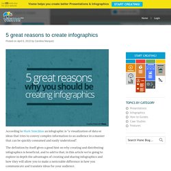
The definition by itself gives a good hint on why creating and distributing infographics is beneficial, and to add to that, in this article we’re going to explore in depth the advantages of creating and sharing infographics and how they will allow you to make a noticeable difference in how you communicate and translate ideas for your audience. 6 Tips to help you create better Infographics. According to Wikipedia an infographic is a visual representation of information “which involve descriptions, narratives or interpretations presented graphically, which may or may not coincide with abstract graphics and / or sounds.”
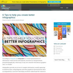
Infographics provide you access to complex information, usually appearing in numerical data, using diagrams and other graphical representations often accompanied by a narrative that helps you better understand the context in which these data are given. In laymen terms at Visme we define Infographics as a medium that combines both text and visual elements to help viewers digest information efficiently. Using graphics to share information has several advantages: Here are a few helpful tips to improve your next infographic.
It all starts with the idea. This could be a related subject such as an issue related to the services or products offered by your organization or a tendency in your field of interest. What end result do you want to achieve from your infographic? Infografika. Infographies. 35 Great Social Media Infographics. 35 Great Social Media Infographics [Note: I recently updated this compilation to include some more recent visualizations... you can see it here.]
Here’s a collection of terrific social media infographics that might come in handy. As you probably know, infographics are visual representations of information, data, or knowledge. They illustrate information that would be unwieldy in text form and they act as a kind of visual shorthand, making information easy to understand and consume. They are driven by the same information as charts, but they’re often a better form of communication because of their pleasant aesthetics — charts and graphs can communicate data, but infographics turn data into information. It’s very helpful to use infographics in presentations, reports, articles, etc., to convey concepts. Most of these have been scaled down or cropped. If you know of any good ones that I’ve missed, please leave a comment and let me know! 1. 2. 10 Levels of Intimacy in Today’s Communication. ActuVisu. Visualisation de l'information. Faites parler les données. What are the tools that can be used to create infographics. A good blend between bringing data and outputting it into very attractive graphics.
Infographs. Data Visualization and Infographics Resources - Smashing Magazin. Advertisement Data visualizations and infographics can make complex datasets easier to understand and comprehend.
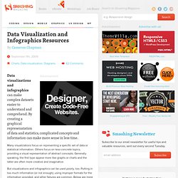
By creating a graphical represenatation of data and statistics, complicated concepts and information can make more sense in less time. Many visualizations focus on representing a specific set of data or statistical information. Others focus on less-concrete topics, providing a visual representation of abstract concepts. Generally speaking, the first type appear more like graphs or charts and the latter are often more creative and imaginative. But visualizations and infographics can be used poorly, too. Also consider our previous articles: Infographics For The Rest Of Us.
To test it out I started a timeline of the life of Frederick Law Olmsted, considered to be the father of American landscape architecture. Referring to his biography on Wikipedia, I picked out a few events and started adding them to a new timeline on Dipity. When you add an event to a timeline, in addition to the title, date, and description of the event, it is possible to upload a picture, link to a webpage, or add a location. Dipity presents the uploaded images as a slideshow or a "flipbook".
Location information is presented on a map. Visit the interactive timeline I created. It is also possible to automatically generate a timeline based on a data source. You can capture images from the timeline for use in other documents. It is so easy to generate a timeline using a data source that I couldn't resist the urge to create another one. [Web developers might be interested in MIT's Simile Timeline project. Sparklines. 14 Visually Stunning Animated Infographics. Infographics are visual illustrations communicating information by means of signs, symbols, icons, maps and diagrams.
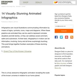
When these graphics are animated they can be used to represent complex situations and tell stories, or they can address social comment, satire and subversion. At their best, infographics in motion can be informative, involving, funny and at times surprisingly touching. This post brings together fourteen examples of these stunning animations. 1. Grand Tour of the Known Universe This is a truly awesome infographic animation revealing the scale of the known universe in relation to our home planet. 2. In this animation the credit crunch is explained in simple steps with informative narration and crisp graphics. 3. This charming animation considers the worries of growing up, and reassures that the wonders of growing and life’s surprises are really nothing to fear.