
Francesco Bailo. Are you parallelizing your raster operations?
You should! If you plan to do anything with the raster package you should definitely consider parallelize all your processes, especially if you are working with very large image files. Drawing beautiful maps programmatically with R, sf and ggplot2 — Part 1: Basics. View raw Rmd Maps are used in a variety of fields to express data in an appealing and interpretive way.
Data can be expressed into simplified patterns, and this data interpretation is generally lost if the data is only seen through a spread sheet. Maps can add vital context by incorporating many variables into an easy to read and applicable context. Maps are also very important in the information world because they can quickly allow the public to gain better insight so that they can stay informed. It’s critical to have maps be effective, which means creating maps that can be easily understood by a given audience. Html - Center leaflet in a rmarkdown document. Beyond Basic R - Mapping - The USGS OWI blog. David Watkins Introduction.
What You're Doing Is Rather Desperate. I love it when researchers take the time to share their knowledge of the computational tools that they use.
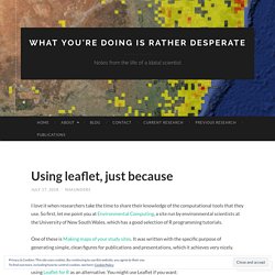
So first, let me point you at Environmental Computing, a site run by environmental scientists at the University of New South Wales, which has a good selection of R programming tutorials. One of these is Making maps of your study sites. It was written with the specific purpose of generating simple, clean figures for publications and presentations, which it achieves very nicely. I’ll be honest: the sole motivator for this post is that I thought it would be fun to generate the map using Leaflet for R as an alternative. You might use Leaflet if you want: Mapping in R just got a whole lot easier. Subplots in maps with ggplot2. Following the surprising success of my latest post, I decided to show yet another use case of the handy ggplot2::annotation_custom().
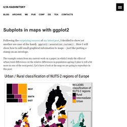
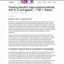
Here I will show how to add small graphical information to maps – just like putting a stamp on an envelope. The example comes from my current work on a paper, in which I study the effect of urban/rural differences on the relative differences in population ageing (I plan to tell a bit more in one of the next posts). Let’s have a look at the map we are going to reproduce in this post: So, with this map I want to show the location of more and less urbanized NUTS-2 regions of Europe. But I also want to show – with subplots – how I defined the three subregions of Europe (Eastern, Southern, and Western) and what is the relative frequency of the three categories of regions (Predominantly Rural, Intermediate, and Predominantly Rural) within each of the subregions.
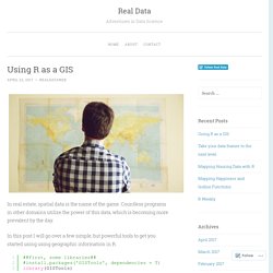
An Introduction to Spatial Data Analysis and Visualisation in R - CDRC Data. Where Europe lives, in 14 lines of R Code. Using R as a GIS. In real estate, spatial data is the name of the game.
Countless programs in other domains utilize the power of this data, which is becoming more prevalent by the day. In this post I will go over a few simple, but powerful tools to get you started using using geographic information in R. GISTools provides an easy-to-use method for creating shading schemes and choropleth maps. Some of you may have heard of the sp package, which adds numerous spatial classes to the mix. There are also functions for analysis and making things look nice. Let’s get rolling: source the vulgaris dataset, which contains location information for Syringa Vulgaris (the Lilac) observation stations and US states.
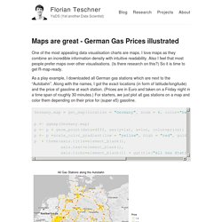
One thing to note here is the structure of these objects. us_states is a SpatialPolygonsDataFrame, which stores information for plotting shapes (like a shapefile) within its attributes. vulgaris by contrast is a SpatialPointsDataFrame, which contains data for plotting individual points. Look familiar? Kiefer. Easy earthquake mapping using ggmap. Maps are great - German Gas Prices illustrated – Florian Teschner – YaDS (Yet another Data Scientist) One of the most appealing data visualisation charts are maps.
I love maps as they combine an incredible information density with intuitive readability. The rOpenSci geospatial suite. Geospatial data - data embedded in a spatial context - is used across disciplines, whether it be history, biology, business, tech, public health, etc.
Along with community contributors, we're working on a suite of tools to make working with spatial data in R as easy as possible. If you're not familiar with geospatial tools, it's helpful to see what people do with them in the real world. Example 1 One of our geospatial packages, geonames, is used for geocoding, the practice of either sorting out place names from geographic data, or vice versa. geonames interfaces with the open database of the same name: A recent paper in PlosONE highlights a common use case.
Harsch & HilleRisLambers1 asked how plant species distributions have shifted due to climate warming. Example 2 We covered the state of our geospatial tools in March of this year, but a lot has changed since then so we thought it would be useful to do an overview of these tools and future work. GeoJSON. Mapping tweets: How to create your own web app. May 28, 2016 One of the reasons why Twitter has become so popular is because it is a great way to get data for web applications and projects.
Through its Search API, it is possible to find content by issuing a query to Twitter based on a supplied string. The results can then be parsed or displayed as preferred using ancillary tools. The purpose of this tutorial is that you learn how to create an interactive web app that retrieves geolocated tweets and shows them in a map. Sounds cool? Web mapping with Leaflet and R. Aug 11, 2015 Leaflet is a JavaScript library that has become quite popular for creating interactive maps.
One way to create a map using the Leaflet JS library is to include the Leaflet JS and CSS files in the head of a web page and then set up the map in the body of the html page, as shown in the Leaflet Quick Start Guide. An alternative way is to create the web map in the R environment using an R package called leaflet, developed by the guys from RStudio, which allows controlling and integrating Leaflet maps in R.
In this post I show how to read a vector map in shapefile format and create a leaflet web map customizing how the vector map is displayed. I will also show how to add a legend, a layers control and popups for displaying attribute data. Web mapping with Leaflet and R. R and GIS – working with shapefiles. R has some very useful libraries for working with spatial data. In this blog we will look at some of the libraries and demonstrate few basic functionalities. Lets start with reading a shapefile. How to read a shapefile : We will use the maptools package to read the shape file.
Along with the maptools package, install the rgeos and sp packages. Incase you missed it: My Webinar on Spatial Data Analysis with R. In case you missed my free webinar on “Getting Started with Spatial Data Analysis with R“, here is the recording. You can access the material used for this webinar from Domino Data Lab‘s platform using the following links: The Slides [domino-presentation.pdf]The RMarkdown Script [ReadMe.Rmd]The Whole Project [All files including data] If you have any questions, please do not hesitate to contact me.
If you have more topics (related to R) that you are interested in learning about, send them my way so we can prepare another webinar. Finally, I would like to thank Anna Anisin from Domino Data Lab for setting up this webinar. Upload shapefile to R Shiny app to extract leaflet map data. In this post I share an R Shiny app which uses the leaftlet package for interactive maps. This app differs from prior apps I’ve made featuring leaflet maps. First, it displays rasterized map data rather than just point layers. Also, longitude and latitude sliders in the browser allow for cropping the map. Additionally, the user can upload a shapefile to crop and mask the rasterized data overlays in the leaflet window to the specific spatial data they wish to work with, and then extract and download that data. Japans ageing population, animated with R.
The US Census makes a number of its databases available to developers via the Census API. One of those databases is the International Data Base, in which the Census department provides historic demographic breakdowns (population by age and sex) for many countries, along with projections through 2050. Kyle Walker created the R package idbr (currently only available on GitHub) to make it easy to download these datasets using R, and used it to create the animation below showing Japan's demographic change since 1990.
As you can see, the Census Bureau predicts that this ageing of the population will only intensify over time. Tips for reading spatial files into R with rgdal. R has become a go-to tool for spatial analysis in many settings. You can read and edit spatial data, conduct geoprocessing and spatial analysis and create static and interactive maps. Of course, the first step in spatial analysis with R is often reading in your spatial data and this step can be confusing and frustrating. The super-powerful grandfather of functions for reading vector-based spatial data is readOGR from the package rgdal. You can use this function to read in dozens of different formats but the syntax can be odd and, importantly, is different for different input types.
Visualising your hiking trails and photos with My Tracks, R and Leaflet. Building Interactive Maps with Leaflet. Manipulating and mapping US Census data in R using the acs, tigris and leaflet packages. The US Census provides an incredible wealth of data but it’s not always easy to work with it. In the past, working with the tabular and spatial census data generally meant downloading a table from FactFinder and a shapefile from the boundary files site and joining the two, perhaps in a GIS system.
Technical Tidbits From Spatial Analysis & Data Science. Display of Geographic Data in R – Adventures in Analytics and Visualization. MapView: basic interactive viewing of spatial data in R. Administrative Maps and Projections in R - AriLamstein.com. Today I will demonstrate how to create maps of “other countries”, and use map projections, with the choroplethr package in R. I write “other countries” in quotes because, like most things, translating a high level wish into software can be complicated.
Thematic Mapping in R without the Tears, Walkthrough. Geographic visualization with R's ggmap. Have you ever crunched some numbers on data that involved spatial locations? R tutorial for Spatial Statistics: Organize a walk around London with R. Mortgages Are About Math: Open-Source Loan-Level Analysis of Fannie and Freddie - Todd W. Schneider. [M]ortgages were acknowledged to be the most mathematically complex securities in the marketplace. The complexity arose entirely out of the option the homeowner has to prepay his loan; it was poetic that the single financial complexity contributed to the marketplace by the common man was the Gordian knot giving the best brains on Wall Street a run for their money.
Ranieri’s instincts that had led him to build an enormous research department had been right: Mortgages were about math.The money was made, therefore, with ever more refined tools of analysis. —Michael Lewis, Liar’s Poker (1989) Fannie Mae and Freddie Mac began reporting loan-level credit performance data in 2013 at the direction of their regulator, the Federal Housing Finance Agency. R Video tutorial for Spatial Statistics: Interactive maps for the web in R. Choroplethr v3.1.0: Better Summary Demographic Data. Visualisation with R and Google Maps. Zevross. Interactive Maps for John Snow’s Cholera Data. Amphitheaters. Roman Amphitheater in-Class "Mash Up" Mapping Paris bikes stands - SHARP SIGHT LABS. Robin Lovelace - The leaflet package for online mapping in R.
Spatial data in R: Using R as a GIS. Robinlovelace/Creating-maps-in-R · GitHub. Spatial visualization with R. Robin Lovelace - Basic mapping and attribute joins in R. Ramnathv/rMaps. Technical Tidbits From Spatial Analysis & Data Science. » Proficiency levels @ PISA and visualisation challenge @ useR!2014 SmarterPoland. Creating Inset Map with ggplot2. Using R — Working with Geospatial Data (and ggplot2) The choroplethr package for R. Visualizing a tiny slice of India's demographics with information from Wikipedia. Ggplot2 Chloropleth of Supreme Court Decisions: A Tutorial. The OpenStreetMap Package Opens Up « Fells Stats. Using R — Working with Geospatial Data. Create maps with maptools R package.