
Using the viewport meta tag to control layout on mobile browsers - Mozilla. The upcoming release of Mobile Firefox (Fennec) 1.1 features improved support for the <meta name="viewport"> tag.
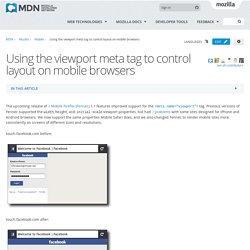
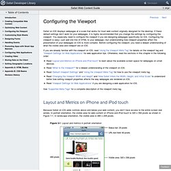
Previous versions of Fennec supported the width, height, and initial-scale viewport properties, but had problems with some sites designed for iPhone and Android browsers. We now support the same properties Mobile Safari does, and we also changed Fennec to render mobile sites more consistently on screens of different sizes and resolutions. touch.facebook.com before: touch.facebook.com after: You can see these changes for yourself in the latest Fennec 1.1 and trunk nightly builds for Maemo, Windows, Mac, or Linux. Background Mobile browsers like Fennec render pages in a virtual "window" (the viewport), usually wider than the screen, so they don't need to squeeze every page layout into a tiny window (which would break many non-mobile-optimized sites). Mobile Safari introduced the "viewport meta tag" to let web developers control the viewport's size and scale.
A pixel is not a pixel is not a pixel. Page last changed today Yesterday John Gruber wrote about the upped pixel density in the upcoming iPhone (960x640 instead of 480x320), and why Apple did this.
He also wondered what the consequences for web developers would be. Now I happen to be deeply engaged in cross-browser research of widths and heights on mobile phones, and can state with reasonable certainty that in 99% of the cases these changes will not impact web developers at all. The remaining 1% could be much more tricky, but I expect Apple to cater to this problem by inserting an intermediate layer of pixels.
(Later John pointed out that such a layer already exists on Android.) One caveat before we start: because they’re unimportant to web developers I have mostly ignored the formal screen sizes, and I’m not really into disucssing the ins and outs of displays, pixel densities, and other complicated concepts. Safari Web Content Guide: Configuring the Viewport. Safari on iOS displays webpages at a scale that works for most web content originally designed for the desktop.
If these default settings don’t work for your webpages, it is highly recommended that you change the settings by configuring the viewport. You especially need to configure the viewport if you are designing webpages specifically for iOS. Configuring the viewport is easy—just add one line of HTML to your webpage—but understanding how viewport properties affect the presentation of your webpages on iOS is more complex. Before configuring the viewport, you need a deeper understanding of what the visible area and viewport are on iOS. Responsive Webdesign (3) – Bilder automatisch skalieren - Michael's Blog. Nachdem wir in den beiden ersten Beiträgen zum Thema „Responsive Webdesign“ ein einfaches Grundlayout einer Webseite aufgebaut haben, widmen wir uns nun den Inhalten von Webseiten.
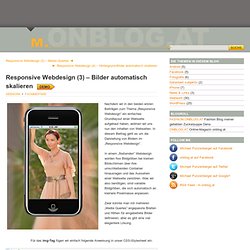
In diesem Beitrag geht es um die Darstellung von Bildern im „Responsive Webdesign“. In einem „fließenden“ Webdesign würden fixe Bildgrößen bei kleinen Bildschirmen über ihre umschließenden Container hinausragen und das Aussehen einer Webseite zerstören. Was wir also benötigen, sind variable Bildgrößen, die sich automatisch an kleinere Pixelmasse anpassen. Zwar könnte man mit mehreren „Media Queries“ angepasste Breiten und Höhen für eingebettete Bilder definieren, aber es gibt eine viel elegantere Lösung.
5 Useful CSS Tricks for Responsive Design. Making the design to be responsive is very easy as shown in my Responsive Design in 3 Steps tutorial, but maintaining the elements to look aesthetically balanced on all breakpoint layouts is an art.
Today I’m going to share 5 of my commonly used CSS tricks along with sample cases for coding responsive designs. They are simple CSS properties such as min-width, max-width, overflow, and relative value — but these properties play an important part in responsive design. View Demos 1. Responsive Video (demo) This responsive video CSS trick was discovered by tjkdesign.com. 2. Max-width property allows you to set the max width of the element. Max-Width Container In the example below, I specify the container to display at 800px if possible, but it should not exceed 90% of the boundary width.
Responsive Image You can make the image auto resize to the max width of the boundary by using max-width:100% and height:auto. Build a basic responsive site with CSS. Knowledge needed: Basic CSS and HTML Requires: Text editor Project Time: 1-2 hours Everyone’s talking about responsive web design.
But does everyone understand what it’s for? I’m not sure. Many web designers and developers seem to me to have misunderstood the problem it’s trying to solve. Put simply, it’s not about making sites for mobile devices, it’s about adapting layouts to viewport sizes. In this tutorial I’ll look at the principles behind responsive web design in detail, so we’re sure to understand the concepts correctly. Responsive web design has mainly become a hot topic because more and more people are using mobile devices such as iPhones, iPads, and BlackBerrys to access the internet. So it’s becoming increasingly important to understand that a website should not be specifically about either the desktop or the mobile device, but about building in such a way that its layout adapts to varying viewport sizes.
Frustrating? User frustration The walkthrough <! Main navigation switch.