
Responsive Image Grids with Transitional Effects when Hovered. Responsive image grids, or image gallery with fluid rows & columns, can be seen all over the web nowadays.

Let's built it with pure CSS/CSS3. No fancy dancy JavaScript or jQuery needed. CSS3 will be used for the mouse-over transitional effect. It degrades nicely for legacy browsers such as IE6 - IE8 The demo contains 12 images. If you want to use an image sprite (only one image) to help with performance, please refer to the demo 2. <ul id="rig"><li><a class="rig-cell" href="#"><img class="rig-img" src="/rg/img/1.jpg" /><span class="rig-overlay"></span><span class="rig-text">Lorem Ipsum Dolor</span></a></li> ...more... View full HTML source code View full CSS source code. 24 Sets Of Clean Minimalistic Icons For Perfect Web Design. 50 Best Testimonials Page Design Inspiration For Designers - TechClient. How to Write a Web Design Case Study that Lands New Clients. Free Bonus Guide: Are you a freelance web designer?

This comprehensive guide will show you everything you need to start fuelling the growth of your business. Download your copy now. One of the toughest challenges designers face when pitching prospective clients is winning over their trust and confidence. If your prospective clients haven’t worked with you in the past, they’ll likely have hesitations about handing over their hard-earned cash to a stranger.
To win their confidence (and close the deal!) One of the greatest tools in a designer’s arsenal for overcoming this unique obstacle is the case study. Case studies are narratives that reveal what you are capable of as a designer. The best case studies move beyond intuition-based explanations and document the rationale behind the design, UX, and visual decisions. First things first: Plan for your case study ahead of time With that out of the way, let’s take a look at the five core elements that should be included in any case study. 1.
Button Styles Inspiration. Winona Ujarak Wayra Tamaya Rayen Pipaluk Moema Based on the "Add New Location" button concept by Charles Patterson.
Isi Aylen Saqui Wapasha Nina Nanuk Nuka Antiman Itzel clip-path does not work in IE, so you'll see the line under the icon. Naira Quidel. Seamless Responsive Photo Grid. Let's say you have a bunch of images you want to display, and the goal is to get them edge-to-edge on the browser window with no gaps.
Just because you think that would be cool. They are of all different sizes. You don't care if they are resized, but they should maintain their aspect ratio. Like this: Ideally we keep it pretty chill on the markup, like: <section id="photos"><img src="images/cat-1.jpg" alt="Cute cat"><img src="images/cat-2.jpg" alt="Serious cat"> ... Without any CSS at all, the images will line up in a row since they are essentially inline-block: Rivers of whitespace But that's not quite what we want. We can get this working the way we want it to with just CSS. We could wrap equal numbers of images in floated divs, but that's not very easy to keep balanced. So as long as the parent with the multiple columns is as wide as the browser window (default) and the column-gap is 0, we got it made in the shade. Here's the CSS: Using Modern CSS to Build a Responsive Image Grid. Building custom responsive layouts is always exciting.
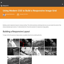
This article examines a technique that we can use to take full control of the distance between grid columns. To demonstrate this, I’ll use the example of a responsive image gallery. Building a Responsive Layout To begin with, let’s assume on large screens our gallery should look something like this: On smaller screens (i.e. <50em), it should have the following appearance: The markup is simple: As you probably already know, we can take advantage of different layout methods for generating the desired result. I want a 2-column layout on medium screens and smaller (i.e. <50em), and a 4-column layout on large screens (50em or above).The distance between columns should be 8px.
Using inline-block I’ll first use the display:inline-block method to build our gallery. Here’s an explanation of what I’ve done: By default, there’s a space between inline-block elements. On small screens I have a 2-column layout and I specify 8px of space between columns.