
dafont.com Diese 8 Tools helfen dir beim Testen mobiler Websites Simulatoren Simulatoren versuchen das Verhalten eines bestimmten Gerätes nachzuahmen. Oft wird hierbei lediglich der Bildschirm-Ausschnitt verkleinert. Manche Simulatoren schaffen es aber durchaus treffend das wiederzugeben, was später auch auf dem Gerät zu sehen ist. iPhone-Tester Mit dem Online-Tool iPhone-Tester können Websites auf ihre Wirkung auf dem iPhone hin getestet werden. iPhoney iPhoney ist die „Offline“-Version von iPhone-Tester, die als eigenständiger Download für den Mac daherkommt und auch das Drehen des iPhones simulieren kann. iPad Peek iPad Peek simuliert die Darstellung euerer Webseiten auf einem iPad im Hoch- und Querformat. Screenfly Mit Screenfly können Webseiten in einer Vorschau für verschiedenste Geräte-Größen und -Typen getestet werden. Mobile Phone Emulator Emulatoren All Simulatoren haben ein gemeinsames Problem: Sie geben nur sehr beschränkt wieder, wie der Benutzer die Webseiten im Endeffekt auf den Geräten dargestellt bekommt. iOS Simulator Android Simulator
Responsive Web Layouts for Mobile Screens: Intro, Tips and Examples Designers have it tougher now than before. We not only have to design for stationary devices, but also mobile devices like the tablet and smartphones, and since we are talking about a lot of different screen sizes and resolutions here, it’s a huge task to shoulder. In light of this, responsive web design could be the best solution. It offers more than just a simple mobile template; instead, your entire site layout is designed to be flexible enough to fit into any possible screen resolution. With such a fluid design scheme there are obvious benefits and drawbacks. How Responsive Design Works When I use the word “responsive” in terms of web design I mean that the entire layout responds based on the user’s screen resolution. Responsive design is all about creating a homogeneous experience regardless of the browser or device screen size. Why Design for Mobile? It has become evident that more users are going mobile, and not just for on-the-go web browsing either. (Image Source: bradfrostweb)
8 Ways to Add a Responsive Navigation Menu on Your Site By Jacob Gube There are plenty of techniques for implementing responsive navigation menus on your site. One of your options: Build your menu from scratch. There are many tutorials on the Web for that if you need to learn how. But some of us may just be interested in getting the task done as quickly and as painlessly as possible. In this post, I’ll discuss a few excellent open source projects for building responsive navigation menus. There are many options out there, so for convenience, I narrowed it down to just 8. At the end of the post, you’ll find a summary table that has links to the official site, demos, usage guide, and official open source repository for each project I’ll talk about. 1. This responsive navigation menu system is lightweight — less than 1KB when optimized. 2. Bootstrap has two components for building responsive menus. 3. menu-aim This jQuery plugin will allow you to make responsive mega-dropdown menus modeled after Amazon.com’s fast and responsive menus. 4. 5. 6. 7. 8.
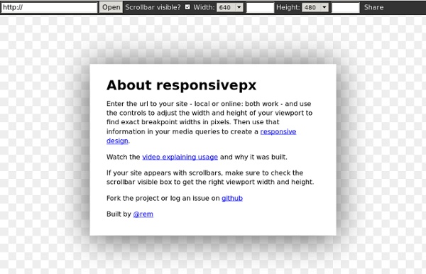
50 Useful Tools and Resources For Web Designers - Smashing Magazine Advertisement An effective, well-organized workflow is an important asset of professional web designers. The more useful and time-saving your tools are, the more time you can focus on important things, thus creating a foundation for timely good-quality results. The problem is that there are just way too many tools, services and resources out there, so it has become difficult to keep track on them and find those tiny little time-savers that will spare you headaches and save time in a long run. And this is where we come in. Back in old days, Smashing Magazine used to publish lists after lists, with plethora of links that covered different topics all somehow related to web design and development. Below you’ll find 50 useful tools and time-savers for web designers and developers. You may be interested in the following related posts: Typography Web Font Specimen This template lets you check the typography by analyzing the HTML-specimen in your browser. Bookmarklets CSS, HTML and JavaScript Tools
Framote: Browser-Fernsteuerung für Layout-Tests Langweilige Websites gibt es bei dir nicht? Hier findest du deinen neuen Job!t3n.de/jobs/ Framote setzt sich auf den Begriffen Frame und Remote zusammen. Auf der Webseite von Framote gebt ihr eine URL ein und generiert zwei Links: Die Framote-URL, die auf den darstellenden Geräten aufgerufen werden muss und die Control URL, die ihr benutzen könnt, um die Frames fernzusteuern. Unter der Framote-URL findet sich ein Inline-Frame, das mit einem Ajax-Script im Hintergrund auf die aktuelle URL, die im Framote-Control-Bereich hinterlegt werden kann, gesetzt wird. So können automatisch und ohne jedes Endgerät von Hand reloaden zu lassen, Webseiten auf ihre Responsive-Eigenschaften hin getestet werden. Auf der Webseite von Framote könnt ihr euch vom Nutzen des Tools selbst überzeugen.
A Simple Device Diagram for Responsive Design Planning Updated for 2015! Check out Analytics-driven responsive web design planning At Metal Toad we're big fans of responsive design, but a common snag in the responsive planning process comes when choosing what device widths to design to. Just yesterday we had a big internal debate over what the best widths to design to are for 3 layout sites, 4 layout sites, etc. There are an ever-increasing number of devices with different screen resolutions to take into account with a responsive design, so we put together a simple but handy diagram that lists the most common device widths as of the present, along with overlays for potential device width ranges. The Diagram Here's the result! A couple of things to note: As the labeling indicates, the top of the diagram is portrait orientations and the bottom is landscape orientations for devices. Our Suggested Layouts 3 Layouts Design Targets: Layout 1: iPhone (320/640px) in Portrait is a good candidate for the PSDs. 4 Layouts 6 Layouts! Go big or go home, right?
Wikis for Everyone - Wikispaces Kompatibilitätsmodus für Internet Explorer 8 – Türchen 16 | TYPO3 Blogger Der heutige Eintrag stellt eine kleine Extension vor, die das Leben des Supports und aller Anwender mit Internet Explorer 8 erleichtern sollte. Das derzeit herrschende Problem ist, dass User mit diesem Browser manchmal aus dem TYPO3-Backend ausgeloggt werden. Der Hintergrund Wenn aufgrund von falsch interpretiertem Code der IE in den Quirks-Modus fällt, ist die aktuelle Session und damit der Login nicht mehr gültig und der Browser wechselt in den sogenannten Kompatibilitätsmodus. Die Extension ie8compatmode Der Kompatibilitätsmodus kann entweder manuell über das Menü des Browsers (Seite > Kompatibilitätsansicht) aktiviert werden oder über einen bestimmten Meta-Tag: Hier kommt die Extension ie8compatmode ins Spiel, die über XCLASS den Meta-Tag automatisiert setzt. Das Besondere Die Extension gibts vorab für alle typo3blogger-Leser ganz exklusiv hier.