
250+ Free Responsive HTML5 CSS3 Website Templates All professional free premium responsive HTML5 and CSS3 Templates have functionality and features of HTML5 and CSS3. Using HTML5 and CSS3 features are popular among web designers nowadays. HTML5also provide great features to create animation on web instead of flash animation. Websites developed in HTML5 animation will not require adobe flash support on your web browser anymore, provided that your browser supports HTML5. Design websites at speed with Photoshop and Edge Reflow Some months ago, a major advance took place at Adobe with its responsive web design tool, Edge Reflow CC. This was the creation of the Generator plugin, which links Photoshop to Edge Reflow and allows you to quickly export your web layout in Photoshop directly into Edge Reflow without the need for coding. Previously, if a designer wanted to create a web layout, they would need to create a layout, cut it apart into individual components, and move those into a web design program.
Retina graphics for your website How it works When your users load a page, retina.js checks each image on the page to see if there is a high-resolution version of that image on your server. If a high-resolution variant exists, the script will swap in that image in-place. The script assumes you use Apple's prescribed high-resolution modifier (@2x) to denote high-resolution image variants on your server. For example, if you have an image on your page that looks like this: <img src="/images/my_image.png" />
Responsive Multi-Level Menu A responsive multi-level menu that shows its submenus in their own context, allowing for a space-saving presentation and usage. View demo Download source Today we want to share an experimental drop-down menu with you. The main idea is to save space for menus that have a lot of content and sub-levels. Each sub-level in this menu will be shown in its own context, making the “parent” level disappear.
Designing with Dynamic Content A lot of visual designers I’ve worked with have convinced themselves every user’s name is “Sara” without an “h”. For most of my career I’ve had to battle designers creating incredibly unrealistic best-case scenario mock-ups. You know what I’m talking about. The user’s name is “Sara Smith” and always fits neatly on one line. Her profile picture looks like it was clipped out of a magazine. Her profile is completely filled out. stickUp - a free jQuery Plugin Setting up stickUp in Wordpress is a breeze. I am also working on development of a Wordpress Plugin version of stickUp, which will allow for an easy backend to work with and include many features. Its exactly the same as setting it up on any other website, but here are exact instructions for Wordpress users. First, you must download the stickUp javascript file 'stickUp.min.js' and place it in a directory called 'js' in your theme's directory. Create this directory if it doesn't already exist. You can get the file from our GitHub.
Responsive Web Design: Using Fonts Responsively Typography is one of the most important aspects of responsive web design, and optimizing your fonts for mobile devices is an absolute necessity if you want your content to be palatable across all screen sizes. Fortunately, the process of building flexible fonts is not very difficult. When we talk about flexibility (which is the guiding principle in this case), we cannot overlook the specified size of the font we’ve chosen to adapt for our responsive website. We may use different metrics for this purpose, including pixels, ems, rems, or percentages. Choosing the right metric is critical for designing a malleable, responsive interface.
How to go beyond the basics with SVG filters Filter effects apply graphics operations such as blurs, lighting, colour transformations and distortions to content. Today's browsers implement three types of filters: CSS filters: a set of simple CSS properties like sepia() and contrast() that can be applied to any HTML content. SVG filters: combinations of graphics effects that can be applied to SVG content (and HTML content through a CSS filter cross-reference).
Responsive Website Design What is Responsive Website Design? A responsive website is a single website that adapts to the device of each unique visitor, whether desktop, smartphone, or tablet. A responsive website dynamically re-sizes its content and imagery for a variety of different screen sizes in order to ensure the website is effective and easy to use on any device. Why should I use Responsive Website Design?
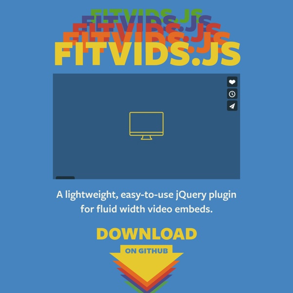
If you deliver video on your website, you need the flexibility to resize your video embeds. Unfortunately, this can be a little hectic as you have to code that into every video that you embed. Fitvids.js saves you that hustle by use of a JQuery plugin. With this plugin, you can add fluid video embeds to make responsive websites that your users will love to interact with. by coderdan Feb 11