
Some simple tricks for creating responsive charts with D3. In this post I have collected some techniques that I used recently when creating D3 Charts.
With focus on small screens, these examples might help you to improve the readability and usability of your charts. Create test data We will need some test data that we want to show in our visualization. Therefore, I created a simple node.js script that creates a data.csv file which contains a date and a value column. var fs = require('fs');var startDate = new Date('2014-1-1');var endDate = new Date('2015-1-1');var csv = 'date,value\n'; for(var i = startDate; i < endDate; startDate.setDate(startDate.getDate() + 10)) { csv += '' + startDate.toString() + ',' + Math.random() + '\n';} fs.writeFileSync('data.csv', csv); create-data.js You can run the script with this command:
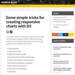
Code from my post on responsive bar charts. Responsive Charts with D3. A confession: I'm starting to hate choropleth maps.
When it comes to comes to comparing U.S. states, especially where there's no obvious geographic pattern, a map is often the wrong choice. So, following my posts on responsive maps and legends, let's make a bar chart, and let's make it responsive: Percent of adults over 25 with at least a bachelor's degree: Median: 18% Source: U.S. Bar charts aren't especially sexy. Our brains, however, are wired to parse differences in length faster than differences in color. Charts (bar and otherwise) end up being slightly more complicated to resize than maps, if only because there are more moving parts. Ultimately, the process is roughly the same as making a responsive map, there's just more stuff to keep track of.
Size and scale SVG elements based on thier containers.Reset scales when the window resizes.Resize all the things. 1. Just as before, start with a responsive framework and set initial sizes based on containers. Reset scales when the window resizes. Resize svg when window is resized in d3.js. SVG CSS - How to embed svg for liquid layout or Rsponsive Web Design - Firefox - Chrome - Safari - IE9 - Opera. Css snippet for all (modern) browsers and all embed modes ( <img /> , <object> , inline <svg> ) .svg file settings : I removed the width and height attributes and added : preserveAspectRatio="xMinYMin meet" viewBox="0 0 800 960" Without viewBox preserveAspectRatio has no effect If you know a better way to do that, tell me !
@eQRoeil or eqroeil[at]gmail.com And if you want to see my first attemps, SVG as a CSS background-image or links with SVG in <object>, have a look. SVG media-queries We can add media-queries to the svg file into a <style> tag. I made a ugly tag that says "You can use SVG in Responsive Web Design" on large screen, or "Use SVG in RWD" on smaller ones. I used an <object> with callback (png). The zebra is red when the svg is small, then green, then blue for inside svg media-queries. CSS media-queries In wide screens the svg and the notes are side by side. How to Make d3 Charts Responsive. D3.js is an amazing javascript library that allows you to create beautiful charts and graphics from data from a variety of sources.
I am in the process of shifting to using purely d3 for generating charts for this website, and one of the first obstacles that I had to overcome is making the charts where they would fit in the browser. Unfortunately, d3 charts will not be responsive even if the theme or framework that you are using is. The good news is that this is fairly simple to implement with just a little planning and a few lines of code. Take a look at the code below. This is fairly basic code to begin a d3 bar chart. This code uses the standard margins convention that is very common in d3 now and after appending to the page will generate a svg graphic that is 750px wide and 500px tall. Fortunately, we can use a little javascript to have the graphic size itself dynamically based on the size of its container.