
Optimizing Images for Mobile. The limited amount of screen real estate available on mobile viewports means that images should be added thoughtfully to HTML email.
However, solid CSS support in clients like iPhone Mail has meant that there are a number of ways you can be clever about their use. In this chapter, we'll look at some techniques that take advantage of supported CSS properties like background-image. These techniques will not only allow you to display mobile-optimized images throughout your designs, but ensure they look crisp at any width. Using background images for better headers We usually run a mile before recommending that anyone use background images in their email newsletters, but in the case of iPhone and Android default Mail, we're talking about clients with pretty solid CSS support and all the benefits that media queries can bring. Traditionally, we've recommended that images be resized as to fit within the viewport of mobile devices. Resizing images for fluid layouts. iPhone vs. Android: How to Get Your Email Looking Great on Both Platforms.
Today, nearly 60% of American adults own a smartphone. iPhone and Android purchases are nearly even in the US—iPhone represents 47.7% of sales, while Android holds 47.6% of market share.

In most of Europe and China, Android has the majority of purchases, followed by iOS. Conversely, in Japan, iOS holds the majority with over 60% of sales. While looking at worldwide purchase data is a great indicator of smartphone adoption, it’s your audience that matters. What smartphones are most popular with email subscribers? Understand your audience Beyond sales, email opens are another great indicator of smartphone popularity—in particular, what devices are favored among your audience. Scalable, Fluid or Responsive: Understanding Mobile Email Approaches. Mobile is a wildly popular topic in email design, which makes sense—emails opened on mobile devices have grown more than 400% since 2011, and mobile email opens hit the 50% mark in 2013.

We’ve talked before about how important mobile has become to email marketers and the need to optimize campaigns for mobile audiences. But it’s not always clear which strategy works best for mobile audiences. To make matters worse, many marketers are confused about what strategies actually exist. Eliminating the possibility of not doing anything at all, mobile email design can roughly be broken down into three categories: Scalable DesignFluid DesignResponsive Design For marketers to choose the approach that best suits their needs, it’s important to understand the differences between these three approaches.
Scalable Design Let’s begin with what many email marketers are currently using: scalable design. Scalable designs are typically the easiest to implement. Responsive Email Design. If you read your email regularly using an Internet-enabled phone, you probably know that it's an experience that can swing from awesome to awful.
While an email newsletter can look superb in the inbox, when squeezed onto a small screen, it can become absolutely unusable, with small fonts, narrow columns and broken layouts being common issues. In this guide, we'll look at why designing for mobile has become a necessary skill for email designers, cover the fundamentals of designing and building a mobile-friendly email and back it all up with some neat tips and techniques. Responsive Email 101 Webinar Q&A: HTML & CSS Basics. As mobile opens continue to rise (they’ve increased over 500% in the past four years!)

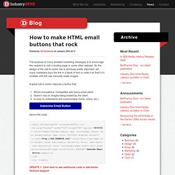
How to make HTML email buttons that rock. How to make HTML email buttons that rock Posted by: Eli Dickinson on January 29th 2013 The purpose of many emailed marketing messages is to encourage the recipient to visit a landing page or some other website.
So the design of the call-to-action link is obviously pretty important, yet many marketers bury the link in a block of text or code it so that’s it’s invisible until the use manually loads images. Ditch the “Mobile Version” of Your Email. Quick question: Which of the screenshots below represents your ideal way to read an email on your phone? I’m going to guess that many of you chose the option on the right, the mobile-optimized email.
It’s my choice, too! Since mobile users value efficiency, speed and ease of use, a clearly organized and well-designed mobile email is the logical choice over a text-based page devoid of imagery, links or clear hierarchy. A bit of history A couple years ago when smartphones were just coming of age, it was fairly common practice to link to a “mobile version” in the preheader of your email, which would take you (the reader), to a page similar to the Kenneth Cole example below. In most cases, these mobile versions have been simple, text-only versions of the emails they accompany: no branding, images, or color (although I’ve seen a few exceptions). Mobile Email is Here to Stay. What Comes Next?
Last year, we predicted that mobile would become the majority platform for email opens.

As of December 2013, our prediction proved correct. Although Gmail’s new image caching rules recently forced mobile back down below 50%, it’s clear that mobile is no longer a secondary consideration—it’s a force to be reckoned with. Responsive Email.