
Design Triggers from ZURB. Why Your Links Should Never Say "Click Here" Advertisement Have you ever wanted your users to click a link but didn’t know how to get them to act?
When some designers run into this problem, they’re tempted to use the words “Click here” on their links. Before giving in to the temptation, you should know how using these words on a link can affect how users experience your interface. Not to mention that having proper link titles is a major accessibility requirement since the term ‘click’ is irrelevant to many assistive technologies and isn’t descriptive enough for screen readers. “Click” Puts Too Much Focus On Mouse Mechanics In my opinion, using the word “click” on your links takes the user’s attention away from the interface and on to their mouse.
“View” relates to the user’s task, while “Click” puts focus on mouse mechanics. Instead of using the word “click,” you might look for a different verb that relates to the user’s task. Why Your Form Buttons Should Never Say Submit. By anthony on 01/05/11 at 10:27 pm When you see a Submit button on a form, what comes to your mind?
One could easily reason that clicking the button submits the user’s information into the system for processing. A Submit button describes what the system does well, but it doesn’t describe what the user does at all. When users fill out a form, they are engaging in a task. The action button should affirm what that task is, so that users know exactly what happens when they click that button. Arrow and Ellipsis Affordances on Buttons and Menus. By anthony on 05/02/12 at 1:18 am There’s more to menus and buttons than just labels.
Before users click a button or menu option, they’ll usually read the label first. But labels alone don’t always give users a clear picture of what will happen after they click it. Sometimes users are left wondering which buttons or menu options open a new page, window or dropdown. How to Establish a Modular Typographic Scale. Possibly the most obvious typographic question in the hands of a designer is "which typefaces should I use?
" The second question, one which rarely gets the kind of attention it ought, is "at what sizes should I set my type? " Establishing a modular scale is the best way to determine typographic sizes, in fact, it can help with laying out measurements and proportions across your whole page layout. During this session we've looked at hierarchy; how size and other factors can influence the visual relationship of typographic elements. We've also recently looked at vertical rhythm, the visual consistency of spacing and elements on a page. Then we have the issue of setting a baseline grid, which ties in with establishing vertical rhythm. Introducing Modular Scale The term Modular Scale refers to a series of harmonious values. An Event Apart: Universal Typography. More Meaningful Typography. We have all heard of the golden mean (also known as the golden ratio or golden section): the self-replicating page with a proportion of 1:1.618 that is said to be found in everything from the design of ancient Greek architecture to the growth patterns of plants.
Article Continues Below This and other meaningful ratios rooted in geometry, music, nature, and history can be expressed as modular scales and put to work on the web. An Event Apart: Big Type Little Type. An Event Apart: Web Type For Developers. Multi-Device Layout Patterns. Through fluid grids and media query adjustments, responsive design enables Web page layouts to adapt to a variety of screen sizes.
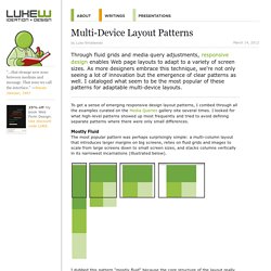
As more designers embrace this technique, we're not only seeing a lot of innovation but the emergence of clear patterns as well. I cataloged what seem to be the most popular of these patterns for adaptable multi-device layouts. To get a sense of emerging responsive design layout patterns, I combed through all the examples curated on the Media Queries gallery site several times. I looked for what high-level patterns showed up most frequently and tried to avoid defining separate patterns where there were only small differences. Mostly Fluid The most popular pattern was perhaps surprisingly simple: a multi-column layout that introduces larger margins on big screens, relies on fluid grids and images to scale from large screens down to small screen sizes, and stacks columns vertically in its narrowest incarnations (illustrated below). Column Drop. New Layouts for the Multi-Device Web. Most Web page layouts rely on design patterns created for laptop and desktop computers equipped with a mouse and keyboard.
As the variety of devices being used to access the Web has grown, these patterns haven’t been keeping up. Designing for today’s Web means considering single-handed thumb use on smartphones, two handed touch interactions on tablets, mouse and keyboard input on traditional PCs, hybrid devices, and more. Web layouts have to evolve to support this new reality. The New Reality As device diversity increases, so does the number of ways people interact with the Web.
Todays’ smartphones are defined by palm-sized screens (usually 3-5 inches diagonally) of varying pixel density, multi-touch input, and predominately one-thumb use with the device about a half arm’s length away.