
Besser als display: none – Inhalte auf Smartphones richtig ausblenden. Beim responsiven Webdesign geht man üblicherweise von einer HTML-Basis aus, die Anpassungen an die unterschiedlichen Viewportbreiten finden über Media Queries, d.h. über CSS statt.

Das Problem dabei ist, dass auf einem klassischen Desktop-Monitor wesentlich mehr Platz zur Verfügung steht, als bei einem klassischen kleinen Smartphone-Screen. Wenn Inhalte auf einem Smartphone einfach keinen Platz finden, greift man gerne zu display: none, um Inhalte gezielt auf einzelnen Endgerätegruppen auszublenden. Das hat jedoch so seine Nachteile. Wer sagt beispielsweise, dass Nutzer von kleinen Screens bestimmte Informationen nicht brauchen? Aber von Anfang an. Das Ausblenden von Inhalten auf Smartphones wird etwa durch den folgenden Code realisiert: display: none ist natürlich recht praktisch, aber es können zwei Probleme auftreten: das eine betrifft die Performance, das andere, dass es sein kann, dass Inhalte dadurch nicht mehr erreichbar sind.
Google Maps im Responsive Webdesign. Nicht nur das Layout einer Website lässt sich mitunter schwierig für die mobile Darstellung optimieren, auch verschiedene Inhalte sorgen regelmäßig für Unmut.
HTML/Multimedia und Grafiken/picture – SELFHTML-Wiki. Das picture-Elements ist ein Container mit dem Sie mehrere Bildquellen referenzieren können.

Responsive image maps with roll-overs. One of our clients asked us to create an interactive map of the US for use on their website.
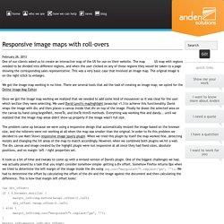
The map needed to be divided into different regions, and when the user clicked on any of those regions they would be taken to a page showing the corresponding sales representative. This was a very basic case that involved an image map. The original image is on the right (click to enlarge). We got the image map working in no time. There are several tools that aid the task of creating an image map; we opted for the Online Image Map Editor. Once we got the image map working we realized that we needed to add some kind of mouseover so it was clear for the user which section they were selecting.
The problem came up because we were using a responsive design that automatically resized the image based on the browser size, and the rollovers were not working at all when the map was smaller than the original. It took us a bit of time and tweaks to come up with a revised version of David's plugin. Stacks4Stacks - HotSpotsPro - Responsive HTML Image Maps. Setup Follow these instructions to setup a HotSpotsPro stack:Once installed, drag and drop a HotSpotsPro stack into your RapidWeaver Stacks page.In the HotSpotsPro stack settings on the right, choose to use either a local image or a warehoused image, for the background.

Most people find it’s easier to start with a local image to begin with, and then switch-over to a warehoused version of the same image later on; for faster live-previews of the stack inside RapidWeaver.Scroll-down to the Hotspot Configuration groups, to configure each of the hotspot regions. You can adjust its position, size and other attributes like tooltip positioning, links and titles. Dimensions and positioning are specified in percentage units of measurement, for greater flexibility.Change any of the other style or colour settings shown in the HotSpotsPro General Settings group.
Image Mapper. HTML/Multimedia und Grafiken/picture – SELFHTML-Wiki. HTML Standard. 4.8 Embedded content 4.8.1 Introduction This section is non-normative.
To embed an image in HTML, when there is only a single image resource, use the img element and its src attribute. <h2>From today's featured article</h2> <img src="/uploads/100-marie-lloyd.jpg" alt="" width="100" height="150"> <p><b><a href="/wiki/Marie_Lloyd">Marie Lloyd</a></b> (1870–1922) was an English <a href="/wiki/Music_hall">music hall</a> singer, ... However, there are a number of situations for which the author might wish to use multiple image resources that the user agent can choose from: Different users might have different environmental characteristics: The users' physical screen size might be different from one another. The above situations are not mutually exclusive. While it is possible to solve these problems using scripting, doing so introduces some other problems: With this in mind, this specification introduces a number of features to address the above problems in a declarative manner. 4.8.2 The.
Industry News Design. Making Embedded Content Work In Responsive Design – Smashing Magazine. About The Author Rachel is a freelance web designer and writer specialising in mobile and responsive WordPress development. She’s the author of ‘Mobile WordPress … More about Rachel McCollin … A few HTML elements don’t play nice with responsive layouts. One of these is the good ol’ iframe, which you may need to use when embedding content from external sources such as YouTube. In this article, we’ll show you how to make embedded content responsive using CSS, so that content such as video and calendars resize with the browser’s viewport.
A few HTML elements don’t play nice with responsive layouts. In this article, we’ll show you how to make embedded content responsive using CSS, so that content such as video and calendars resize with the browser’s viewport. Further Reading on SmashingMag: Note: This technique was originally detailed in Thierry Koblenz’s excellent tutorial ‘Creating Intrinsic Ratios for Video’. The Markup For Embedded Content Fortunately, there is a way around this using CSS. 9 GIFs That Explain Responsive Design Brilliantly. What is responsive design?
Most people vaguely understand that it refers to websites that work just as well on desktops as they do on smartphones, but there's a lot more to it than that, leading to widespread confusion (heck, I'll admit, I've even been known to misuse it myself, even after fellow Co.Design writer John Pavlus called me a dummy for it). But the principles of responsive design aren't that hard to understand, thanks to this amazing collection of animated GIFs put together by the guys Froont, a San Francisco-based company specializing in making tools for designers to create responsive websites.