Sign Generators - Preview Images (Thumbnails) List
Below is a thumbnail list of 90% of the image generators (change captions in pictures of things) found on www.SignGenerator.org. Just click the image and you will be taken to the text editor (change the captions) in a new window. You can send your personalized images as FREE e-cards or download the freebie clipart images (even upload so you can use on blogs/profiles/forums/sites).
Zondle.com - Fun Learning Games For Kids That Teachers Can Customize
Home > Online > Zondle.com - Fun Learning Games For Kids That Teachers Can Customize It's not always easy for teachers to keep kids enthralled with learning these days. The world introduces so many fun and interesting distractions. While there are some teachers that still turn away from using technology in the classroom, a large majority of educators now realize the value of bringing computers - and sometimes even computer games - into the classroom.
Question Box: Bringing the Power of the Internet to People Without Computers - Business
Google is great. Ask basic questions, get instant answers. You do it every day, and are more efficient for it. That access to information can be a matter of life or death or business survival in rural villages in the developing world, but the people who need basic information the most often don’t have internet access or computers. They may not even be able to read or write. So Rose Shuman, of the nonprofit Open Mind, came up with a plan to bring the value of a Google-type search to even the most remote parts of the globe.
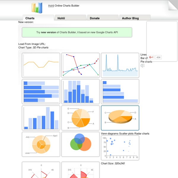
The 15 best tools for data visualisation
It's often said that data is the new world currency, and the web is the exchange bureau through which it's traded. As consumers, we're positively swimming in data; it's everywhere from labels on food packaging design to World Health Organisation reports. As a result, for the designer it's becoming increasingly difficult to present data in a way that stands out from the mass of competing data streams. Get Adobe Creative Cloud
The Anatomy Of An Infographic: 5 Steps To Create A Powerful Visual
Information is very powerful but for the most bit it is bland and unimaginative. Infographics channel information in a visually pleasing, instantly understandable manner, making it not only powerful, but extremely beautiful. Once used predominantly to make maps more approachable, scientific charts less daunting and as key learning tools for children, inforgraphics have now permeated all aspects of the modern world. I designed a couple of infographics back in college, the need arising especially around the time Soccer World Cup fever spiked. It was a fun process representing the different groups, predicting winners in each group at each stage and creating a mock pairing of teams that would clash all the way leading upto the finals. I was a devout Argentinian supporter at the time.
16 great tools for creating mood boards
Whether you work in digital media, logo design or even brochure design, if you're trying to get a big design idea across, a good mood board can be invaluable. With a mood board you can instantly convey a whole assortment of concepts and feelings that are central to your pitch but difficult to get across verbally. So what's the best way to put a digital mood board together?
Visual Thinking Evolution
A mind map is a diagram used to represent words, ideas, tasks, or other items linked to and arranged around a central key word or idea. Especially in British English, the terms spidergram and spidergraph are more common,[1] but they can cause confusion with the term spider diagram used in mathematics and logic. Mind maps are used to generate, visualize, structure, and classify ideas, and as an aid to studying and organizing information, solving problems, making decisions, and writing.
How To Break Your Daily Caffeine Habit And Use Coffee Strategically
Caffeine seems so simple, even if you're a veteran user. You drink it, you get amped up for a short period, and you inevitably come down a bit when it wears off--or so you think. But caffeine is a more subtle substance than we give it credit for. Knowing how it works on your body and brain, and how it is most effective, can give you an edge at concentrating, while still keeping the jittery edge off. The best way to get the most from caffeine is to start from scratch.
Chicago builds ETL toolkit for open data
Chicago builds ETL toolkit for open data By Stephanie KanowitzJan 16, 2015 Data officials in Chicago are churning out open datasets faster than ever by using technology rather than developers to get the job done. About a year ago, the city government embedded Pentaho Data Integration (PDI), a graphical extract-transform-load (ETL) tool with pre-built and custom components to process big data, into its OpenData ETL Utility Kit. The kit provides several utilities and a framework to help governments extract data from a database and upload it to an open data portal using automated ETL processes.
Viz - The quickest way to create simple charts
Available on the App Store from Minisimpli Viz is the first iOS App that lets you create simple graph charts instantly
A Great Tool to Create 3D Timelines in Class
November 6, 2014 Tiki-Toki is a powerful web tool that allows you to create visually appealing and interactive multimedia timelines. This app is web-based and does not require any software installation. TikiToki timelines can include a wide variety of materials such as images, text, and videos (from YouTube and Vimeo or AVIS). What's more, TikiToki now supports 3D timelines which means that you can both create and view timelines in 3D. To activate the 3d view for your timeline, open the timeline for editing. Then choose the 'Settings' tab in the admin panel, and click on the '3d settings' button at the top centre.
Fusion Tables - Gather, visualize, and share data tables online
Bust your data out of its silo! Get more from data with Fusion Tables. Fusion Tables is an experimental data visualization web application to gather, visualize, and share data tables. Visualize bigger table data online
An Interactive Whiteboard For Bell Labs Maps A Century Of Innovation
When you're a company with an encyclopedic list of achievements that includes everything from the transistor radio to the telephone, your employees can't possibly be asked to remember every single innovation detail from your storied history. One can imagine the researchers at Bell Labs faced such a dilemma with their archives -- including over 80,000 publications and 25,000 patents. So how to bring all that information front-and-center for employees to use while brainstorming, without making them head to a computer and interrupt the concepting process?
Tools on Datavisualization.ch
A Carefully Selected List of Recommended Tools 07 May 2012 Tools Flash, JavaScript, Processing, R When I meet with people and talk about our work, I get asked a lot what technology we use to create interactive and dynamic data visualizations. To help you get started, we have put together a selection of the tools we use the most and that we enjoy working with. Read more