
Tons of Great Free Downloadable Classroom Posters and Educational Infographics. Design Series: With These 8 Articles You Can Now Design Like a Pro. Have the data but lack the design expertise?
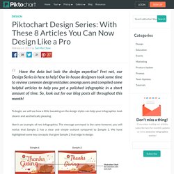
Fret not, our Design Series is here to help! Our in-house designers took some time to review common design mistakes among users and compiled some helpful articles to help you get a polished infographic in a short amount of time. So, look out for our blog posts all throughout this month! To begin, we will see how a little tweaking on the design styles can help your infographics look clearer and aesthetically pleasing. Here’s an example of two infographics. These subtle changes can make a great difference in the “look” of your infographic. On that note, over the next month, we’ll be publishing handy tips every Monday and Wednesday to help you create the best infographic designs, so look out for them! Design elements know-how that will improve your overall design skills.Some common mistakes we all make, and how to fix them.The shortcuts to improve your infographics. Here’s a quick preview of the articles that are coming!
Icons and Images : 5 'Must-knows' on how to use them effectively. This is part of the Infographic Design Series.
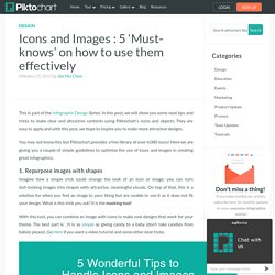
In this post, we will show you some neat tips and tricks to make clear and attractive contents using Piktochart’s icons and objects. They are easy to apply and with this post, we hope to inspire you to make more attractive designs. You may not know this but Piktochart provides a free library of over 4,000 icons! Here we are giving you a couple of simple guidelines to optimize the use of icons and images in creating great infographics. 1.
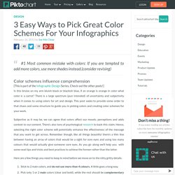
Imagine how a simple trick could change the look of an icon or image; you can turn dull-looking images into shapes with attractive, meaningful visuals. With this tool, you can combine an image with icons to make cool designs that work for your theme. Note: To use the masking tool, you will need to select BOTH (hold down the SHIFT key) the image and a shape (icon) and click on “Masking” on the top menu. 2. Note: Text Frames are available under Text tool on the left panel. 3. 4. 3 Easy Ways to Pick Great Color Schemes For Your Infographics. #1 Most common mistake with colors: If you are tempted to add more colors, use more shades instead.
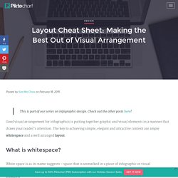
(consider revising) Color schemes influence comprehension [This is part of the Infographic Design Series. Check out the other posts!] Is this bruise on my arm bluish black or blackish blue, if an orange is orange in color what color is a carrot? Subjective as it may be, we can agree that colors affect our moods, perceptions and adds context to our content. Here are a few things you need to keep in mind before we move on to the nitty gritty details. Stick to 2 main colors, and do not use more than 4 colours. 1. If you are creating work-related material, one of the best and safest ways to choose a color scheme is to follow the color of the company’s brand guidelines. Image credits: Left: redpepper | Right: Coca – Cola Infographic by Nelly Soegianto on Behance The examples above use colors of their company branding guidelines as the main color.
Selecting complementing colors Selecting shades. Layout Cheat Sheet for Infographics : Visual arrangement tips. This is part of our series on infographic design.
Check out the other posts here! Good visual arrangement for infographics is putting together graphic and visual elements in a manner that draws your reader’s attention. The key to achieving simple, elegant and attractive content are ample whitespace and a well arranged layout. White space is as its name suggests – space that is unmarked in a piece of infographic or visual representation. It could be margins, padding, or the space between columns, text, and icons and design elements. Whitespace matters in creating visually engaging content A page crammed full of text and images will appear busy. It is always crucial to remember visually engaging content is usually clean and simple. Understanding common infographics layouts to help ease visual arrangement An infographic layout refers to the arrangement of your visual elements and your content.
We have put together a cheat sheet of layouts for your reference. Numerical miracle of the Holy Quran (English) Surah Al-Fatihah: A Dialogue with Allah.