
http://readwrite.com/2008/03/13/the_best_tools_for_visualization
SEO Keyword Graph Visualization Use this free Java application to explore the connections between related websites. Try it now! Enter keywords or a URL, and click 'Graph it!' See Getting Started below for more details. Edraw Mind Map Professional Clarify Thinking Edraw can easily conceptualize your visualization on computer and organize your work. It helps you pull all ideas and assets together to organize them in logical structure, then to steer clear of irrelevant information and recognize the critical.
40+ Visualization Tools for dashboards and social business There is so much data that it is an incredible task to actually comprehend it. Like looking at a TV screen full of static… trying to rationalize if one pixel means something. In order to make the data actionable we need to really focus on tools to clarify what we are looking at. We need to think about Welkin What is this? Welkin is a graph-based RDF visualizer. What's New in Version 1.1 Works on Windows, Linux and MacOSX. Added support for Turtle/N3 RDF syntax. Tinderbox Save 25% on Tinderbox and Storyspace during the 2019 Festival of Artisanal Software. Tinderbox is just $199 — save $50! Storyspace is just $114 — save $35! A new era for Tinderbox: the tool for notes. Tinderbox 8 is now available with more than 150 visible improvements and lots of new technology.
Over 100 Incredible Infographic Tools and Resources (Categorized) This post is #6 in DailyTekk’s famous Top 100 series which explores the best startups, gadgets, apps, websites and services in a given category. Total items listed: 112. Time to compile: 8+ hours.
graphl Overview Graphl1 is a tool for collaborative editing and visualisation of graphs, representing relationships between resources or concepts of the real world. Graphl may be thought of as a visual wiki, a place where everybody can contribute to a shared repository of knowledge. Graphl builds upon RDF (the Resource Description Format), a standard for expressing the relationships of resources. While RDF specifies how to express these relationships in terms of concepts and grammar rules, Graphl focusses on visualizing these (possibly complex) networks of relationships, and allows the visual editing of such networks. While RDF was created mainly as a standard to support the machine-processability of relationship data, Graphl allows human users to interact with this kind of data in an intuitive way, by providing sophisticated rendering methods that allow users to explore even complex graphs and networks without visual overload.
The 15 best tools for data visualisation It's often said that data is the new world currency, and the web is the exchange bureau through which it's traded. As consumers, we're positively swimming in data; it's everywhere from labels on food packaging design to World Health Organisation reports. As a result, for the designer it's becoming increasingly difficult to present data in a way that stands out from the mass of competing data streams. Get Adobe Creative Cloud One of the best ways to get your message across is to use a visualization to quickly draw attention to the key messages, and by presenting data visually it's also possible to uncover surprising patterns and observations that wouldn't be apparent from looking at stats alone. And nowadays, there's plenty of free graphic design software to help you do just that.
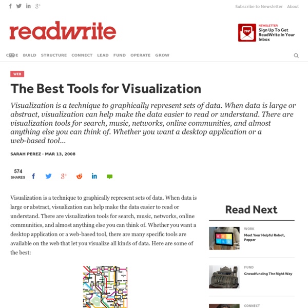
22 free tools for data visualization and analysis You may not think you've got much in common with an investigative journalist or an academic medical researcher. But if you're trying to extract useful information from an ever-increasing inflow of data, you'll likely find visualization useful -- whether it's to show patterns or trends with graphics instead of mountains of numbers, or to try to explain complex issues to a nontechnical audience. There are many tools around to help turn data into graphics, but they can carry hefty price tags. The cost can make sense for professionals whose primary job is to find meaning in mountains of information, but you might not be able to justify such an expense if you or your users only need a graphics application from time to time, or if your budget for new tools is somewhat limited. If one of the higher-priced options is out of your reach, there are a surprising number of highly robust tools for data visualization and analysis that are available at no charge. Data cleaning
Curio - Mind Mapping, Brainstorming, and Project Management Software for Mac OS X The Real World You have work projects and home projects, school classes to manage and book reports to research, vacations to plan and novels to write, web sites to design and lab results to organize. You currently use a collection of notebooks, your office whiteboard, scraps of sticky notes, oodles of browser bookmarks, and multiple documents scattered around your hard disk. You’re juggling it all, but organizing this information should be easier. 20 Powerful Infographic Design Kits Infograpics have become so popular these days and as a result more and more high quality infographic design kits are made available to help designers. Infographics can be used very effectively to present complex data in a nice visual and powerful way. It is done using hand-picked design elements that relate to the data they represent e.g. demographic data can be effectively illustrated using small carefully colored human icons as overlay on a simplified map. Online marketers love infographics for their ability to go viral on social networks and often they are offered as easy to embed code making it fast and simple for e.g. bloggers to share them in posts… very useful value oriented way to build links and online presence.
20+ Tools to Create Your Own Infographics A picture is worth a thousand words – based on this, infographics would carry hundreds of thousands of words, yet if you let a reader choose between a full-length 1000-word article and an infographic that needs a few scroll-downs, they’d probably prefer absorbing information straight from the infographic. What’s not to like? Colored charts and illustrations deliver connections better than tables and figures and as users spend time looking back and forth the full infographic, they stay on the site longer. Plus, readers who like what they see are more likely to share visual guides more than articles. While not everyone can make infographics from scratch, there are tools available on the Web that will help you create your very own infographics.