
13 Free Sites That Offer High-Quality 2D People and Objects for Your Architecture Visualizations 13 Free Sites That Offer High-Quality 2D People and Objects for Your Architecture Visualizations October 23, 2017 Share FacebookTwitterPinterestWhatsappMail Or Gallery "Spike" map Interactive United States population density map. Average rating: 7.5 (23 votes) 2D histogram An extension of the concept of histogram to display the colour image content.
Information design Information design is the practice of presenting information in a way that fosters efficient and effective understanding of it. The term has come to be used specifically for graphic design for displaying information effectively, rather than just attractively or for artistic expression. Information design is closely related to the field of data visualization and is often taught as part of graphic design courses.[1] Etymology[edit] Data Wrangler UPDATE: The Stanford/Berkeley Wrangler research project is complete, and the software is no longer actively supported. Instead, we have started a commercial venture, Trifacta. For the most recent version of the tool, see the free Trifacta Wrangler. Why wrangle? Too much time is spent manipulating data just to get analysis and visualization tools to read it. Wrangler is designed to accelerate this process: spend less time fighting with your data and more time learning from it.
Processing.js Basic Syntax A brief look at the structure of a Processing sketch reveals how easy it is to program interactive visualizations. As with any language, you begin by defining your global variables. Then you create a setup() function, where you control the visualization's properties, like the canvas size, frame rate and perhaps variables such as the stoke-weight or background-color. The next step is to create your draw() function, which controls the behavior of each frame in your animation. OWL - Semantic Web Standards Overview The W3C Web Ontology Language (OWL) is a Semantic Web language designed to represent rich and complex knowledge about things, groups of things, and relations between things. OWL is a computational logic-based language such that knowledge expressed in OWL can be exploited by computer programs, e.g., to verify the consistency of that knowledge or to make implicit knowledge explicit. OWL documents, known as ontologies, can be published in the World Wide Web and may refer to or be referred from other OWL ontologies. OWL is part of the W3C’s Semantic Web technology stack, which includes RDF, RDFS, SPARQL, etc. The current version of OWL, also referred to as “OWL 2”, was developed by the [W3C OWL Working Group] (now closed) and published in 2009, with a Second Edition published in 2012.
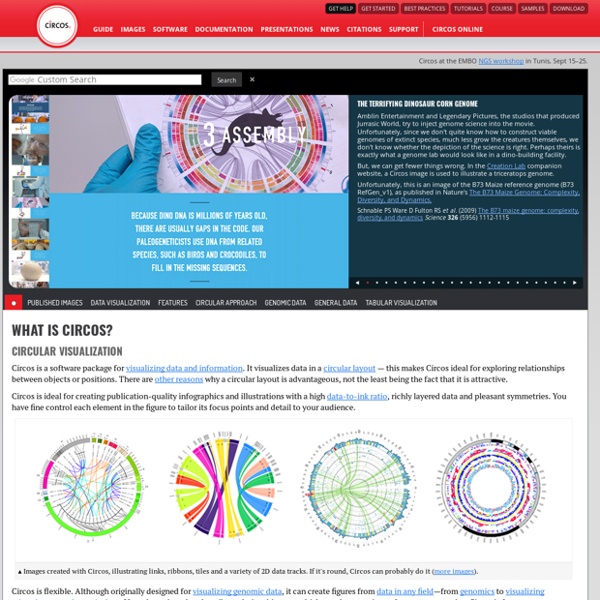
Case study: A brief review of online visualisation tools that can help There is a growing range of online tools to help users their data. This brief review highlights four online visualisation tools that can help. The links page also links to lots more useful resources. Online tools that can help visualise data (these tools are free to use, but any data uploaded is typically then available on the system for other users) highlighted below include:
Information graphics Information graphics or infographics are graphic visual representations of information, data or knowledge intended to present complex information quickly and clearly.[1][2] They can improve cognition by utilizing graphics to enhance the human visual system’s ability to see patterns and trends.[3][4] The process of creating infographics can be referred to as data visualization, information design, or information architecture.[2] Overview[edit] Infographics have been around for many years and recently the proliferation of a number of easy-to-use, free tools have made the creation of infographics available to a large segment of the population. Social media sites such as Facebook and Twitter have also allowed for individual infographics to be spread among many people around the world. In newspapers, infographics are commonly used to show the weather, as well as maps, site plans, and graphs for statistical data.
Protovis Protovis composes custom views of data with simple marks such as bars and dots. Unlike low-level graphics libraries that quickly become tedious for visualization, Protovis defines marks through dynamic properties that encode data, allowing inheritance, scales and layouts to simplify construction. Protovis is free and open-source, provided under the BSD License. Workshop / Chrome Experiments Unfortunately, either your web browser or your graphics card doesn't support WebGL. We recommend you try it again with Google Chrome.