pChart | a PHP Charting library
CSS Layout Generator
About the CSS Layout Generator The CSS Layout Generator was first released by Tony Aslett in October 2003, since then over 871,000 layouts have been generated. Updated in November 2010, HTML5 doctype can now be selected and a simple HTML5 template with appropriate tags will be created. Other HTML and XHTML doctypes are still available. The generator helps you create the structure of your website template using valid HTML and CSS. You can create a fluid or fixed width floated column layout, with up to 3 columns and with header and footer. The generator requires a modern DOM capable browser with JavaScript enabled. Instructions To create your layout select the structural elements your site requires (header, footer, columns). Info popups are available where you see InfoMore info example :) icon, just hover over it for more information. Join the CSS Forum to suggest changes or ask for help where needed. Author: Tony Aslett
Data Visualization Review: Gephi, Free Graph Exploration Software
I do not often get to play with networks, yet I find them fascinating and full of knowledge gathering potential. The data visualization works of Moritz Stefaner, Jer Thorp, and Mark Lombardi captivate me. I am intrigued by relationships, how we perceive them, and how we can understand them. Gephi, the "Open Graph Viz Platform", is not just for the hobbiest node nerd. So what is Gephi capable off? Gephi interface displaying airline traffic data. Pros — Options! Cons — Interface is a bit cluttered. Main interface displaying the Diseasome data. Review Overall, Gephi is a useful and interesting tool. There are some plugins available for Gephi that extend the functionality. The only thing keeping Gephi from being a professional grade tool is its bugginess and lack of documentation. Graph of Minard's data using Gephi and the GeoLayout plugin. For the Purists Gephi is a purist's delight. Two nerdy charts of network statistics that Gephi will output.
22 free tools for data visualization and analysis
You may not think you've got much in common with an investigative journalist or an academic medical researcher. But if you're trying to extract useful information from an ever-increasing inflow of data, you'll likely find visualization useful -- whether it's to show patterns or trends with graphics instead of mountains of text, or to try to explain complex issues to a nontechnical audience. There are many tools around to help turn data into graphics, but they can carry hefty price tags. Here's a rundown of some of the better-known options, many of which were demonstrated at the Computer-Assisted Reporting (CAR) conference last month. Data cleaning Before you can analyze and visualize data, it often needs to be "cleaned." DataWrangler What it does: This Web-based service from Stanford University's Visualization Group is designed for cleaning and rearranging data so it's in a form that other tools such as a spreadsheet app can use. What's cool: Text editing is especially easy.
Case study: A brief review of online visualisation tools that can help
There is a growing range of online tools to help users their data. This brief review highlights four online visualisation tools that can help. The links page also links to lots more useful resources. Online tools that can help visualise data (these tools are free to use, but any data uploaded is typically then available on the system for other users) highlighted below include: On the resources and links page, we also link to free software applications and libraries for visualising data, and development languages for more sophisticated data visualisation. Many Eyes Many Eyes was started by researchers from the IBM Visual Communication Lab, to encourage sharing and conversation around visualisations. Users can upload datasets to the Many Eyes website, and use the visualisation tools to explore the data (see the image below for some examples). Click for full size Gapminder World and Trendalyzer Maptube Users can:
Tutorials
How to Make a State Grid Map in R Something of a cross between a reference table and a map, the state grid provides equal space to each state and a semblance of the country to quickly pick out individual states. How to Make Animated Line Charts in R Sometimes it's useful to animate the multiple lines instead of showing them all at once. How to Make a Multi-line Step Chart in R For the times your data represents immediate changes in value. Symbols-based Charts to Show Counts in R Add visual weight by using individual items to show counts. Introducing a Course for Mapping in R Mapping geographic data in R can be tricky, because there are so many ways to complete separate tasks. How to Edit R Charts in Adobe Illustrator A detailed guide for R users who want to polish their charts in the popular graphic design app for readability and aesthetics. How to Make an Animated Map in R, Part 4 In the the last part of the four-part series, you make a longer animation with more data and annotate.
Logo Creator Online. Design and Create Free Logos web 2.0
Quickly create a nice looking professional style logo using the SimWebSol free online logo creation tool. Choose background color, logo color, font face, font style (bold, italic, or underline) and font size. Add a reflection or a symbol to the left or right side to make it even more unique. Then choose PNG, GIF, or JPG, with DPI ranging from 72 to 1200.
20+ Tools to Create Your Own Infographics
A picture is worth a thousand words – based on this, infographics would carry hundreds of thousands of words, yet if you let a reader choose between a full-length 1000-word article and an infographic that needs a few scroll-downs, they’d probably prefer absorbing information straight from the infographic. What’s not to like? Colored charts and illustrations deliver connections better than tables and figures and as users spend time looking back and forth the full infographic, they stay on the site longer. While not everyone can make infographics from scratch, there are tools available on the Web that will help you create your very own infographics. Read Also: The Infographic Revolution: Where Do We Go From Here? What About Me? “What About Me?” Vizualize.me Vizualize.me allows you to create an online resume format that is beautiful, relevant and fun, all with just one click. Piktochart easel.ly Visual.ly Infogr.am Many Eyes Venngage iCharts Dipity Timeline JS StatSilk InFoto Free Photo Stats More Tools

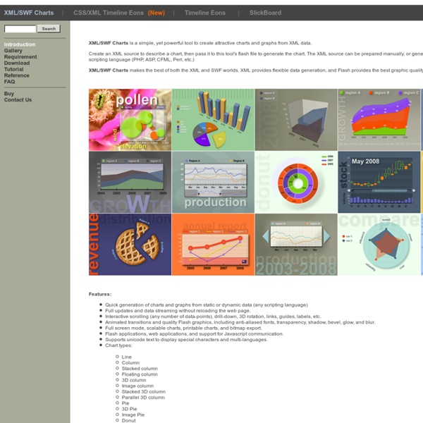
Aplicación para generar gráficas a partir de XML by valzor Jun 17