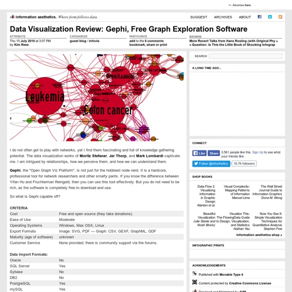
Data Visualization Review: Gephi, Free Graph Exploration Software
Public Data Explorer
Indicateurs de développement humain Rapport sur le développement humain 2013, Programme des Nations Unies pour le développement Les données utilisées pour calculer l'Indice de développement humain (IDH) et autres indices composites présentés dans le Rapport sur le développement humain ... Eurostat, Indicateurs démographiques Eurostat Indicateurs démographiques annuels. Chômage en Europe (données mensuelles) données sur le chômage harmonisé pour les pays européens. Salaire minimum en Europe Salaire mensuel brut minimum en euros ou parités de pouvoir d'achat, données semi-annuelles. Dette publique en Europe Statistiques sur les finances publiques des pays européens.
Gapminder: Unveiling the beauty of statistics for a fact based world view.
FlowingData | Data Visualization, Infographics, and Statistics
Pictures of Numbers
InfoGraphic Designs: Overview, Examples and Best Practices | Inspiration
Information graphics or infographics are visual representations of information, data or knowledge. These graphics are used where complex information needs to be explained quickly and clearly, such as in signs, maps, journalism, technical writing, and education. They are also used extensively as tools by computer scientists, mathematicians, and statisticians to ease the process of developing and communicating conceptual information. They can present a rich amount of information without intimidating you. Or sometimes they intimidate you, but make the digesting of the information much more bearable. You may be interested in the following related articles as well. Feel free to join us and you are always welcome to share your thoughts that our readers may find helpful. Don’t forget to and follow us on Twitter — for recent updates. What is InfoGraphics? Little History of InfoGraphics! In prehistory, early humans created the first information graphics: cave paintings, later maps and now charts.
True Colors: What Brand Colors Say About A Business
Studies have shown that a product’s color influences 60-80 percent of a customer’s purchasing decision, which makes choosing the wrong color a death sentence before your brand ever has a chance to get off the ground. The most recognizable labels in the world are defined by their colors. Take a second to think of some of the most popular brands that instantly come to mind: Coca-Cola, Facebook, Apple, McDonalds, and Google – to name a few. All of these companies strategically use colors in their logo, website, and product to appeal to customers, making them instantly recognizable across the globe. Color is one of the first things people notice about a brand, and there are a few colors which get the most play: blue, red, black/grayscale, and yellow. 95 percent of companies only use one or two colors, 5 percent use more than two, 41 percent use text only, and 9 percent don’t feature the company name at all. Click here or below for a full-sized version. via: Marketo
List of Tweetchats By Day of Week
From Gnosis Media Group Looking for a tweetchat? Below is a list of tweetchats in both alphabetical order and by day. Thank you to @merylkevans for the inspiration to build this Twitter chat wiki. A detailed list appears after the list sorted by the day of the week. Tweetchats - or Twitter chats as they are sometimes called - are virtual meetings or gatherings held on Twitter. Text GNOSISARTS to 368266to get tweetchat info by text message! Note: All times listed in Central Standard Time with a couple of noted exceptions. List of Tweetchats by Day of the Week Sunday #vegrunchat: Chat for vegan and vegetarian runners to share tips, recipes, and races. #giftchat: We discuss holiday gifts on Twitter. #pcinsurance: We will be discussing property and casualty insurance for both business and personal lines. #FashionInternPH: We meet twice a month to talk about internships, resumes, cover letters and everything about internships! #Spiritchat: Discuss the spiritual life. Monday #TheSMGirl. #BCSM.
Twitter chat
Related:
Related:
