
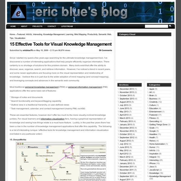
http://eric-blue.com/2009/05/10/15-effective-tools-for-visual-knowledge-management/
Related: To be categorizedGot Permission to Upload that Video? A parent video records your spring concert and posts it online. What’s to worry? A lot. You need permission from two sources: Individuals in the video or their parentsThe copyright owner The battle of Stalingrad More about the battle of Stalingrad The battle of Stalingrad began on the 19th August 1942. Taking Stalingrad would have given Germany access to key oilfields, however the dogged resistance of the Red Army forced them to fight house-to-house.
Document Management Systems: SCAN (Smart Content Aggregation and Navigation) Back in March, I began evaluating some open source Document Management Systems (DMS) to help compliment my wiki-based Personal Knowledge Manager (PKM). That’s a little bit of acronym-overload. But, in simple terms I really am looking for a way to easily store, categorize, and retrieve a number of my documents related to research and learning (PDFs, Word Docs, etc). I quickly discovered that although my wiki can manage attaching simple documents, there was no way to easily store metadata for the documents or search within the wiki itself. As I alluded to in my original post, I narrowed down my search to 3 main DMS choices: SCAN, Alfresco, and Knowledge Tree. Of these three, SCAN (Smart Content Aggregation and Navigation) ended up being the most feature-rich and least complicated.
Knowledge retrieval Knowledge Retrieval seeks to return information in a structured form, consistent with human cognitive processes as opposed to simple lists of data items. It draws on a range of fields including epistemology (theory of knowledge), cognitive psychology, cognitive neuroscience, logic and inference, machine learning and knowledge discovery, linguistics, and information technology. Overview[edit] In the field of retrieval systems, established approaches include: Data Retrieval Systems (DRS), such as database management systems, are well suitable for the storage and retrieval of structured data.Information Retrieval Systems (IRS), such as web search engines, are very effective in finding the relevant documents or web pages.
The 36 best tools for data visualization It's often said that data is the new world currency, and the web is the exchange bureau through which it's traded. As consumers, we're positively swimming in data; it's everywhere from labels on food packaging design to World Health Organisation reports. As a result, for the designer it's becoming increasingly difficult to present data in a way that stands out from the mass of competing data streams. National Geographic Education - National Geographic Education This website would like to remind you: Your browser (Firefox 17) is out of date. Update your browser for more security, comfort and the best experience on this site. Educators! Take our survey for a chance to win a $50 Amazon gift card. Xpeditions is now archived in National Geographic Education's new website—natgeoed.org If you liked Xpeditions, you'll love the new media-rich natgeoed.org.
visualizing.org: a New Shared and Free Resource on Data Visualization Visualizing [visualizing.org] has just been released as the latest online player in the ever-increasing blogosphere about the topic of data visualization. But Visualizing is different in many ways. For one, the man behind the Visualizing initiative is Adam Bly, founder and Editor-in-Chief of Seed and one of the people behind the impressive Design and the Elastic Mind exhibition at MoMA. Together with the fact that Visualizing is also supported by a wide range of highly reputable design institutions, the website positions itself as the most serious media player in the field of data visualization, enjoying an unseen amount of credibility and financial funding. While Visualizing.org's mission is to help make data visualization figure more prominently across the web as a way of understanding complex world issues as they unfold, it is not a weblog in the classic sense. The website has just been launched and it officially still in beta, but many more features are planned.
100 Apps for Taking Notes on Your iPhone Note-taking applications are some of the hottest items on the App Store. More and more these utilities make it easy to record data in a fast and convenient way and the fact that this information lives on our phones means that we can access it anytime we need it. The 100 apps below will help you accomplish all your iPhone note-taking endeavors. Whether you want to collect random bits of information, remember something about a specific place or even record some thoughts about your favorite wine, we’ve got you covered. There’s even a section containing our favorite apps so you can get a good idea of where to start! Our Favorites Knowledge extraction Knowledge extraction is the creation of knowledge from structured (relational databases, XML) and unstructured (text, documents, images) sources. The resulting knowledge needs to be in a machine-readable and machine-interpretable format and must represent knowledge in a manner that facilitates inferencing. Although it is methodically similar to information extraction (NLP) and ETL (data warehouse), the main criteria is that the extraction result goes beyond the creation of structured information or the transformation into a relational schema.
An Internet and You, Me, O.S. Welcome to the Future! "UMEOS" by Xopher Dee To put your YOUniverse in your hands & pockets, or on your desk, table, or wall. We will be delivering a limited number of pocket size USB Key Drives, and All-in-One Touch Screen Desktop/Wall Computers during our marathon. A peak under the hood of the back end of UmeosSuper Powered by SuperDom 's video poster PLAY Play For nearly a decade, I have been researching and developing a way to articulate Umeos. It's been a silent pledge, where my deliberate communication has mostly been with source and trusted colleagues, keeping visions scattered across notebooks and the æther.
Institute of Scrap Recycling Industries, Inc. ISRI and JASON are proud to partner on a national recycling awareness campaign to help students and educators understand the importance of recycling and the recycling industry, as well as the science, technology, engineering, and math (STEM) topics that relate to recycling. The campaign includes rich, standards-based, multimedia curricular experiences for students in grades K–12, to be composed of the following elements: an annual recycling competition, interactive Web-based experiences to enhance student engagement, classroom posters featuring ISRI’s key educational messages, age-appropriate hands-on activities for students in three grade bands from kindergarten through high school, fact sheets, live events with STEM role models, a national distribution network, strategies for school visits to ISRI facilities, and more. Visit isri.org (link is external) or watch this video (link is external) to learn more about the recycling industry.
Christopher Baker Email became an integral part of my life in 1998. Like many people, I have archived all of my email with the hope of someday revisiting my past. I am interested in revealing the innumerable relationships between me, my schoolmates, work-mates, friends and family. This could not readily be accomplished by reading each of my 60,000 emails one-by-one. Instead, I created My Map, a relational map and alternative self portrait. My Map is a piece of custom designed software capable of rendering the relationships between myself and individuals in my address book by examining the TO:, FROM:, and CC: fields of every email in my email archive.
Hi Aynat! Never heard of it but I'm now looking at it! Sounds really interesting! Thank ou :) by ascendson Jul 12