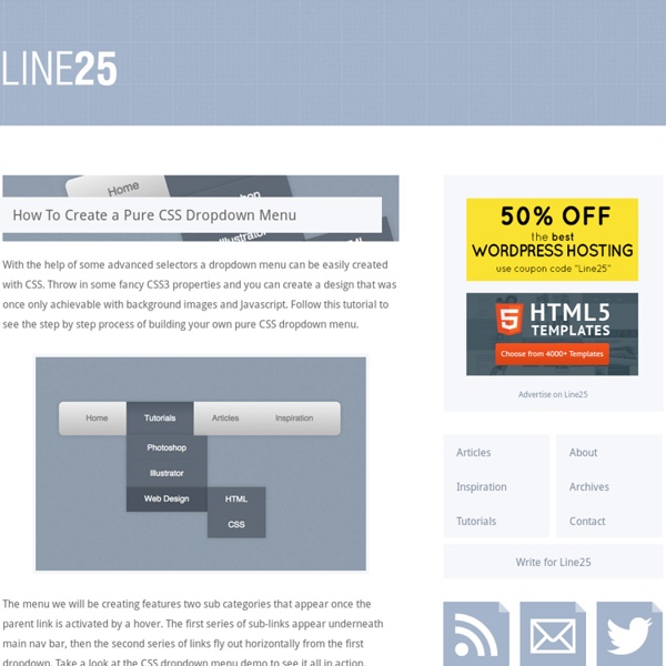
background preloader

How To Create a Pure CSS Dropdown Menu

How To Create a Pure CSS Dropdown Menu
With the help of some advanced selectors a dropdown menu can be easily created with CSS. Throw in some fancy CSS3 properties and you can create a design that was once only achievable with background images and Javascript. Follow this tutorial to see the step by step process of building your own pure CSS dropdown menu. The menu we will be creating features two sub categories that appear once the parent link is activated by a hover. View the pure CSS dropdown menu demo <nav><ul><li><a href="#">Home</a></li><li><a href="#">Tutorials</a></li><li><a href="#">Articles</a></li><li><a href="#">Inspiration</a></li></ul></nav> First up we’ll need to create the HTML structure for our CSS menu. The first sets of sub-menus can then be added under the “Tutorials” and “Articles” links, each one being a complete unordered list inserted within the <li> of its parent menu option. The secondary sub-menu is nested under the “Web Design” option of the first sub-menu.

Learn how to Create Javascirpt Menu for Your Web Site Javascript is a client-side object oriented programming language. It is used to add dynamic features and interactive functionality to web sites. Javascript is a dialect of the ECMAScript standard. Javascript and Java are different programming languages, although they have some similar structures. In our Javascript menu tutorial we will show how to create a simple drop-down menu. However, you can easy create external .css and .js files and include them in the html file. You should replace myjavascript.js with your actual Javascript file. The drop-down menu will be visualized in the way shown below: The source code of the drop-down menu is as follows: In the above example we are using a timer, otherwise the submenus will be closed immediately after moving the mouse away from their area. Please note that the above code is tested on the latest version of Mozilla Firefox.

How to Create a Dropdown Menu in HTML and CSS: 9 Steps Edit Article Edited by D1s1, Teresa, 80_Calo, Jeff and 5 others Two Methods:HTMLCSS A dropdown menu provides clear and hierarchical view of all main sections on the page and subsections contained within them. All you need to do for the subsections to appear is to mouse cursor over the main sections. This is our menu which was created with only HTML code and CSS. Ad Steps Method 1 of 2: HTML 1Create a HTML structure for your CSS menu. 4Add CSS to your HTML. Method 2 of 2: CSS 1Create a CSS file. 5Position your dropdown and align it to list item.

How To Create A Responsive Navigation Menu Using Only CSS In this tutorial we will be creating a basic responsive navigation menu with dropdown using only HTML and CSS. Many navigation menus (especially responsive ones) are created using a combination of HTML, CSS and Javascript. This simple CSS only method will demonstrate that Javascript isn't always necessary! The code we will create includes only the most essential CSS required for structure and basic styling. This makes it much easier to follow and understand the purpose of each line of code. It also means that the end product is primed and ready for your unique customization. Live Demo A Quick Message Big thanks to the commenters that informed us of an issue this code was having on mobile devices! The HTML As you can see I have declared the HTML5 doctype, and included the basic page structure. <! The CSS First of all, some basic styling to the ul and li elements to remove bullet points and other list styles. The following attributes are almost exclusively for aesthetic appeal. Complete Code <!

Guide des étapes par étapes à la mise en place d’un forum BBPress - Partie 1 - Bb press français Partie 1- Les instructions de configuration étape par étape du forum BBPress Les instructions de configuration étape par étape de BBPress BBPress est un plugin pour WordPress qui permet d’avoir un forum pour votre site. BBpress utilise le concept de votre site quand c’est possible pour répondre à vos attentes. Cela peut très bien marcher sur certains thèmes, mais ne marchera pas bien sur d’autres, donc différents styles seront nécessaires. En dehors de la boite, il fonctionne bien avec TwentyTen, et je comprends TwentyEleven. La mise en place de WordPress nécessite certaines ou toutes les étapes suivantes en fonction de la manière dont vous voulez qu’il apparaisse. Les instructions ici génèrent un forum qui travail à l’intérieur d’un thème TwentyTen. Qui ressemble à : Cliquer sur cette image pour voir en taille réelle. En résumé vous avez besoin de : La partie 1 traite les étapes de 1 à 8 La partie 2 traite l’étape 9 Installer le plugin

100 Great CSS Menu Tutorials Navigation is such an important part of your website. It’s how your visitors navigate to the main areas of your site and makes it easy for them to find your good content. CSS is of course the perfect language for designing beautiful navigation menus. It can be applied to any type of website and is very flexible. Today we would like to show you 100 of these tutorials; 75 horizontal CSS menu tutorials and 25 vertical CSS menu tutorials. Horizontal CSS Menu Tutorials 1. View Tutorial | Demo 2. View Tutorial | Demo 3. View Tutorial & Demo 4. View Tutorial | Demo 5. View Tutorial | Demo 6. View Tutorial | Demo 7. View Tutorial | Demo 8. View Tutorial 9. View Tutorial | Demo 10. View Tutorial | Demo 11. View Tutorial | Demo 12. View Tutorial | Demo 13. View Tutorial | Demo 14. View Tutorial & Demo 15. View Tutorial | Demo 16. View Tutorial | Demo 17. View Tutorial 18. View Tutorial | Demo 19. View Tutorial | Demo 20. View Tutorial | Demo 21. View Tutorial & Demo 22. View Tutorial | Demo 23. View Tutorial | Demo 24.

BuddyPress - Le Tutorial complet en mode pas-à-pas Il y a quelques jours, le WordCamp me donnait l’opportunité de parler de mon plugin WordPress préféré : BuddyPress. Lors de ma conférence, je vous ai présenté globalement ce puissant moteur de communautés. Or le WordCamp, c’est aussi une rencontre communautaire, et je suis heureux d’avoir fait la connaissance de Fabrice (WP Formation WordPress) avec qui j’ai beaucoup échangé pendant ces 2 journées dédiées aux amoureux de WordPress. Il m’a notamment proposé de publier des "tutos" sur son site, et c’est pour moi l’opportunité de prendre le temps d’entrer un peu plus dans le détail de BuddyPress et ce de manière très opérationnelle. Je vous propose donc une série d’articles pour découvrir BuddyPress en mode tutorial pas-à-pas. Dans ce 1er épisode, nous allons commençer par créer un annuaire de membres pour notre site... @iMath Episode 1: Mettre en place un annuaire de membres WordPress Out of the box Petit rappel de ce que nous propose WordPress pour organiser les membres de notre blog : Tada !

Flat Dropdown Menu Tutorial Recently, the new Flat Accented Dropdown Menu was added to our library of Drop Down Menus. As a nice followup, we'll be explaining its creation process in this flat dropdown tutorial! Demo HTML Base For all the menus on this page we use the same HTML template, which looks as follows: <div id='cssmenu'> <ul> <li class='active'><a href='index.html'>Home</a></li> <li class='has-sub '><a href='#'>Products</a> <ul> <li class='has-sub '><a href='#'>Product 1</a> <ul> <li><a href='#'>Sub Item</a></li> <li><a href='#'>Sub Item</a></li> </ul> </li> <li class='has-sub '><a href='#'>Product 2</a> <ul> <li><a href='#'>Sub Item</a></li> <li><a href='#'>Sub Item</a></li> </ul> </li> </ul> </li> <li><a href='#'>About</a></li> <li><a href='#'>Contact</a></li> </ul></div> We contain everything within a div with the id of "cssmenu". CSS Base @charset "UTF-8";@import url( Style Time In this portion, we setup our links, menu, and submenu properies. Final Tweaks

The Beginner's Guide to BuddyPress (Open Source Social Networking) BuddyPress is plugin that adds social network like abilities to the acclaimed CMS WordPress. Adding features like a better profile for your blogs writers which combined turn it into a fully fledged social networking site. Most of the possibly for this great plugin aren’t even existent yet! As more and more sites start to use BuddyPress its true power, and that of WordPress is astonishing. Despite all this BuddyPress isn’t too hard to set up and use. In its early days a BuddyPress install required WPMU to run on, although since 1.2 that’s all changed, as BuddyPress can now run on a single WordPress install. BuddyPress adds the following functionality to WordPress. Activity Streams: Members can follow the activity of their friends or groups on your site. Extended Profiles: The default WordPress profiles don’t even compare to these ones. Friends: Members can add each other as friends, this allows them to communicate and track each other easily. 10 Extremely Useful BuddyPress Plugins Tweetstream

Creating a Dropdown Menu with HTML & CSS – Inspirational Pixels Today we’re going to look at how to make a HTML and CSS dropdown menu. No JavaScript or jQuery required! Take a look at the demo to test it out and see what the end result looks like. The below HTML and CSS dropdown menu relies on z-index for some of the functionality, which can sometimes trip up beginners. If you get stuck, don’t hesitate to ask me a question. You might also like: Creating a Responsive Menu with HTML, CSS & jQuery Table of Contents Skip to the HTMLSkip to the CSS 1 HTML Structure Finished HTML Ek Mukta Font If you would like to use the same font as I’ve used you need a link to it in the header. Wrapper and Nav We start off with a wrapper div and give it a class of menu-wrap. First Unordered List The first unordered list we’ll be using needs a class of clearfix (more on why when we write the CSS). Nested Dropdown Menu For the dropdown menu we put another unordered list inside the one we already have and the HTML code is complete. 2 CSS Styling Finished CSS Base Styling Menu Setup

Initiation au positionnement CSS : 3. position absolue et fixe La position absolue et la position fixe permettent de placer une boîte par rapport aux limites de la zone d’affichage ou du conteneur. Comment les utiliser dans une mise en page CSS ? Cet article fait suite à l'initiation au positionnement CSS: 2.position float. Une boîte en positionnement absolu peut être placée n'importe-où dans le code HTML et s'afficher à l'endroit de votre choix. Ceci s'avère très utile en particulier pour : placer les menus de navigation en fin de page, pour améliorer l'accessibilité de votre site en donnant un accès immédiat à son contenu dans les navigateurs textes, tout en les faisant apparaître en haut de page ou encore dans une colonne pour les navigateurs graphiques ; créer plusieurs colonnes au positionnement indépendant de l'ordre dans lequel elles se trouvent en HTML. Le fonctionnement de la position absolue Le positionnement absolu « retire » totalement du flux le contenu concerné : sa position est déterminée par référence aux limites du conteneur. En CSS :

CSS Navigation Bar Positionnement, static, relative, absolute, fixed Propriété : Position La propriété sert à définir la position des éléments dans une page HTML Héritage : Il n'y pas de notion d'héritage pour les marges (voir notion d'héritage sur ce lien) Syntaxe : position: valeur; Valeurs possibles: La propriété de feuille de style position css est généralement utilisée pour la création de calques (Layer). Valeurs possibles: top left right bottom Exemple : position: absolute; top: 10px; right: 10px; Le principe du positionnement en CSS fait qu'il est possible de positionner un block n'importe. Le positionnement absolu Une balise HTML avec une position absolue ne laisse aucun espace vide après qu'il est positionné. Dans cette exemple, vous allez obtenir une div à chaque coin de votre écran. Le positionnement relatif On place une div en position relative en avec la valeur de la propriété : relative. En d'autres termes, si on déplace l'élément vers la droite, la gauche, le haut ou le bas.

Table-Based Layout Is The Next Big Thing The recently-launched SitePoint CSS Reference (and its print version, The Ultimate CSS Reference) contains extensive coverage of some of the more obscure areas of CSS. One such area that is going to become very important with the release of IE8 later this year is CSS tables. For years now, enlightened designers who have embraced CSS layout have had to bend over backwards to produce complex designs that would have been trivial to produce using the HTML table-based layout techniques of the past. The lengths to which designers must go to produce, say, a simple three-column layout using CSS techniques are so extreme that many web designers simply give up on CSS and resort to HTML tables for their layout. With the release of IE8 coming this year, the stage is set for all that to change. To demonstrate this, I’ve produced the following 3-column page layout example using CSS tables: View the example in your browser Each of the three columns in the layout is a <div> with a unique ID.

Tutoriel - Creer un site avec Bootstrap de Twitter Découvrez comment il est possible de réaliser une interface Web de manière simple et la rendre compatible avec les différents types de support mobiles en utilisant Bootstrap de Twitter, qui repose sur un système de grille. Son avantage est qu'il permet également un gain de temps énorme en proposant des fondations prédéfinies pour vos projets, une normalisation de votre code en respectant les standards et des éléments graphiques loin d'etre négligeables. En plus de tout ceci, et c'est là l'objet de ce tutoriel, Bootstrap permet de faire rapidement et efficacement des structures de sites en Responsive Web Design, en d'autres termes de prendre en compte et d'adapter le contenu de votre site Web aux différents types d'appareils, mobiles ou non. Afin de profiter pleinement de toutes le joies que peut proposer Bootstrap, il est préférable d'avoir déjà de bonnes connaissances en CSS et une approche plus ou moins familière de JQuery et LESS. Voir la réalisation effectuée avec ce tuto <! <! <!

Related: