
16 really useful responsive design tutorials | Tutorial Responsive web design can be a daunting step to take if you have no idea where to start. Thankfully, we've rounded up these really useful tutorials to help you from day one. From dealing with typography and video, through imagery and layout to the technicalities of using JavaScript on your responsive sites, you'll be a pro before you know it. 01. In the field of web design and development, we're quickly getting to the point of being unable to keep up with the endless new resolutions and devices, writes Kayla Knight. 02. These days, 'one size fits all' is quickly becoming a dated concept. 03. Chris Coyier explains the very basics of what 'responsive web design' has come to mean, with examples, related resources, relevant people, tips and tricks, and more. 04. Responsive design is much misunderstood. 05. Responsive web design has changed the way we approach video. 06. Interested in responsive web design but not sure how to get started? 07. 08. 09. 10. 11. 12. 13. 14. 15.
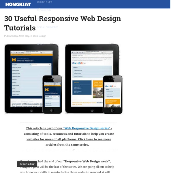
29 New Inspiring Responsive Web Designs 13 January '13, 03:00pm Follow Everyone who is anyone is talking about responsive design these days — and everyone certainly has a strong opinion about it. But, whether you love it or hate it, responsive design is bound to go mainstream in 2013. Every business from Harvard to AOL are embracing responsive design as the wave of the future, and more websites are popping up on every device with an internet connection with conforming layouts. Take a look at these new, smart and stylish responsive layouts and get inspiration for your next website. What’s your favorite responsive design website?
Coding An HTML 5 Layout From Scratch Responsive Website Design Tutorial Responsive design is an approach to web page creation that makes use of flexible layouts, flexible images and cascading style sheet media queries. You can now create your very own responsive website quickly and efficiently, allowing you to showcase your content in a format that will work on any device with an Internet browser, such as desktops, laptops, tablets, and smartphones. Click here for high quality Responsive Website Templates! This Responsive Web Design Tutorial will teach you the basics of responsive design and how to create a simple responsive website. You will learn how to re-use our css styles and Html to create a single website that works across different device platforms. Demo | Download Basics of Responsive Web Design To create a responsive website, we should know the below 3 main parts 1. For example: width: 1126px; will be width: 98%; 2. The most common relative solution is to set the max-width of the image at 100%. 3. Tutorial The basic HTML structure is <! Let's start!
Responsive Webdesign, Apa dan Bagaimana ? | ariona.net Saat ini, internet sudah dapat diakses oleh berbagai macam perangkat, mulai dari Komputer sampai dengan Smartphone. Dan yang menjadi permasalahan adalah semua perangkat tersebut memiliki layar dengan resolusi yang berbeda-beda, sehingga jika situs yang kita buat dibuka di dalam handphone dengan layar yang kecil, maka konten yang ditampilkanpun menjadi rusak, atau jika bisa ditampilkan secara penuh atau mungkin akan direpotkan dengan aktifitas zoom-in dan zoom-out untuk membaca kontent. Disinilah Responsive webdesign berperan. Webdesign yang responsive akan langsung beradaptasi dengan ukuran layar device, sehingga konten yang ditampilkan tidak rusak atau tidak perlu lagi zoom-in dan zoom-out. Jika masih bingung apa yang sedang saya bicarakan, silahkan tengok demonstrasi berikut, lalu resize browser anda secara horizontal. Pertama-tama kita buat markup untuk demonstrasi tutorial ini, markup adalah layout web standar yakni header, navigation, content, sidebar dan footer. <! Kesimpulan Update
The ABCs of Web Development Web development can often be an utterly perplexing affair. Today, aimed at beginners, I'd like to introduce you to twenty six concepts or technologies, each mapping to a letter of the alphabet. Sounds wonky? Republished Tutorial Every few weeks, we revisit some of our reader's favorite posts from throughout the history of the site. AJAX stands for Asynchronous JavaScript And XML and is the main driving force behind all these super smooth web applications you've been using over the past few years. AJAX, as a technology, has been pretty much all pervasive. At the center of everything is the XMLHttpRequest which allows calls to be sent and received, after a page has been fully rendered without touching the rest of the page. Related reading B -- Browser A browser is the understated structure on which you frame your magnificent masterpieces, be it websites or applications. CSS is one prong of the front end development trident. E -- Events Modern web applications are deeply event driven affairs.
Responsive Web Design - Learn to Code Advanced HTML Lesson 4 The Internet took off quicker than anyone would have predicted, growing like crazy. Now, for the past few years, mobile growth has exploded onto the scene. The growth of mobile Internet usage is also far out pacing that of general Internet usage growth. These days it is hard to find someone who doesn’t own a mobile device, or multiple, connected to the Internet. With the growth in mobile Internet usage comes the question of how to build websites suitable for all users. Responsive Overview#responsive-web-design Responsive web design is the practice of building a website suitable to work on every device and every screen size, no matter how large or small, mobile or desktop. The responsive web design term itself was coined, and largely developed, by Ethan Marcotte. Responsive vs. For some the term responsive may not be new, and others might be even more acquainted with the terms adaptive or mobile. Flexible Layouts#flexible-layouts Relative Viewport Lengths Flexible Grid Viewport Scale
RainbowCrack Project - List of Rainbow Tables This page lists the rainbow tables we generated. LM rainbow tables speed up cracking of password hashes from Windows 2000 and Windows XP operating system. NTLM rainbow tables speed up cracking of password hashes from Windows Vista and Windows 7 operating system. The largest rainbow tables here are ntlm_mixalpha-numeric#1-9, md5_mixalpha-numeric#1-9 and sha1_mixalpha-numeric#1-9. Benchmark result of each rainbow table is shown in last column of the list below. Video demonstration of some rainbow tables on Perfect rainbow tables are rainbow tables without identical end points, produced by removing merged rainbow chains in normal rainbow tables. Rainbow Tables LM Rainbow Tables NTLM Rainbow Tables MD5 Rainbow Tables SHA1 Rainbow Tables Perfect Rainbow Table Generation, Sort, Merge and Conversion Commands All rainbow tables in this page can be generated with RainbowCrack software. © 2017 RainbowCrack Project
How to build a responsive HTML5 website - a step by step tutorial Rating: 8.6/10 (1247 votes cast) Required knowledge level: intermediate In this responsive web design tutorial we will create an awesome responsive HTML5 website starting from scratch. Preview HTML5 responsive website Download Download it from GitHub7kB93356Times downloaded Please note that this tutorial is made for people who already have an intermediate knowledge level. First of all let´s have a look at the basic structure of our website. Creating the head – Doctype and Meta Tags Let´s begin by defining the HTML5 doctype and creating our head section with the required scripts and CSS files. In our head section let´s set the charset to UTF-8 which is also easier now in HTML5. As we would like to create a responsive design which should work on all kind of devices and screen resolutions we need to add the viewport meta tag which defines how the website should be displayed on a device. Note that there are multiple different opinions about using initial-scale and width=device-width. <!
Welcome [Savannah] What are Frameworks? 22 Best Responsive CSS Frameworks for Web Design This post aims to present what frameworks are and what they are used for, alongside a selection of the best that can be got for free on the internet. In this way, we want to help web designers and developers who are starting out to discover new resources and possibilities, as well as setting out concepts that can sometimes be too abstract for those who have already travelled far in the world of web design. What is a framework? A framework is a standardized set of concepts, practices and criteria for dealing with a common type of problem, which can be used as a reference to help us approach and resolve new problems of a similar nature. In the world of web design, to give a more straightforward definition, a framework is defined as a package made up of a structure of files and folders of standardized code (HTML, CSS, JS documents etc.) which can be used to support the development of websites, as a basis to start building a site. To summarize: there’s no need to reinvent the wheel. 1.
6 Great Responsive Frameworks for 2014 | Gridgum Responsive websites also allow the website to smoothly scale to a wide range of different sized devices without the need for an additional mobile/device specific site and these responsive frameworks help speed up the process. So lets get started with our list, please note this is not in order of popularity or favouritism. 1. Gumby is a responsive CSS framework that’s built with Compass and SASS. 2. Foundation is a lightweight front-end framework from ZURB, this framework enables the user to create complicated layouts without the need to create a large number of custom elements. 3. Skeleton is a small responsive framework designed for the rapid development of websites of any size. 4. The Responsive Grid System claims not to be a framework, or a boilerplate, but a ‘quick, easy & flexible way to create a responsive website’. 5. 6. And last and not least, Bootstrap.
10 Best Responsive HTML5 Frameworks This is a review of 10 open source responsive HTML5 frameworks, boilerplates and tools for front-end web development (HTML, CSS, and JavaScript). I’ve included tutorials and resources related to each of them, and a comparison table at the end. 1. Twitter Bootstrap Bootstrap is a popular, modern front-end/UI development framework. It’s feature-packed and will have most of the things you’ll need for developing responsive sites and apps. Bootstrap has a 12-grid responsive layout, 13 custom jQuery plugins for common UIs like carousels and modal windows, a Bootstrap customizer, and more. Bootstrap is well-documented, and this open source project has plenty of coverage in blogs and tutorial sites. Bootstrap Tutorials Bootstrap Tools and Resources 2. Foundation is another popular responsive front-end framework. It has rapid-prototyping capabilities, a responsive grid system and much more. Foundation is by ZURB, a company of product designers focused on providing web-based solutions. 3. 4. 5. 6. 7. 8.