
Reconstructing the structure of the world-wide music scene with last.fm. Gapminder: Gapminder Foundation is fighting devastating ignorance with a fact-based worldview that everyone can understand. Here Are the Real Boundaries of American Metropolises, Decided by an Algorithm. When we think about where we live, usually our ideas start with political boundaries—we’d say we live in a particular state, city, or town.
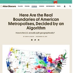
Ask about a neighborhood, sports team loyalties, or regions not defined by borders, though, and it might get a little fuzzier. In densely settled places like the East Coast, sprawl can make it hard to draw lines around places, too. Where in New Jersey does the New York City region end and the Philadelphia region begin? These larger urban areas are sometimes called “megaregions,” and in a new paper, published in PLOS ONE, Garrett Dash Nelson, a historical geographer from Dartmouth, and Alasdair Rae, an urban analyst from the University of Sheffield, teamed up to identify them across the United States, using commuting data and a computational algorithm. Essentially, they used data describing more than 4 million commutes to look at how small units of place—census tracts—are connected into much larger units of place.
The globe of economic complexity. Visualizing Graphs in 3D with WebGL – neo4j. I was already aware of and impressed by three.js, especially the 3d and WebGL capabilities.
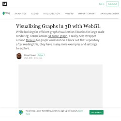
I had seen and done some graph visualization using it years ago, but 3d-force-graph packages three.js nicely with a Graph API and adds useful options to quickly get good looking results. If you want to try the different approaches directly, I put them into a GitHub Repository with live examples using the RawGit Service to serve HTML pages and assets directly from the repository. Datasets I started by using the Game of Thrones interaction graph, that my colleague Will Lyon wrote about here and which you can create yourself by running :play got in your Neo4j Browser.
Besides the basic graph of characters, it also has interaction “weights” on the relationships and the guide adds some additonal metrics like a pageRank property that we want to use in the visualization. Vasturiano.github.io/3d-force-graph/example/large-graph/ The $80 Trillion World Economy in One Chart. The latest estimate from the World Bank puts global GDP at roughly $80 trillion in nominal terms for 2017.
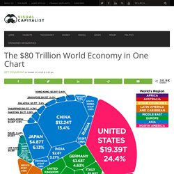
Today’s chart from HowMuch.net uses this data to show all major economies in a visualization called a Voronoi diagram – let’s dive into the stats to learn more. Interactive Data Visualization BI Tools. Quid. Quid. A Collection of 10 Data Visualizations You Must See. MicroStrategy Community. Network Visualization. Introduction to Circos, Features and Uses. Datavisualization.ch Selected Tools. 13 Free Sites That Offer High-Quality 2D People and Objects for Your Architecture Visualizations.
13 Free Sites That Offer High-Quality 2D People and Objects for Your Architecture Visualizations October 23, 2017 Share FacebookTwitterPinterestWhatsappMail Or Even though a solid majority of architectural visualizations adhere to similar style guidelines, that doesn't mean you have to follow suit. OWL - Semantic Web Standards. Overview The W3C Web Ontology Language (OWL) is a Semantic Web language designed to represent rich and complex knowledge about things, groups of things, and relations between things.
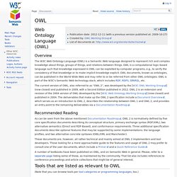
OWL is a computational logic-based language such that knowledge expressed in OWL can be exploited by computer programs, e.g., to verify the consistency of that knowledge or to make implicit knowledge explicit. OWL documents, known as ontologies, can be published in the World Wide Web and may refer to or be referred from other OWL ontologies. OWL is part of the W3C’s Semantic Web technology stack, which includes RDF, RDFS, SPARQL, etc. The current version of OWL, also referred to as “OWL 2”, was developed by the [W3C OWL Working Group] (now closed) and published in 2009, with a Second Edition published in 2012. Recommended Reading. WebVOWL. Paperscape. Temperature anomalies arranged by country 1900 - 2016. Colours in Cultures — Information is Beautiful. Paperscape. About Paperscape Paperscape is an interactive map that visualises the arXiv, an open, online repository for scientific research papers.
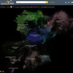
Each paper is represented by a circle, with the size of a circle related to how often that paper has been cited (referred to) - a measure of its impact. The papers are clustered together according to how they reference each other i.e. share information. D3.js - Data-Driven Documents. The Hollywood In$ider. Explore data on over 1200 major Hollywood films of the last ten years.

Click on the axis labels to view other data. View each year by itself. 20th Century Death. 10 Awesome Twitter Analytics and Visualization Tools. Recently Twitter rolled out their native analytics platform for all users and now you can get some quality data about your tweets directly from Twitter.
After researching over a thousand Twitter Tools for the Twitter Tools Book I came across many Twitter analytics and visualization tools. These Twitter tools were designed to add value by presenting a different way to visualize or analyze your tweets, the people in your network, and the tweets from the people in your network.