
Cromometría. Imagen Pública Etac. Cromometría. Best And Worst Colors To Wear To Job Interview. Charlene Kaye/Getty Images What you choose to wear communicates a lot about who you are and how you see yourself.

So in the all-important job interview, what color should you wear to make a great first impression? According to 2,099 hiring managers and human resource professionals who participated in CareerBuilder's recently published survey, blue and black are the best colors to wear to a job interview, and orange is the worst. Conservative colors, such as black, blue, gray, and brown, seem to be the the safest bet when meeting someone for the first time in a professional setting, whereas colors that signal more creativity, like orange, may be too loud for an interview.
Below, hiring professionals who participated in the survey explain how they view different colors worn by job candidates. Black: Leadership Black can be seen as unapproachable, but if you wear it correctly, it can also "communicate glamour, sophistication, exclusivity," says branding expert Karen Haller. Michael Seto.
Interview Attire for Designers: What to Wear. With the ubiquity of business casual and the proliferation of easygoing start-up chic that’s becoming commonplace at many small design and digital shops, many young designers may feel a bit lost or confused when it comes to what constitutes proper interview attire in 2012.

To help provide clear and informed guidance for emerging designers, we decided to ask some local authorities on from the agency, recruiting, digital, and corporate side for their take on how candidates should dress for the big day. Also, we’ve pinned some foolproof outfits for designers on our Pinterest board here! Natalie Gonzalez Sr. Recruiter, Clearpoint Creativewww.clearpointco.com/creative 1) What would you wear to a design job interview and why?
For women, I would wear clothing that matches the style and personality of where I am going to interview. For men, I always suggest men wear a suit for corporate environments—with or without a tie depending on how buttoned-up the company might be. John Luu Written by John Luu. Interview Attire for Designers: Fall 2013. Our blog post last fall Interview Attire for Designers: What to Wear surprisingly was the most popular blog post ever on AIGA Houston’s site.

We decided to do a follow up for Fall 2013. AIGA Houston got in touch with four local creative professionals from studios, to in-house, and recruiting, to get their perspectives on what designers should wear on the big day. What is your color season? Spring, summer, autumn, winter? FUN! :) Teoría del Color. | parte 1 | parte 2 | La sensación que se obtiene con la evaluación visual de un color depende de tres factores fundamentales, igualmente importantes que son: LA LUZ, EL OBJETO COLOREADO Y EL OBSERVADOR Analizamos a continuación cada uno de estos puntos por separado, para poder comprender cómo influyen en la percepción de un color.
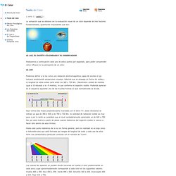
Podemos definir a la luz como una radiación electromagnética capaz de excitar el ojo humano produciendo sensaciones visuales. Además que se propaga en forma de ondas y la longitud de estas ondas varía entre los 380 y 730 Nm. (Nanómetro unidad de medida igual a 10 elevado a la -9 metros), lo que conforma el espectro visible. How to Wear Color Like a Pro. Want more confidence with color?
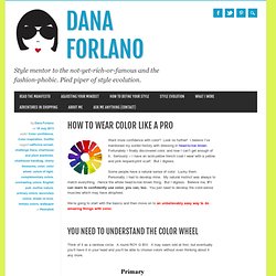
Look no further! I believe I’ve mentioned my sordid history with dressing in head-to-toe brown. Fortunately I finally discovered color, and now I can’t get enough of it. Seriously – I have an acid-yellow trench coat I wear with a yellow and pink leopard-print scarf. But I digress. Some people have a natural sense of color. We’re going to start with the basics and then move on to an unbelievably easy way to do amazing things with color. Think of it as a rainbow circle. Let me explain some of the gibberish. They’re called the primary colors because all other colors are made by mixing them in different amounts and combinations.
It gets a bit more complex when you discuss SHADES. Now I’m going to unleash my inner nerd. Granthaffner.com. Pasión por la pintura al óleo… - Values do all the work.
Colors have all the fun. Recordemos que las dimensiones o factores del tono son tres: Tinte, color o croma; Valor o grado de luminosidad y Saturación, brillo o intensidad (remarco en negrita la más común). Pero además sabemos que el color tiene también otro factor relativo llamado temperatura. Pues los factores que influyen en la dinámica del color son la temperatura y el valor. Por Tono entendemos el color en su totalidad, es decir, integrado por todas sus dimensiones. Vamos a seguir avanzando en la teoría del color con una excepcional exposición sobre las leyes que rigen el contraste y sus relaciones en un cuadro. Se habla de contrastes cuando se puede constatar entre dos efectos de colores que se comparan, unas diferencias o unos intervalos sensibles. Decía Ortega que si lo frío y lo húmedo vinieran siempre juntos creeríamos ser ambas cosas una misma cualidad.
Extracto de Las leyes del contraste del color y sus aplicaciones a las artes, M.E. 1.