
AVS HD 709 - Blu-ray & MP4 Calibration. INTRODUCTION This project aims to provide a free set of calibration patterns for high definition (HD) video players.

You will find downloads here to create discs for Blu-ray and AVCHD players, a version with MP4 video for computers or other compatible devices, and a Patterns Manual with some basic instructions. Users can burn the downloads to DVD media for some applications, but all of the download versions are intended only for HD players. These calibration patterns will not play on standard DVD players, and they are not expected to calibrate for Rec. 601 video used in commercial DVDs. The AVS HD 709 patterns are meant only to calibrate for Rec. 709 encoded HD video, such as commercial Blu-rays. Primarily we intend to offer HD video patterns for calibrating digital displays, such as current LCD, LED, Plasma, and DLP models. DOWNLOADS Updated November 30, 2010 Directly below you will find the project downloads.
MP4 (.exe) or MP4 (.7z)Plays on: Many MPEG-4 AVC or H.264 video players. Front-Box Series. CAMERAS: Rough Guide to Color Grading with the new DSC Labs OneShot by Art Adams. Now that we've made the neutral tones fairly neutral it's time to look at our primary and secondary colors.
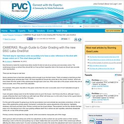
The vectorscope shows us where they should fall, so if we put their respective dots in the boxes we should see accurate color reproduction. There are two things to note here: Some cameras have a hard time saturating colors enough to go into their boxes. That's not always a bad thing as that kind of detail gives cameras their "look. " It's more important to ensure the colors fall on the correct "vectors", which are lines drawn from the center of the vectorscope through each color box. For example, if the green chip falls on the green vector then the color is accurate, even if it isn't saturated enough to reach its box. Cyan and green always seem to be the hardest colors to put in the boxes.
CAMERAS: Rough Guide to Color Grading with the new DSC Labs OneShot by Art Adams. In the old days we shot an 18% gray card to tell a film dailies timer where we wanted our exposure placed and what color we wanted dailies to be.
Now that film is being replaced by HD a simple gray card is no longer enough, because while film colors are fixed by emulsion video colors are not. A gray card in video doesn't communicate anything about accurate color. What Good is a Macbeth/Colorchecker Chart? by Art Adams. Most camera rental houses have an in-house expendables store, and during a recent visit to one such store I ran across a stack of X-Rite "Macbeth" ColorChecker charts sitting on a shelf.
I'm firmly convinced that the only reason people buy these is because they think there is a reason to use them for film-style production... but if there is a reason I can't think of what it is. Let me explain: I work as a consultant, both paid and unpaid, to DSC Labs, manufacturers of the highest quality video test charts in the world. I straddle both the film and video worlds, and a while back I realized that there was no simple, universal, dedicated color chart for film-style HD production. So... CAMERAS: A New Chart for Film-Style Production—The DSC OneShot by Art Adams.
Last but not least, the middle column of the OneShot contains four standard hues of flesh tone.
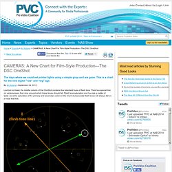
There's a special line on vectorscopes, the I-line, around which these tones should fall. Flesh tone saturation and hue are a matter of taste--as is the saturation of the primary and secondary colors in the chart--but accurate flesh tones will always fall on or near that line. The I and Q lines. The best explanation I can find for why these lines exist is here.
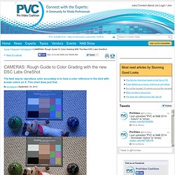
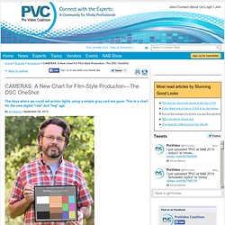
CAMERAS: A New Chart for Film-Style Production—The DSC OneShot by Art Adams. The left column of the OneShot contains the white, black and middle gray chips.
The gray chip is probably the most important as it's calibrated to 18% reflectance, the same as your spot meter. Setting the chart exposure using this chip helps the colorist reproduce the chart accurately in their grading suite, as exposure affects saturation and can make the color chips look too colorful or not colorful enough. 18% gray is generally accepted as being around 40% on a waveform monitor, with some manufacturers suggesting slightly lower values and some slightly higher. 40% has worked well for me, but you may find that you like something slightly different. 18% gray is particularly important in the video world because it moves around a lot.
For example, while testing the dynamic range of the Canon C300 I discovered that the Cinema1 gamma curve gave me 3.5 stops of overexposure latitude above 18% gray, but Cinema2 gave me 4.5 stops! CAMERAS: A New Chart for Film-Style Production—The DSC OneShot by Art Adams. In the old days of video, what we saw was what we got.
Now, with log and raw, the possibilities are infinite. Only one of those possibilities, though, is what YOU want. Here's how to make sure your vision is the one everyone else sees. I'll be showing off this chart at IBC, Sept. 7-11.