
Frameless. Plateforme de gestion de site Web : CMS, e-commerce, CXM ou framework? Comment construire un site Web?
Dans le cas de chaque site, la réponse peut être différente, en fonction d'une foule de facteurs. Mais il existe quelques grandes approches qui méritent d'être connues et comprises par le personnel non-technique qui va sélectionner un développeur ou une agence Web afin de poser les bonnes questions et de comprendre ce qu'il achète. Malheureusement, trop souvent, les entreprises s'arrêtent trop rapidement à un choix : celui que leur développeur Web ou département T.I. propose, une solution tout à fait fonctionnelle, mais non-optimales pour d'autres disciplines de l'organisation, par exemple le marketing ou la gestion des commandes qui, faute d'une compréhension suffisante des technologies voient leurs possibilités limitées après le lancement du site... ou doivent avoir recours à ceux qui l'ont construit à chaque nouveau besoin.
Au commencement, il y avait le langage de programmation. Stephaneblanchard.ca - Poésie dans l'art de vivre - Moqi.ca. Hiding and revealing portions of images. This tutorial is slightly adapted from Chapter 9 of my book, Flexible Web Design: Creating Liquid and Elastic Layouts with CSS.
You can download most of Chapter 9 for free as a PDF at the Flexible Web Design companion site, as well as download the HTML, CSS and image files that go along with this tutorial. Since the area available for an image to display within a flexible layout changes on the fly, your images may need to as well. While fixed-width images can work within flexible layouts—as long as they’re not too large, or you have matching minimum widths in place—there are lots of ways you can dynamically change the screen area that an image takes up. I’ve already written about how to make images literally scale, but another way to change the amount of screen area an image takes up is to dynamically change how much of the image is shown at any given time.
You can create a variable cropping effect with either background or foreground images. Variable cropping with background images. Mise en page « adaptative » ou « réactive » : avantages et inconvénients. De plus en plus d'internautes consultent votre site à partir d'un appareil mobile.

En même temps, la taille des écrans est de plus en plus variée. Une des façons de répondre à ces nouveaux besoins est de créer une mise en page dite « adaptative » ou « réactive » (« responsive design »). (La plupart de ces concepts sont tellement nouveaux que la terminologie en anglais n'est pas encore arrêtée, tandis que la terminologie officielle en français est inexistante) Les ingrédients. Media types. 7.1 Introduction to media types One of the most important features of style sheets is that they specify how a document is to be presented on different media: on the screen, on paper, with a speech synthesizer, with a braille device, etc.
Certain CSS properties are only designed for certain media (e.g., the 'page-break-before' property only applies to paged media). On occasion, however, style sheets for different media types may share a property, but require different values for that property. CSS3 Media Queries. CSS2 allows you to specify stylesheet for specific media type such as screen or print.

Now CSS3 makes it even more efficient by adding media queries. You can add expressions to media type to check for certain conditions and apply different stylesheets. For example, you can have one stylesheet for large displays and a different stylesheet specifically for mobile devices. It is quite powerful because it allows you to tailor to different resolutions and devices without changing the content. Continue on this post to read the tutorial and see some websites that make good use of media queries. CSS3 Media Queries (demo) Check my demo and resize your browser window to see it in action. Max Width The following CSS will apply if the viewing area is smaller than 600px. If you want to link to a separate stylesheet, put the following line of code in between the <head> tag. Les Media Queries CSS3.
Les Media Queries CSS3. Prévoir un site pour toutes les résolutions (design fluide) Media Queries. Mise en page « adaptative » ou « réactive » : avantages et inconvénients. Sans cadre. Building a Frameless grid 1.
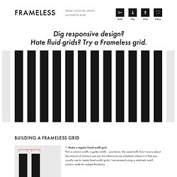
Make a regular fixed-width grid. Pick a column width, a gutter width… you know, the usual stuff. Don’t worry about the amount of columns just yet, but otherwise use whatever criteria it is that you usually use to create fixed-width grids. I recommend using a relatively small column width for added flexibility. 2. Now, give your grid an infinite number of columns, so that no matter how wide you make your viewport, more and more columns come into view. 3. Align your grid horizontally to the middle of your viewport. 4. Start using the grid. Downloads, on GitHub LESS LESS template Contains a small CSS reset, some consistency fixes, as well as some super-basic customizable variables and functions for starting off a Frameless grid. SASS SCSS template The same as the LESS version above, but written in SCSS instead. HTML HTML starting point. Or système de grille. GGS was my next step after Less Framework.
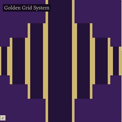
Instead of a fixed-width grid, it used a fully fluid-width one, without even a maximum width. The resources it was published with are still available on GitHub. The idea was to take a 18-column grid, use the outermost columns as margins, and use the remaining 16 to lay elements out. On smaller screens the 16 columns could be folded into 8, 4 and 2.