
Baby Icons Pack - Icons8. 50 Free Responsive Icons + Generator — Icons8 - Icons8. Free download: 30 responsive icons by icons8. We all love icons, they communicate more than words, in much less space.
And they’re even better when they’re free. However, most icons are still limited by a one size fits all mentality: the same icon is displayed no matter what capabilities the device viewing your site has. This incredible set of icons is different. Designed by icons8, they’re entirely responsive, changing their level of detail when scaled. Scale them down and lines become bolder and shapes simpler for maximum legibility. Each of these amazing vector icons is encapsulated in a single SVG file, with all of the CSS to control them packed in there too. If you like these 30 free responsive icons, you’ll be delighted to learn that there are another 20 available to download for free from icons8.
Drag the sliders below to see the icons adapt their shape, then download all thirty icons below the preview: Please enter your email address below and click the download button. Responsive Web Design just got Easier with the Responsive Grid System. Media Query & Asset Downloading Results. A little while back, I mentioned I was doing some research for the book about how images are downloaded when media queries are involved. To help with that, I wrote up some automated tests where Javascript could determine whether or not the image was requested and the results could be collected by Browserscope for review.
I posted some initial findings, but I think I’ve got enough data now to be able to go into a bit more detail. First, any credit has to go to the awesome team at Cloud Four. Most of the tests were created by them for some testing they were doing. I just added some Javascript to automate them. On to the results! Test One: Image Tag Run the test This page tried to hide an image contained within a div by using display: none. The 2014 Guide to Responsive Web Design. Piresponsive, Responsive design outil de test - Pikock.
Demo: CSS Tricks for Responsive Design. A Simple Device Diagram for Responsive Design Planning. Updated for 2015!
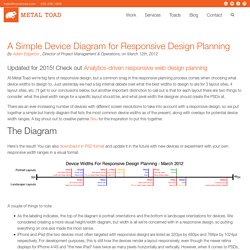
Check out Analytics-driven responsive web design planning At Metal Toad we're big fans of responsive design, but a common snag in the responsive planning process comes when choosing what device widths to design to. Just yesterday we had a big internal debate over what the best widths to design to are for 3 layout sites, 4 layout sites, etc. I'll get to our conclusions below, but another important distinction to call out is that for each layout there are two things to consider: what the pixel width range for a specific layout should be, and what pixel width the designer should create the PSDs at.
There are an ever-increasing number of devices with different screen resolutions to take into account with a responsive design, so we put together a simple but handy diagram that lists the most common device widths as of the present, along with overlays for potential device width ranges. The Diagram Here's the result! A couple of things to note: Our Suggested Layouts. Responsive Email Design. You may have noticed that we've been using one standard media query in this guide, being @media only screen and (max-device-width: 480px) { ... }.
This is great for targeting Apple iPhones and other handheld devices that make up the majority of mobile email client share. But if you, or your clients want to target tablets, larger-screen Android devices and some of the more exotic screen resolutions that feature in the mobile ecosystem, then you'll need both unique media queries and unique styles to match. As you may know, media queries are not supported by every mobile email client - for example, Gmail will not show the responsive version of your email, on any platform.
For more information on which email clients do and don't support the techniques in this guide, view our support chart. Fine-tuning your media queries Lets go back to the max-device-width: 480px rule in our earlier media query. @media only screen and (min-device-width: 320px) and (max-device-width: 480px) { ... } Responsivepx - find that tricky breakpoint. Responsive Web Layouts for Mobile Screens: Intro, Tips and Examples. Designers have it tougher now than before.
We not only have to design for stationary devices, but also mobile devices like the tablet and smartphones, and since we are talking about a lot of different screen sizes and resolutions here, it’s a huge task to shoulder. In light of this, responsive web design could be the best solution. It offers more than just a simple mobile template; instead, your entire site layout is designed to be flexible enough to fit into any possible screen resolution.
With such a fluid design scheme there are obvious benefits and drawbacks. Consider my examples below for how responsive web design can make the transition into mobile devices a smoother one. Responsive-Widths_0.png (Image PNG, 1613 × 273 pixels)