
50 Useful CSS Snippets Every Designer Should Have With so many new trends advancing every year it can be difficult keeping up with the industry. Website designers and frontend developers have been deeply ingrained into the newer CSS3 properties, determining the ultimate browser support and quirky hacks. But there are also brilliant CSS2 code snippets which have been unrequited in comparison. For this article I want to present 50 handy CSS2/CSS3 code snippets for any web professional. These are perfect for storing in your development IDE of choice, or even keeping them saved in a small CSS file. Media Queries Abstract HTML4 and CSS2 currently support media-dependent style sheets tailored for different media types. For example, a document may use sans-serif fonts when displayed on a screen and serif fonts when printed. ‘screen’ and ‘print’ are two media types that have been defined.
A pixel is not a pixel is not a pixel Page last changed today Yesterday John Gruber wrote about the upped pixel density in the upcoming iPhone (960x640 instead of 480x320), and why Apple did this. He also wondered what the consequences for web developers would be. Now I happen to be deeply engaged in cross-browser research of widths and heights on mobile phones, and can state with reasonable certainty that in 99% of the cases these changes will not impact web developers at all.
Experimental CSS3 Animations for Image Transitions Today we want to share some experimental 3D image transitions with you that use CSS3 animations and jQuery. We'll be using CSS3 3D Transforms for Webkit only. View demo Download source Today we want to share some experimental 3D image transitions with you that use CSS3 animations and jQuery. Weekly Web Design Inspiration #33 There is no limit for inspiration and when it comes to webdesign this is much more unlimited. As usual we continue to showcase beautiful and interesting webdesigns that we came across during the week.Hope you like this week’s collection too. Polyester Studio Visit Website Railroad Visit Website
Caption Hover Effects A tutorial on how to create some subtle and modern caption hover effects. View demo Download source Today we want to show you how to create some simple, yet stylish hover effects for image captions. The idea is to have a grid of figures and apply a hover effect to the items which will reveal a caption with the title, author and a link button. Media Query Bookmarklet We created this bookmarklet to aid in designing responsive websites. Now you can always know what media query just triggered. Never again will you lose track of where you are. That Web Guy - An introduction to responsive web design: using media queries Written December 29, 2011. 4 comments. You’ve no doubt heard the term by now, but what exactly is Responsive Web Design? As the name suggests, Responsive Web Design (from hereon in referred to as RWD) is about designing your web site with the use of media queries so that it responds (changes the presentation) to the web browser width, or in the case of mobile devices, the capabilities of said device.
CSS Buttons with Pseudo-elements In this tutorial, I'll show you how to create buttons with a twist, using just one anchor tag per button and the great power of CSS. View demo Download source Hola, amigos. For the last month or so, I’ve been experimenting with the power of CSS pseudo-elements, specially when it comes to mixing them with buttons and that way recreating some great effects that were only possible to do with sprites, in the past. In this tutorial, I’ll show you how to create buttons with a twist, using just one anchor tag per button and the great power of CSS. 10 Rock Solid Website Layout Examples Keeping It Simple Page layout is equal parts art and science. Creating something that’s visually attractive and unique takes an artist’s eye. However, there are several very easy to follow guidelines that you can use to create solid layouts that work for any number of cases.
The Best Freebies for Designers (June 2013) Here are the best freebies for designers from June 2013. We have free GUI templates, icon sets, fonts, Photoshop brushes, PSD templates, textures… and everything else inbetween. Freebies for Designers – June 2013: Icon Sets Thin Stroke Icons (PSD) Download Page →
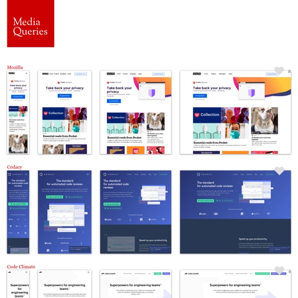
Essential considerations for crafting quality media queries CSS3 media queries are dead simple, in terms of their syntax. You’ve got an @media directive, a media type (which you already know from good ol’ CSS 2, like screen, print, all, etc.) and one or more media features (the characteristics we’re testing against). That’s it: Media Queries for Standard Devices If you think responsive's simple, I feel bad for you son. We got 99 viewports, but the iPhone's just one. —Josh Brewer, March 10, 2010 A major component of responsive design is creating the right experience for the right device.
CSS3 Lightbox Today we want to show you how to create a neat lightbox effect using only CSS. The idea is to have some thumbnails that are clickable, and once clicked, the respective large image is shown. Using CSS transitions and animations, we can make the large image appear in a fancy way. View demo Download source With the help of the pseudo-class :target, we will be able to show the lightbox images and navigate through them. The beautiful images are by Joanna Kustra and they are licensed under the Attribution-NonCommercial 3.0 Unported Creative Commons License.