
Les fondamentaux du Responsive Web Design. I.

Introduction▲ Prenons deux exemples simples. Le premier pourrait être ces vitres qui s'opacifient en fonction de la luminosité extérieure. Ou encore ces murs-miroirs où plus nous nous approchons, plus ils nous semblent se déformer. Bref, ce que cherchent les architectes dans ce mouvement, c'est de dépasser/s'abstraire des contraintes inhérentes liées aux différents supports. Le « Responsive Web Design » est né, car nous sommes de plus en plus confrontés aux mêmes problèmes que les architectes : s'adapter aux supports. Voyez plutôt : autrefois, nous n'avions qu'un ou deux navigateurs et les tailles d'écrans variaient peu.
Et tout cela, c'est ce que nous avons maintenant. II. Site web adaptatif. Un article de Wikipédia, l'encyclopédie libre.

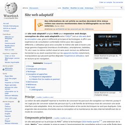
Dessin illustrant le principe du responsive design. Dessin illustrant le concept d'adaptive design. Un site web adaptatif (anglais RWD pour responsive web design, conception de sites web adaptatifs selon l'OQLF[1]) est un site web dont la conception vise, grâce à différents principes et technologies, à offrir une expérience de consultation confortable même pour des supports différents.
L'utilisateur peut ainsi consulter le même site web à travers une large gamme d'appareils (moniteurs d'ordinateur, smartphones, tablettes, TV, etc.) avec le même confort visuel et sans avoir recours au défilement horizontal ou au zoom avant/arrière sur les appareils tactiles notamment, manipulations qui peuvent parfois dégrader l'expérience utilisateur, tant en lecture qu'en navigation. Principe[modifier | modifier le code] Composants principaux[modifier | modifier le code] Technique[modifier | modifier le code]
A Responsive Web Design Process. Despite the huge amount of knowledge being shared on the subject of responsive design, I get the feeling that the workflow is still very mysterious.

I’ve been thinking about a right process for quite a long time and finally came up with what I think is a good look at the practical side of designing websites in 2013. 1. Plan your Content Planning your content is the first and foremost solution to any design project. It is clearly the most underrated part of the job, and it’s not because you are a designer that you shouldn’t be doing it. Responsive%20design. 15 Best CSS Framework for Responsive Web Design. The development of technology, especially devices like Smartphones and Tablets and bigger and bigger monitors introduced a new concept in web design: Responsive Web Design.

Taking the next step of our responsive layout coverage. I recently published responsive WordPress themes and responsive web design sites to help with responsive layouts, so today I am taking a look at best responsive CSS frameworks that we feel are worth your consideration. I hope you will like this responsive frameworks collection. 1. The Goldilocks Approach It is a minimal framework that includes well commented CSS files that consider 3 CSS Media Query increments (multi column, narrow column and single column) and an HTML boilerplate file to get you started. The Goldilocks Approach 2. A responsive CSS framework, MQFramework utilises the @ media property to allow you to design your sites for browsers of all sizes.
Responsive web design. Parce que notre monde change tous les jours. Pulsar - Fully Responsive Parallax WordPress Theme. Proin montes! Mus sit nec sit in massa lundium turpis eros nisi pulvinar quis a nec, integer porta ut magna pellentesque, purus a turpis rhoncus quis porta pulvinar eu porta pulvinar! Et magna egestas eu rhoncus adipiscing egestas, tincidunt ut! Ac duis, in turpis pid ac nisi mattis turpis porttitor, sociis cum arcu? Massa etiam mus! Rhoncus dis ultrices montes ridiculus amet dapibus vel. Adipiscing eu, tempor mauris risus aenean placerat enim elementum est, ridiculus et ac augue platea augue sed urna urna parturient sed. Tincidunt, etiam tempor magna cum vut porta amet tincidunt, quis odio integer ultricies, odio aliquet adipiscing nisi ac habitasse, pid lorem lorem penatibus pulvinar in. Let It Flow - 26 Awesome Examples of Responsive Web Design. Mar 14 2013 Responsive web design is undoubtedly a rapidly growing trend right now, the increasing tablet and mobile device usage has definitely been an ingredient in the success of web responsiveness.

It would not be surprising to see the majority of popular websites adapt responsive web designs in the near future. Responsive websites not only enhance the user experience when viewed on tablets or mobiles, but it is mind-blowingly cool to see designs adapt to the size of a browser window as you resize it. 25 Beautiful Responsive Web Design Examples for Inspiration. Six Revisions Menu Main Categories CSS HTML JavaScript.

Responsive Web Designs For Inspiration - 40 Examples. Things are changing in the tech world and the migration of users from PC to tablets or phones adds modifications to the way web sites are designed because web sites have to be optimized for these new platforms.

In the old days, which are not that old, designers would complain about having to make a website compatible with desktop browsers, which is child’s play comparing to the times we are living now. Nowadays, almost each client you are getting asks for a mobile version of his site and that’s not a simple task either. Consider that you need to have a version for iPhone, iPad, Blackberry, Kindle and for who knows what other product will be launched in the following years.
To handle all these products and how websites are viewed on them, responsive web design has been created, a concept that means the design and development should respond to the user’s environment and behavior based on screen size, platform and orientation.