
HTML5, SEO e personal branding: tutorial su authorship markup Nella nostra attività di lettura sul web - siano articoli, post, commenti o tutorial - capita spesso di imbatterci in un autore che ci piace particolarmente e che vorremmo "seguire" in maniera più assidua. Se questo può essere fatto quando, ad esempio, questo autore ha un profilo Twitter sarebbe utile che anche i motori di ricerca ci aiutassero in questa nostra passione, indicandoci ad esempio nei risultati gli altri articoli (magari sullo stesso tema, cioè sulla stessa keyword che stiamo ricercando) scritti da questa persona. Google sta pensando proprio ad un meccanismo del genere, utilizzando gli strumenti e gli standard di semantic web che tecnologie come HTML5 mettono a disposizione. Authorship markup: che cosa è e come si usa Per quanto potente questa tecnica sia l'utilizzo è davvero semplice: l'idea di base è indicare nella pagina dell'articolo un link con attributo "rel" (relazione) con valore "author" e che punta alla pagina dell'autore (su quel sito). Un esempio concreto rel="me"
Adaptive Images in HTML WebSockets e HTML5: il tutorial introduttivo Sin dall'origine del web uno dei suoi limiti principali (ma forse anche una delle caratteristiche che l'hanno resa semplice e dunque di successo) è l'architettura "stretta" client-server, ovvero una modalità di comunicazione in cui c'è un client ben definito che fa le "domande" e un server (web, pensiamo ad Apache) che fornisce le "risposte" (pagine web, immagini, etc.) solo quand interrogato Se questa struttura è perfetta per un web "statico" fatto di pagine collegate fra loro in cui la richiesta di nuovo contenuto è stimolata dal click su un link da parte dell'utente del browser, questa stessa architettura non è per nulla ideale per applicazioni complesse e ricche di comunicazioni bidirezionali (pensiamo ad un gioco multiplayer via web) o dove le informazioni potrebbero dover arrivare quando sono disponibili e non quando l'utente "fa" qualcosa (ad esempio in applicazioni finanziarie o in real-time) WebSockets Ma vediamo come funziona il tutto. Avrete notato il protocollo "
3 Types Of Solutions To Work With Responsive Images One of the big 3 requirements for responsive design is flexible images and media. On the surface it seems like an easy thing to do. You remove width and height attributes on images, set their max-width to 100% and call it a day. Beneath the surface there’s a lot more we need to consider. The Problem with Images in a Responsive World When the Filament Group was redeveloping the Boston Globe website last year they too added max-width to keep images flexibly inside their containers. Unfortunately for all cases except when the maximum image is needed, that’s wasteful. Even if bandwidth weren’t an issue you still have to consider if the same image works at very different sizes. And let’s not forget about high resolution displays. We can’t simply preload all the different images we might use, since it defeats the whole point. We need a greater ability to serve device and context appropriate images and media. 3 Paths to Solution Let’s take a look at the solutions in each path. A New Image Format
Case Study: Page Flip Effect from 20thingsilearned.com Introduction In 2010, F-i.com and the Google Chrome team collaborated on an HTML5-based educational web app called 20 Things I Learned about Browsers and the Web (www.20thingsilearned.com). One of the key ideas behind this project was that it would best be presented in the context of a book. Since the contents of the book is very much about open web technologies we felt it was important to stay true to that by making the container itself an example of what these technologies allow us to accomplish today. We decided that the best way to achieve the feeling of a real world book is to simulate the good parts of the analogue reading experience while still leveraging the benefits of the digital realm in areas such as navigation. Getting Started This tutorial will take you through the process of creating your own page flip effect using the canvas element and plenty of JavaScript. Before we get started it's a good idea to check out the demo so that you know what we're aiming to build. Markup Logic
IIPImage » Blog » Responsive Images using IIPImage The proliferation of mobile devices has made responsive web design one of the hottest topics in web design. Modern web sites need to be usable on a large range of screen resolutions and sizes, from low resolution mobile devices to high resolution monitors. For page layout, various techniques based on fluid layouts, media-queries or combinations of these with HTML5 have been developed, which adapt layout to suit the available screen size. Responsive Images However, images themselves also need to adapt to the context, not just for maintaining layout, but also to reduce unnecessary bandwidth. These solutions include modifying the <img> tag by adding something like @srcset, which would look like: Or creating a new adaptive image element such as <picture>: Or using javascript libraries such as Foresight, HiSRC or “Responsive Images” which select the appropriate image for use from a list of pre-generated images. This could also be done in CSS rather than within the element itself. Resizing
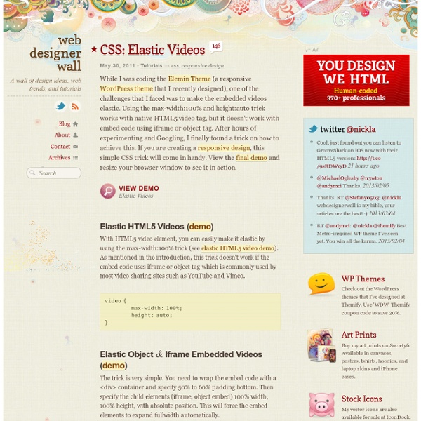
Adaptive & Mobile Design with CSS3 Media Queries Screen resolution nowsaday ranges from 320px (iPhone) to 2560px (large monitor) or even higher. Users no longer just browse the web with desktop computers. Users now use mobile phones, small notebooks, tablet devices such as iPad or Playbook to access the web. So the traditional fixed width design doesn't work any more. Web design needs to be adaptive. View Demo Responsive Design Download Demo ZIP See It in Action First Before you start, check the final demo to see how it looks like. More Examples If you want to see more examples, check out the following WordPress themes that I designed with media queries: Tisa, Elemin, Suco, iTheme2, Funki, Minblr, and Wumblr. Overview The page's container has a width of 980px which is optimized for any resolution wider than 1024px. HTML Code I'm not going to go through the details of the HTML code. HTML5.js Note that I use HTML5 markup in my demo. Reset HTML5 Elements to Block Main Structure CSS Again, I'm not going to get into the details. Step 1 Demo Updates
HTML5 Canvas Tutorials Corso su WebGL - Introduzione Proprio pochi giorni fa (esattamente giorno 3 Marzo 2011) è stata finalmente rilasciata la versione 1.0 delle specifiche per la libreria grafica che a braccetto con HTML 5 dovrebbe cambiare il web…stiamo parlando di WebGL! Molti di voi si domanderanno cosa siano queste librerie dal pomposo nome, e noi siamo proprio qui a spiegarvelo! Il viaggio che stiamo per intraprendere insieme infatti ci porterà alla scoperta di questa recentissima tecnologia che dovrebbe finalmente avvicinare in maniera definitiva il mondo della grafica 3d con quello del web. Ma andiamo con ordine…faremo prima un breve accenno a cosa è esattamente WebGL, a come nasce e successivamente a quale sarà il “piano dell’opera” del corso per imparare ad utilizzare questa libreria. Cosa è WebGL? La programmazione con WebGL può essere quindi sviluppata con ogni linguaggio “DOM Compatibile” (quindi principalmente javascript), a patto che il browser sia compatibile. I vantaggi di WebGL Iniziamo il nostro viaggio… Conclusioni
Home | HTML5 Boilerplate - A rock-solid default template for HTML5 awesome. HTML5 selectors API – It’s like a Swiss Army Knife for the DOM In the infancy of JavaScript, there was little if any concept of an HTML document object model (DOM). Even though JavaScript was invented to enable web developers to manipulate parts of a web page, and in the original implementation, in Netscape 2.0, developers could only access the form elements, links, and images in a page. Useful for form validation, and first widely used for image rollover techniques (think :hover, before CSS), but far from the general purpose tool to create modern web applications we now know (and love/hate). Newer iterations of the DOM provided developers with access to far more than just that original limited range of elements, as well as the ability to insert, modify and delete elements in an HTML document. But, cross-browser implementations very often differed, and full support for the W3C’s DOM standards have arguably been treated as far more optional than CSS or HTML support. Luckily, the standards and browser developers took notice. The Selectors API
Responsive image gallery con HTML5, CSS3 e jQuery PhotoSwipe In questo articolo applichiamo due principi cardine per lo sviluppo di moderne interfacce web nella creazione di una gallery di immagini: si tratta del responsive design e del progressive enhancement. In parole povere, il layout della galleria, realizzato in maniera “fluida” con le dimensioni degli elementi espresse in misure percentuali, assicurerà una corretta visualizzazione della pagina su tutti i device (desktop, notebook, smarthone, tablet) adattandosi perfettamente a qualsiasi risoluzione dello schermo. Inoltre, l’impiego attento delle nuove tecnologie HTML5, CSS3 e Javascript consentirà di fornire con i browser più recenti l’esperienza di navigazione più piacevole e avanzata senza precludere la compatibilità e l’accessibilità su dispositivi e software meno aggiornati. Dulcis in fundo, mettere in pratica tutto questo e lo sviluppo dell’esempio finale sono molto semplici. Cominciamo subito! Non rimane che analizzare la parte “interattiva” dello sviluppo.