
Should You Use Inline-Blocks As A Substitute For Floats? When it comes to developing a site layout with css, floats do most of the heavy lifting.
We use them for the big blocks like our main content and sidebar and we use them for the smaller blocks inside these big ones. Are floats always the answer? They generally work well, but sometimes they can be hard to work with. This is especially true when it comes to inside blocks like a grid of images that won’t line up as expected. Inline-blocks are another option we can use. Inline-blocks aren’t anything new and it’s quite possible you’re already using them. What is an inline-block? Inline-block is one of the values we can assign to the display property of an element. Block elements — form boxes according to the css box-model. If you think about it, that’s not too far off from how a floated elements behaves. The Difference Between Floats and Inline-Blocks While floats and inline-blocks share some characteristics, there are some clear differences between the two.
Solving the Whitespace issue Summary. CSS: Responsive Navigation Menu. Previously I wrote a tutorial on how to make a mobile navigation for responsive design, now I've discovered a new technique to produce a responsive menu without having to use Javascript.
It uses clean and semantic HTML5 markup. The menu can be aligned left, center or right. Unlike the previous tutorial where it is clicked to toggle, this menu toggles on hover which is more user friendly. It also has an indicator to show the active/current menu item. It works on all mobile and desktop browsers including Internet Explorer! View Demo Responsive Menu The Purpose The purpose of this tutorial is to show you how turn a regular list menu into a dropdown menu on smaller display. This trick is more useful on navigation with a lot of links like the screenshot below. Nav HTML Markup. Should You Use Inline-Blocks As A Substitute For Floats? Responsive, Fluid-Width, Variable-Item Navigation with CSS.
Around six months ago I was asked to develop a single row navigation bar that could contain a variable number of menu items while filling the entire width of the container.
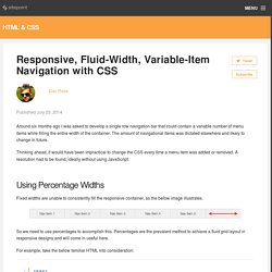
The amount of navigational items was dictated elsewhere and likely to change in future. Thinking ahead, it would have been impractical to change the CSS every time a menu item was added or removed. A resolution had to be found, ideally without using JavaScript. Using Percentage Widths Fixed widths are unable to consistently fill the responsive container, as the below image illustrates.
So we need to use percentages to accomplish this. For example, take the below familiar HTML into consideration: And we’ll add the following CSS: Areas of note are: The <nav> element is given width: 100% to fill the entire available space. The result of adding these styles is shown in the CodePen demo below: Open it in a new window and test it out for responsiveness.
What if We Add or Remove Items? How about when an extra nav item is added? How To Create A Responsive Navigation Menu Using Only CSS. In this tutorial we will be creating a basic responsive navigation menu with dropdown using only HTML and CSS.
Many navigation menus (especially responsive ones) are created using a combination of HTML, CSS and Javascript. This simple CSS only method will demonstrate that Javascript isn't always necessary! The code we will create includes only the most essential CSS required for structure and basic styling. This makes it much easier to follow and understand the purpose of each line of code. It also means that the end product is primed and ready for your unique customization. Live Demo A Quick Message Big thanks to the commenters that informed us of an issue this code was having on mobile devices! The HTML As you can see I have declared the HTML5 doctype, and included the basic page structure. <! The CSS First of all, some basic styling to the ul and li elements to remove bullet points and other list styles. The following attributes are almost exclusively for aesthetic appeal. Complete Code <! A Flexible Approach to Responsive Navigation. Many responsive websites provide a horizontal navigation bar on large screens and drop-down navigation for smaller viewports.
It's a perfectly decent approach, but it's not without its issues. Firstly, devices don't just come in large and small; they come in every size imaginable. Secondly, the navigation might well change over time. Thirdly, the layout or font size might vary across screen sizes. We're going to do things differently… Why not check (with JavaScript) to see how much of our the navigation actually fits in the space available?