
British Council - Our Brand. Master Logo Colors » Brand Identity Standards. Boston University Red Whenever possible, the master logo should appear in the University’s red. It should never be represented in any other colors. Use only 100 percent of the officially designated shades and always insist upon accurate color matching, as poorly matched colors will weaken the impact and effectiveness of our logo. For Print Pantone: 186CMYK: 0, 100, 75, 4 For Web. Brand identity style guides from around the world.
This is great!
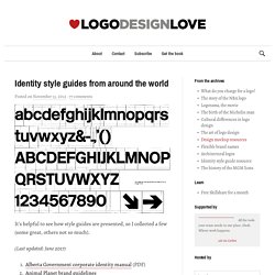
The University of Connecticut has a nice one designed by Peter Good. Web and link to PDF version. (Get the PDF version!) Peter did a great job of differentiating the three identities a university typically has. – The academic and marketing identity (what most would think of as the main identity). – The athletics or mascot identity. Not designed by Peter and very clearly just for and controlled by the athletics department. UConn has a pretty simple color palette but, many academic systems also include extra Pantone colors to be used for marketing or just for the presidential or university seal (gold, etc.). Stanford University just redid their system too! I also like Vanderbilt University’s. Yaroslavl Coast. Yaroslavl Coast (Ярославское взморье in Russian) is a government project to establish a lakeside resort by the Rybinsk Reservoir north of Moscow.
Its visual identity was developed by Art. Lebedev Studio and features a symbol inspired by topographical maps and natural motifs, like tree rings and seashell patterns. The primary version of the logo comes in multiple colours; there are also colour-coded version for different divisions within the project. As is the custom at Art. Lebedev Studio, an insanely detailed documentation of the design process is available on the studio's website. Art.
A good university website: not more, not less, but the sum of its parts. We all remember it well: 17 years-old and full of hope, flicking through brochures in the school library, each of us desperately wondering where we'd end up spending the next three or four years of our lives.
Whether to venture to a new city and move away from home, or save money and go to our local university. Picking a university was never easy – and this was before the days of spiralling fees. This year's batch of freshers will be the first to see the effects of the restructuring of UK higher education and increased tuition fees. Helping prospective students feel they've made the right decision has never been more important. To complicate matters, universities are scrambling to reap the rewards of the international student market, while absorbing their share of upward demand in postgraduate interest. As a solution universities are looking to their global shop window – the internet. 1) Establish brand guidelines 2) Clarify department goals 3) Create building blocks. New Museum - Wolff Olins. Ambition The New Museum of Contemporary Art is New York City’s only museum dedicated exclusively to showcasing contemporary art.
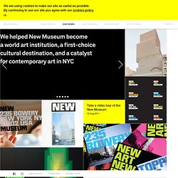
It’s an adventurous, progressive institution with an internationally renowned program. In a city overly saturated with cultural institutions, we faced an exciting challenge: create a brand that would drive the museum’s vision and ambition to become a world player in contemporary art and a first-choice, 21st century cultural destination. Action. OCAD University Visual Identity. SHANGHAI BIENNALE / SYDNEY PAVILLION - Jason Little. ‘The Floating Eye’ was the curatorial theme of the Sydney Pavilion in the Shanghai Bienale, the largest international art event in mainland China, attracting over 8 million visitors.
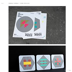
Sydney was part of the Inter-City Pavilions, offering observations of a city’s shifting references and influences. The challenge was to convey the varied perspectives of the city’s transforming reality observed though its demographics, environment, history, politics, geography and society. BME - Budapest University of Technology and Economics. Eskimo. Fashion Store on Branding Served.
Liquid Agency. A brand identity system is more than a logo.
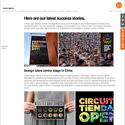
When it was time to craft the brand identity for the event, our designers opted for a solution that captures the role of design as a burst of innovation. Instead of developing a static logo, Liquid’s designers created a flexible and dynamic branding system, which allowed the identity to come to life as a texture within type, or in a variety of permutations. The multicolored burst represents the varied disciplines in the field of design which are as diverse as industrial design, graphics, fashion, digital, motion, architecture – and even service design. The Chile National Design Competition 2011. Neue. The Ingenious and Interactive Branding of Nordkyn.