
1 talking about - Mining Twitter with R. Flowmentum » The data must flow. I love good typography, even more so as Microsoft Word and PowerPoint have debased our standards.
When I see a really fine piece of technical typesetting, it’s almost always done using TeX and friends. Beautiful LaTeX documents are easy to recognize. Beautiful R graphics are also easy to recognize. When literate programming systems like Sweave, Org mode, or knitr weave R graphics and LaTeX typesetting together, the beauty of both LaTeX and R is obvious, but documents can still look all wrong because of font clash. Documents typeset purely in LaTeX can have a visual consistency that is hard to match. As wonderful as R is for plotting, changing the fonts in plots can be a bit cryptic. An alternative is the Cairo package which provides the ability to change fonts in any supported device. Most of the time I use the LaTeX mathdesign package with Charter BT fonts. The solution using Cairo appears to be pretty simple. So for example, a code block like will result in a histogram like. Ggplot2. Etsy/statsd. Graphite - Scalable Realtime Graphing - Graphite.
Software and Programmer Efficiency Research Group. Our research often involves quantitative studies producing large amounts of data.
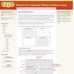
To analyze and visualize that data we use various tools (and we sometimes develop our own, such as Trevis or LagAlyzer). One of the most effective general information visualization tools we know is Hadley Wickham's ggplot2 package for R. Our pages here provide a quick reference, mostly for our own use. We made them public because we think others might benefit from them, too. This quick reference is based on ggplot2 version 0.8.8 running on R version 2.11.1. The Anatomy of a Plot In ggplot2, you create a plot using the ggplot() function. Besides a list of layers, a plot also has a coordinate system, scales, and a faceting specification.
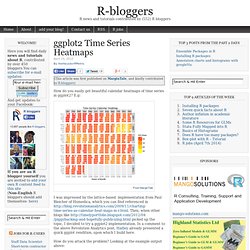
Each layer uses a specific kind of statistic to summarize data, draws a specific kind of geometric object (geom) for each of the (statistically aggregated) data items, and uses a specific kind of position adjustment to deal with geoms that might visually obstruct each other. Aviz Main/Home Page. Ggplot2 Time Series Heatmaps. Require(quantmod) require(ggplot2) require(reshape2) require(plyr) require(scales) # Download some Data, e.g. the CBOE VIX getSymbols("^VIX",src="yahoo") # Make a dataframe dat<-data.frame(date=index(VIX),VIX) # We will facet by year ~ month, and each subgraph will # show week-of-month versus weekday # the year is simple.
Chartsnthings. 19 Sketches of Quarterback Timelines On Sunday Eli Manning started his 150th consecutive game for the Giants, the highest active streak in the NFL and the third-longest streak in NFL history.
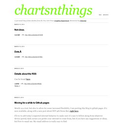
(One of the other two people above him is his brother, Peyton.) The graphics department published an interactive graphic that put Eli’s streak in the context of about 2,000 streaks from about 500 pro quarterbacks. The graphic lets you explore the qbs and search for any quarterback or explore a team to go down memory lane for your team. It’s not particularly important news, but the data provided by pro-football-reference is incredibly detailed and the concept lended itself to a variety of sketches.
A couple bar charts in R. And percent of games started (the people are 100% are players like Andrew Luck or RGIII who just haven’t played a lot of seasons.) Ported to a browser, just using total starts: And share of total possible starts …or all the way back to 1970. Example 9.26: More circular plotting. SAS's Rick Wicklinshowed a simple loess smoother for the temperature data we showed here. Then he came back with a better approach that does away with edge effects.
Rick's smoothing was calculated and plotted on a cartesian plane. In this entry we'll explore another option or two for smoothing, and plot the results on the same circular plot. Since Rick is showing SAS code, and Robert Allison has done the circular plot (plot) (code), we'll stick to the R again for this one. RWe'll start out by getting the data and setting it up as we did earlier.
Probability Distributions. The zoo of discrete probability distributionsThe zoo of continuous probability distributionsFitting a distributionExtreme value theoryMiscellaneous In this chapter, we present the most important probability distributions (Gaussian, Exponential, Uniform, Bernoulli, Binomial, Poisson); we explain how to "fit" a distribution, i.e., how to find the distribution that most closely matches a given data set, i.e., how to find the most probable parameters; finally, we focus on the distributions of extreme values.
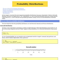
The zoo of discrete probability distributions The most important discrete probability distributions are the Bernoulli, Binomial and Poisson distributions. Bernoulli distribution Tossing a coin is equivalent to examining a random variable following a Bernoulli distribution of parameter 0.5. P( X=1 ) = p P( X=0 ) = 1-p In case of equiprobability, you can simulate such an experiment with the "sample" command, that performs such draws, with or without replacement, from a given set. Many Eyes.