
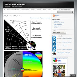
Projet : La future application Permamap. Pour la future application : le bute de l’application est de faire pousser les branche de la fleur permaculturel afin d’y découvrir son contenue ( l’univers de la permaculture) Vous pouvez voir le futur design en fond d’écran.
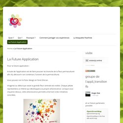
Imaginez au début que seule la grande fleur centrale est visible. Chaque pétale représentera un thème qui développera sa propre arborescence. Lorsque vous cliquerez dessus, cette arborescence permettra d’arriver à des initiatives concrètes. Enfin sur une autre page, s’ouvrira la fiche informative de l’initiative en question. Cela permettra de voir se dessiner au fur et à mesure cette carte/univers des initiatives. Un outil pour sensibiliser Vous avez déjà certainement entendu ce genre de phrases : « De toute façon on ne peut rien y faire… » « Oui, mais qu’est-ce que l’on peut y faire ? Pour permettre a tous de s’informer par soi même, à son rythme,car parfois un bon dessin vaut mieux qu’un long discours.
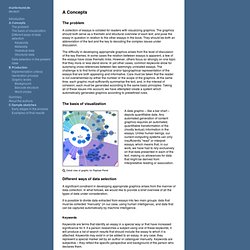
Earnings and Unemployment by College Major. The Wall Street Journal recently published a table of income and unemployment data that presented pay and employment rates for various college majors.
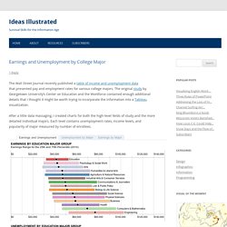
The original study by Georgetown University’s Center on Education and the Workforce contained enough additional details that I thought it might be worth trying to incorporate the information into a Tableau visualization. After a little data massaging, I created charts for both the high-level fields of study and the more detailed individual majors.
Each level contains unemployment rates, income levels, and popularity of major measured by number of enrollees. Rebuilding Ancient Egyptian Temples in 3D. The reconstructions, in this section, give an idea of how these ancient temples might have appeared to ancient eyes.
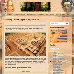
Ancient peoples liked to decorate their buildings and temples with bright colours. Take the Parthenon, in Athens, for example; nowadays we have this vision of those beautiful columns and fabulously carved marbles showing the bare stone, which appeals to our modern aesthetic. However, in ancient times the bare stone was hidden from view because it was all painted in the most brilliant colours. Rebuilding Ancient Egyptian Temples in 3D The mystery of Egyptian cult temples explained, illustrated with videos, photos, drawings and 30 highly detailed computer generated reconstructions. Nicholas Felton. Data Aesthetics. WikIT. 7 Eye-popping interactive timelines (and 3 ways to create one) Visual Understanding Environment. Visualisation. Visual Thinking.
Visual Thinking. Mapping the 2010 U.S. Census. Map of the World Drawn Entirely Using Facebook Connections. A visual exploration on mapping complex networks. OSCILLATORIUM. 2012 Perceptual Edge Dashboard Design Competition: A Solution of My Own. Design and the Elastic Mind. Large-scale RDF Graph Visualization Tools. AI3 Assembles 26 Candidate Tools.
Art, Charts, and Diagrams. Eternity and Consciousness Mind-Matter Relation.
A Periodic Table of Visualization Methods. What Are The Hardest Languages To Learn? [INFOGRAPHIC] Learning a new language can be difficult, but some languages can be trickier than others.
![What Are The Hardest Languages To Learn? [INFOGRAPHIC]](http://cdn.pearltrees.com/s/pic/th/hardest-languages-infographic-18047888)
For native English speakers, the difficulty level of a new language depends on a variety of factors. Graphical visualization of text similarities in essays in a book. The problem A collection of essays is collated for readers with visualizing graphics.
The graphics should both serve as a thematic and structural overview of each text, and pose the essay in question in relation to the other essays in the book. They should be both an abbreviation of the text and the key to decoding the complex issues under discussion. The difficulty in developing appropriate graphics arises from the level of discussion of the key themes. In some cases the relation between essays is apparent, a few of the essays have close thematic links.
The basis of visualization. Horoscoped. MindMap: Systems Thinking Skills. 43 Intricate Mind Map Illustrations. Vintage data visualization: 35 examples from before the Digital Era. This is a guest post by Tiago Veloso, the founder of Visual Loop, a collaborative digital environment for everything related to information design and data visualization.
He lives in Brazil, and you can connect with him online on Twitter and LinkedIn. Infographics. DataViz. DataViz Mediaeater MMX Archive / RSS June 21.
Motion Graphics, Design & VFX. 20 Examples Of Infographs That You Don’t See Every Day. I think we all know what an infograph is, and nowadays they are increasingly popular.
The bad thing is that almost all of them are becoming boring and very similar. In this article I have collected 20 infographs that are very unique design and also interesting subjects. Twitter Dots: Mapping all Tweets for a specific Keyword Twitter Dots translates individual tweets as simple dots on a geographical world map. TIME. Gun-death tally: Every American gun death since Newtown Sandy Hook shooting (INTERACTIVE) The answer to the simple question in that headline is surprisingly hard to come by. So Slate is collecting data for our crowdsourced interactive. This data is necessarily incomplete (click here to see why, and to learn more about @GunDeaths, the Twitter user who helped us create this interactive). But the more people who are paying attention, the better the data will be.
The History of E-commerce [INFOGRAPHIC] Ever wonder how e-commerce started and has evolved to its state today? Infographic. Infographs. Great examples of Visual Thinking. Exemplari. Mind Maps. QR Y.