
Week 30: Presenting data effectively. Last week I was lucky enough to be involved in a series of workshops by Stephanie Evergreen on presenting data effectively.
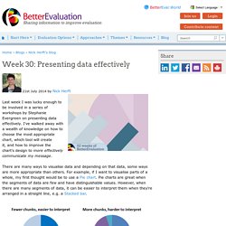
I've walked away with a wealth of knowledge on how to choose the most appropriate chart, which tool will create it, and how to improve the chart's design to more effectively communicate my message. There are many ways to visualise data and depending on that data, some ways are more appropriate than others. For example, if I want to visualise parts of a whole, my first thought would be to use a Pie chart. Pie charts are great when the segments of data are few and have distinguishable values. However, when there are many segments of data, it can be easier to interpret them when they're arranged in a straight line, e.g. a Stacked bar.
Check out our page on Visualise data which can help you in choosing a way to represent your data. Once you've decided what kind of chart you want, you need to go ahead and create it. How to Make a Diverging Stacked Bar Chart in Excel. Using Graphics to Report Evaluation Results. "People 'consume' information in different ways and presenting information graphically can help clarify evaluation results.

While some find text easy to digest, others find that graphics - bar charts, pie charts, illustrations and photographs - can simplify complex information, emphasize key points and create a picture of data. Graphics can also tell a story, showing proportions, comparisons, trends, geographic and technical data and, in the case of photographs, putting a 'human face' on a project. This booklet gives a brief overview of how to choose among common types of graphics and ensure that they accurately represent your data. " (Minter & Michaud, 2003) Contents Why use graphics to present evaluation results? Stephanie Evergreen. Visualization of Relationship Data. Before uploading a data file, check the samples gallery to make sure that your data format is compatible.
Your file must be plain text. Your data values must be non-negative integers. Data must be space-separated (one or more tab or space, which will be collapsed). No two rows or columns may have the same name. Column and row names must begin with a letter (e.g. Need help? If you are using the size, order or color options below, make sure your input file has the appropriate content (see samples 5-9). Don't have a data file? Current load is 0/5. Do not use this tool on confidential, sensitive or otherwise expensive, inflammatory or incriminating information (use the offline tableviewer which has a tutorial). 9.oct.15 Updated to use Circos 0.68. Free Sankey Diagrams.
<svg id="sankey_svg" height="600" width="600" xmlns=" version="1.1"><title>Your Diagram Title</title><!
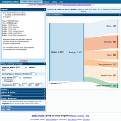
Copy the code above to embed your diagram. Save it in a “.svg” file to edit it in another application. Every Flow will have a tooltip when hovering. A Periodic Table of Visualization Methods. *Excel Tutorials. Walk through the analytical process one technique at a time.
Newest Tutorials Import and Merge Datasets Learn how to import, export, and merge datasets in Excel by using features such as text to columns, vlookup, and hlookup. Organize Your Spreadsheets When you’re staring at a spreadsheet for hours on end, a little organization can go a long way. Clean Data and Recode Variables Before you can analyze your data, you’ll need to check for missing data and recode some variables. Explore Your Dataset Use exploratory data visualization techniques like color-coding and sparklines find initial patterns. Calculate Summary Statistics (with Formulas) Summarize your data by finding the mean, median, standard deviation, and other descriptive statistics. Calculate Summary Statistics (with Pivot Tables) Pivot tables are the fastest, most accurate way to analyze your data — and they’re easier than you think.
Putting It All Together Learn intermediate and advanced spreadsheet skills. Extra Time-Saving Techniques. Juice Labs - Chart Chooser.