
The D3 Graph Gallery – Simple charts made with d3.js. Alternative for Tableau by Indian companies which are cost effective. Picular. Sign In to Overleaf. Finding D3 plugins with ease - D3 Discovery. JOY.JS - make happy little programs. Consider the paintbrush: simple enough for a child, complex enough for an Old Master. That's what any artistic tool should strive for, and the art of programming deserves a tool that's more creative, more alive. Joy.js is a tool for making tools like that. EASY & EXPRESSIVE With regular coding: tweak a number, compile, see the result seconds later, tweak again, repeat 'til bored.
With Joy.js: change the code by clicking / dragging / hovering, and see the result immediately. This lets you improvize, and discover "happy little accidents"! SEE WHOLE SYSTEMS No need to second-guess the program, to "play computer" in your head. SAVE & SHARE And finally, when you make a tool with Joy.js, your users will be able to save and share their work, and remix each others' creations!
Gephi - The Open Graph Viz Platform. Problem loading page. DataBasic.io. Tad - A Desktop Viewer App for Tabular Data. Bl.ock Builder. Unified ASAT Visualizer. Download UAV!
UAV Video Demo UAV Source Code Example Visualizations google/dagger apache/curator. IEEE Software Blog: The Unified ASAT Visualizer (UAV), a tool for comparing multiple ASATs on your Java projects. Authors: Moritz Beller (@Inventitech), Andy Zaidman (@azaidman), Tim Buckers, Clinton Cao, Michiel Doesburg, Boning Gong, Sunwei Wang Editors: Nikolaos Tsantalis (@NikosTsantalis), Mei Nagappan (@meinagappan) TL;DR: You want to compare whether using multiple Automated Static Analysis Tools (ASATs) makes sense for your projects, say whether the additional warnings of using Checkstyle on top of FindBugs are worth the increased maintenance costs.
Extreme Presentation Tools - Extreme Presentation. We’ve consolidated all the most useful tools from the Extreme Presentation method here.
Feel free to contact us and let us know if there is anything you would like us to add. The tools are below. In each case, click on the link below the image, not on the image itself. 1. Dli (David Li) Introducing Vega-Lite – HCI & Design at UW – Medium. Provide sensible defaults, but allow customization.
Vega-Lite’s compiler automatically chooses default properties of a visualization based on a set of carefully designed rules. However, one can specify additional properties to customize the visualization. Vega-Lite. Vega-Lite is a high-level visualization grammar.
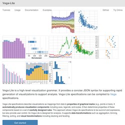
It provides a concise JSON syntax for supporting rapid generation of visualizations to support analysis. Vega-Lite specifications can be compiled to Vega specifications. Vega-Lite specifications describe visualizations as mappings from data to properties of graphical marks (e.g., points or bars). It automatically produces visualization components including axes, legends, and scales. Embedding.js. BigGorilla. D3. d3 Tutorial. d3 Tutorial. First Part by Kanit "Ham" Wongsuphasawat Interactive Data Lab, University of Washington @kanitw / kanitw.yellowpigz.com (Based on Vadim Ogievetsky and Scott Murray's work) Outline.

Technology Fundamental for d3. Cascading Stylesheet CSS Selectors Query the DOM Tree See also: CSS Properties – Webmonkey and CSS Selectors on NetTuts CSS: Box Model, Position The default position is position: static; CSS: Position relative adjust the element's position, without changing layout absolute taken out of the flow and thus takes up no space when placing other elements.

Absolute under relative CSS: Short Form. Vis.js - A dynamic, browser based visualization library. Cambridge Intelligence - Understand your Connected Data. GitHub - ft-interactive/chart-doctor: Sample files to accompany the FT's Chart Doctor column. Data Management Reimagined. Feature Labs. FT Interactive News. GitHub - ft-interactive/visual-vocabulary: Small examples of data driven graphics.
Financial Times. Data Scientist Workbench. Elex 2.0.9 — elex 2.0.9 documentation. Carebot – Meaningful analytics for journalism. KeyLines Network Visualization Software. Bookworm. Three.js - Javascript 3D library. Web Crawling Platform & Services. Twine / An open-source tool for telling interactive, nonlinear stories. Thinkmap Visual Thesaurus - An online thesaurus and dictionary of over 145,000 words that you explore using an interactive map. Blazegraph Download - Graph Database & Application Download. BigBench: Toward An Industry-Standard Benchmark for Big Data Analytics - Cloudera Engineering Blog.
Learn about BigBench, the new industrywide effort to create a sorely needed Big Data benchmark.

Benchmarking Big Data systems is an open problem. To address this concern, numerous hardware and software vendors are working together to create a comprehensive end-to-end big data benchmark suite called BigBench. BigBench builds upon and borrows elements from existing benchmarking efforts in the Big Data space (such as YCSB, TPC-xHS, GridMix, PigMix, HiBench, Big Data Benchmark, and TPC-DS). Intel and Cloudera, along with other industry partners, are working to define and implement extensions to BigBench 1.0. (A TPC proposal for BigBench 2.0 is in the works.) Jumbune - Optimize Hadoop Solutions.
GitHub - intel-hadoop/Big-Data-Benchmark-for-Big-Bench: Big Bench Workload Development. 5 Enterprise Alternatives to Hadoop -Big Data Analytics News. Hadoop’s progression from a large scale, batch oriented analytics tool to an ecosystem full of vendors, applications, tools and services has coincided with the rise of the big data market.
While Hadoop has become almost synonymous with the market in which it operates, it is not the only option. Hadoop is well suited to very large scale data analysis, which is one of the reasons why companies such as Barclays, Facebook, eBay and more are using it. Although it has found success, Hadoop has had its critics as something that isn’t well suited to the smaller jobs and is overly complex. Data Journalism Tools Part 1: Extracting and... - Silk. This post on extracting data from a website is the first in a 3-part series on extracting, cleaning and enhancing data.
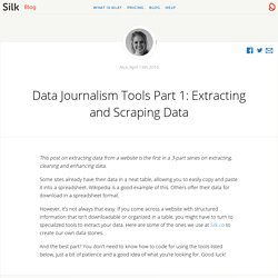
Some sites already have their data in a neat table, allowing you to easily copy and paste it into a spreadsheet. Wikipedia is a good example of this. Others offer their data for download in a spreadsheet format. However, it’s not always that easy. If you come across a website with structured information that isn’t downloadable or organized in a table, you might have to turn to specialized tools to extract your data. Your Friendly Guide to Colors in Data Visualisation · Lisa Charlotte Rost. 22 Apr 2016 A few days ago, I approached my Twitter followers with a request to help me in an urgent matter: “Can somebody tell me how to get better with color? ,” I wrote. “ My color decisions are awful.” Thanks to a retweet by Scott Murray I got a lot of replies with links to websites and tools. Interactive Data Visualization using Bokeh (in Python)
Introduction Recently, I was going through a video from SciPy 2015 conference, “Building Python Data Apps with Blaze and Bokeh“, recently held at Austin, Texas, USA. I couldn’t stop thinking about the power these two libraries provide to data scientists using Python across the globe. In this article, I will introduce you to the world of possibilities in data visualization using Bokeh and why I think this is a must learn / use library for every data scientist out there. 10 tools and platforms for data preparation. Guest blog post by Zygimantas Jacikevicius Traditional approaches to enterprise reporting, analysis and Business Intelligence such as Data Warehousing, upfront modelling and ETL have given way to new, more agile tools and ideas.
Within this landscape Data Preparation tools have become very popular for good reason. Data preparation has traditionally been a very manual task and consumed the bulk of most data project’s time. Profiling data, standardising it and transforming it has traditionally been very manual and error prone. This has derailed many Data Warehousing and analysis projects as they become bogged down with infrastructure and consistency issues rather than focusing on the true value add – producing good quality analysis. Work. Open Data Kit » Use. To use ODK, you need to do three things -- design a form, setup a server, and connect the device to that server. Once those three things are done, you'll be ready to start data collection. You'll need three tools: Build or XLSForm -- to design your survey form.Collect -- running on an Android device to download and fill-in the survey.Aggregate -- for hosting the survey form and gathering the survey results.
Alternatively, Briefcase can be used to gather the survey results (but you'll need to manually place the survey form onto the Android device). If any of this sounds complicated, we promise it's not! Investigation, Cybersecurity, Information Governance and eDiscovery Software. Predictive Analytics Software For Customer Attrition. Customers buy from companies because of their products, but often leave them because of their service. Kyvos Insights – Big Data Analytics. Popular Blocks - bl.ocks.org. European Data Portal · GitLab. Jigsaw. ColorBrewer: Color Advice for Maps. Moment.js.
Popular Blocks - bl.ocks.org. Continuum. Poemage. Poemage Poemage is open source. GitHub - mwysis/StatistikiMePython. Iros (Irene Ros) D3.js - Data-Driven Documents. Lyra: An Interactive Visualization Design Environment. React and Vega: An Alternative Visualization Example. The End Result The code used here will create two different react components, a line chart and a radial heat map using Vega, and use Redux to enable linked highlighting between the two charts when interacting with a single one, as demonstrated below: A JavaScript library for building user interfaces. Vega: A Visualization Grammar.
Iris. Paul Ford: What is Code? A computer is a clock with benefits. They all work the same, doing second-grade math, one step at a time: Tick, take a number and put it in box one. Tick, take another number, put it in box two. Tick, operate (an operation might be addition or subtraction) on those two numbers and put the resulting number in box one.