
Science Isn’t Broken. Graphics by Ritchie King If you follow the headlines, your confidence in science may have taken a hit lately.

Peer review? More like self-review. Data drawing pen pals. Stefanie Posavec, known around these parts for her manual data design and Giorgia Lupi, known for constantly drawing and searching for complexity, are sending each other data postcards once a week for a year.
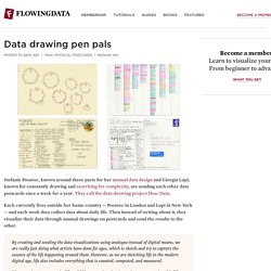
They call the data-drawing project Dear Data. Each currently lives outside her home country — Posavec in London and Lupi in New York — and each week they collect data about daily life. Deconvolution and Checkerboard Artifacts — Distill. When we look very closely at images generated by neural networks, we often see a strange checkerboard pattern of artifacts.

It’s more obvious in some cases than others, but a large fraction of recent models exhibit this behavior. Mysteriously, the checkerboard pattern tends to be most prominent in images with strong colors. What’s going on? Do neural networks hate bright colors? The actual cause of these artifacts is actually remarkably simple, as is a method for avoiding them. F1 Greatest Drivers. Bradybutterfield. How You Will Die. So far we’ve seen when you will die and how other people tend to die.
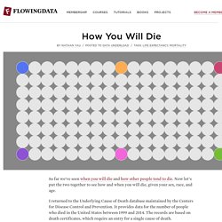
Now let’s put the two together to see how and when you will die, given your sex, race, and age. I returned to the Underlying Cause of Death database maintained by the Centers for Disease Control and Prevention. It provides data for the number of people who died in the United States between 1999 and 2014. The records are based on death certificates, which require an entry for a single cause of death. GitHut - Programming Languages and GitHub. A World of Terror. Data visualisation. Michael Phelps vs. Himself. Credit: Donald Miralle/Allsport (left) and Mark J.
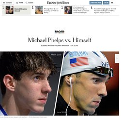
Terrill/Associated Press (right) In 2000, Michael Phelps traveled to Sydney, Australia, to swim in his first Olympics. He finished fifth in the 200-meter butterfly final, ahead of three swimmers who were in their 20s. Phelps was 15. Now 31, Phelps — with a young son in tow and 23 Olympic medals around his neck — has swum in more Olympic events than anyone else in history. The Rio Games represent his fifth Olympics. 2016 Olympic. AboutModal?borders=1~!MTc0Mzc2MTI.NzMyOTYz*MzYwMDAwMDA(MA~!IN*MTI1MzYy.MjA0NTMwNzE)Mg~!AU*NDIxMTI2Mw.MjQyOTcyMTg)MA~!US*MjY2NTE0NA.MjQ5NTMzOTE)Mg~!GL*MTI4MTgyNjg.MjI5MTU2ODU)NA~!CN*OTc2MjE.NjAzMDIxMQ)NQ~!SA*NzY1NDgyNw.MTY1NTIyNjQ(MzU4)Ng~!GL*OTI2MTg4Mw.MT. Plate-forme d'expérimentation en humanités numériques, réseaux sociaux, Twitter, influence sur le web et visualisation de données. Data and visualization blogs worth following.
About three years ago, I shared 37 data-ish blogs you should know about, but a lot has changed since then.
Some blogs are no longer in commission, and lots of new blogs have sprung up (and died). Today, I went through my feed reader again, and here’s what came up. Coincidentally, 37 blogs came up again. (Update: added two I forgot, so 39 now.) Information is Beautiful. 16 Captivating Data Visualization Examples.
Data can be very powerful.
If you can actually understand what it's telling you, that is. It's not easy to get clear takeaways by looking at a slew of numbers and stats. You've got to have the data presented in a logical, easy-to-understand way. Enter data visualization. Hip-Hop Is Turning On Donald Trump. A small black child holds a “Fuck Donald Trump!”
Poster as sirens ring out and a police helicopter patrols overhead. The rapper YG appears, both middle fingers raised, and emphatically raps“Fuck Donald Trump / Fuck Donald Trump”over and over again. Psychology, self-improvement, sexual attraction blog. Frontier Of Physics: Interactive Map. “Ever since the dawn of civilization,” Stephen Hawking wrote in his international bestseller A Brief History of Time, “people have not been content to see events as unconnected and inexplicable.
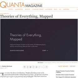
They have craved an understanding of the underlying order in the world.” In the quest for a unified, coherent description of all of nature — a “theory of everything” — physicists have unearthed the taproots linking ever more disparate phenomena. With the law of universal gravitation, Isaac Newton wedded the fall of an apple to the orbits of the planets.
Albert Einstein, in his theory of relativity, wove space and time into a single fabric, and showed how apples and planets fall along the fabric’s curves. And today, all known elementary particles plug neatly into a mathematical structure called the Standard Model. Our map of the frontier of fundamental physics, built by the interactive developer Emily Fuhrman, weights questions roughly according to their importance in advancing the field. How every #GameOfThrones episode has been discussed on Twitter. Every Sunday night, fans of HBO’s Game Of Thrones (@GameOfThrones) know that Twitter is the place to come to talk about the crazy plot twists, how they feel about the characters’ latest shocking actions, share their own memes, and more.
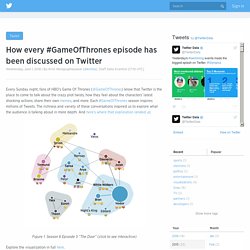
Each #GameOfThrones season inspires millions of Tweets. Hip-Hop Is Turning On Donald Trump. Across U.S. Companies, Tax Rates Vary Greatly - Interactive Feature. Earth Primer. Plateforme de visualisation de données ouvertes. Pylograph Trello, with examples and datasets. Explorable Explanations. The Journalist-Engineer. A couple months ago, I published an article comparing historic and present-day popularity of older music. Disco/graph: The Black Keys. Data Sets. What is the Marital Status of Americans by Age? Visualization Data Notes A few months ago I created a visualization that allowed users to compare age distributions for various topics and another one that showed marital status by age range.
I decided that I wanted to take a closer look at marital status and I thought this tool would give me a good base to start from. This visualization shows uses Tableau to show the marital status for every age. MetricMaps. How fast does miles teller play in whiplash. EDIT 05 Sep. 2015: The concept of Beat Per Minutes (BPM) has been mis-understood as mentioned by reddit. What I was supposed to write was Strokes Per Minutes (SPM). Released in 2014, Whiplash focuses on a promising young drummer (Miles Teller) pursuing his dream of greatness. This greatness will only be achieved with the help of a ruthless teacher (J. K. SAT Scores vs. Music You Listen To. Every Second on the Internet. Information is Beautiful. What You Like Falls on Party Lines.
Far and away, the Republican group is more country, while fans of Mrs. The Ultimate Crowdsourced Map of Long Distance Relationships. Around Valentine's Day this year, we got the idea of asking Atlas Obscura readers about one of the most fraught kind of relationships—the long distance kind, or LDRs. We assumed we'd get 50 or so responses, and maybe we'd pick a few stories to highlight. But nearly 600 of you filled out the survey. The results were incredible—and fill the interactive map above. People conducted relationships from the ends of the earth, spanning years and ostensibly filling whole hard drives with video chats and text messages. The data of long distance lovers. August 25, 2015 · textmining · Fantasy Map: Rail Transport in Westeros by Michael... - Transit Maps. Fantasy Map: Rail Transport in Westeros by Michael Tyznik. Dataviz : 5 projets de contenus et d'outils à la loupe.
En janvier dernier Ouest Médialab organisait un apéro StoryCode Grand Ouest entièrement dédié à la datavisualisation et au datajournalisme. 5 spécialistes du sujet sont donc venus nous présenter leurs réalisations, les outils qu’ils ont développé ou leurs projets en cours. The 9 Best Data Visualization Examples from 2015 - ScribbleLive. Top 6 des infographies et visualisations sur Game of Thrones - Webilicious.
The state of our union is … dumber: How the linguistic standard of the presidential address has declined. Koalas to the Max dot Com. RACER: A Chrome Experiment.