
I Learned Data Viz in a Year, and You Can Too. IntroductiontoDataVisualisationTipsheet4. Superset. Mass shooting statistics in the United States - Washington Post. Visualizing Mass Shootings. Over the past two years or so, we’ve kept tabs on our community’s work around guns in America.
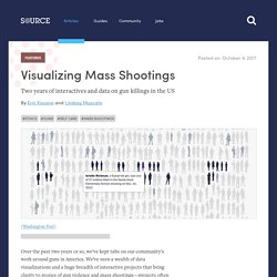
We’ve seen a wealth of data visualizations and a huge breadth of interactive projects that bring clarity to stories of gun violence and mass shootings—projects often assembled quickly amid the chaos of breaking news. After the mass killing in Las Vegas this week, we’re sharing our collection of exemplary and challenging projects as resources to comb through now, and to turn back to when the next time inevitably arrives. A view on despair, a datavisualization project by STUDIO TERP – STUDIO TERP. Let’s just begin with the most frightening part and give you a glimpse of the darkness in me.

You know, the part most people try to ignore, suppress or hide because… Because, well, the pain, the shame, the fear. Something (often: many things) went wrong and you just can’t cope. I found myself at the Primark. Yes, the Primark. Data Visualization as Grief. What we gain when we think beyond spike… Global Foresight Summit 2020. The Global Foresight Summit is an open initiative to raise awareness on futures literacy and strategic foresight across government policy-makers, business leaders, strategists, innovators, scientists, and researchers will help to prepare for decision-making under uncertainty and unpredictability.
The past narratives about the future did not help to manage the present crisis appropriately. Millions of people rushed to supermarkets fearing scarcity of food; media streamed death tolls as points in a football match; politicians were caught improvising and underestimating the reality; scientists were not listened anywhere around the world; countries do not share all their data about the pandemic; and, above all, sci-fi movies, books and shows in our collective imaginary helped to accelerate the fear of a dystopian world. During the course of the summit you will explore some of the most relevant topics in the field of futures thinking, strategic foresight and decision-making. Карта. The map of the practices of the future is not a geographical map but more like a mindmap.
It helps to learn more about the urgent problems of the modern world, existing communities that are moving towards their own image of the future, and the practices themselves. The map is the result of a joint research of the Kruzhok movement and University for the Planet. Data or Statistics? - Data and Statistics - LibGuides at Ohio Wesleyan University Libraries. 25 Tips to Instantly Improve Your Data Visualization Design. Data visualization design is both an art and a science, which is why it can be challenging for noobs to master.
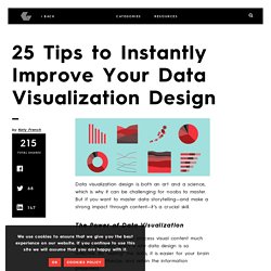
But if you want to master data storytelling—and make a strong impact through content—it’s a crucial skill. The Power of Data Visualization Your brain is prewired to process visual content much quicker than text, which is why data design is so effective. By “seeing” the data, it is easier for your brain to intake, synthesize, and retain the information presented. Placing Graphic Design at the Intersection of Information Visualization Fields. Abstract The popularity of information visualization in academia and practice brings a renewed emphasis on aesthetic values and visual applications to ensure its appeal to a wider audience.
This paper focuses on visualization aesthetics and perception by making the case for using graphic design techniques and design languages to understand and create more aesthetically pleasant and functionally effective information design and visualization. It uses cross-disciplinary reviews of background research to demonstrate the value of graphic design principles and methods in the realm of visualization education. A user-centered design framework and student projects are discussed by adapting graphic design elements into the visualization process. Visual Capitalist. Every Single Cognitive Bias in One Infographic. StoryMapJS. Wakelet – Save, organize and share content.
StoryMapJS. De territorios dejados atrás a aceleradores de desarrollo. La meta del Laboratorio de Aceleración en Colombia Colombia es considerado un país de ingreso medio alto, mejorando consistentemente sus indicadores de desarrollo e ingresando al grupo de países con alto desempeño económico.
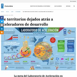
Sin embargo, cuando esta medición es ajustada por desigualdad, el Índice de Desarrollo Humano (IDH) de Colombia pierde 23,6 puntos porcentuales y lo posiciona como el segundo país más desigual de América Latina y el Cariba, únicamente después de Brasil. Imagining narratives for preferable AI futures. The event took place online with the help of Google Meet and Google Hangouts for group sessions.
We used boards in Mural to create frameworks for exercises and provided an additional Google Docs document with instructions for the participants to refer to throughout the workshop. The session was packed with exercises we found necessary in providing the structure that could help the participants narrow down the focus and stimulate lively discussions in groups. At the same time, the technical complexity of hosting a workshop with this many exercises within two hours would be a challenge. : Drag and Drop App Builder for Android and iOS. Habilidades — Español. W.E.B. Du Bois’s Little-Known, Arresting Modernist Data Visualizations of Black Life for the World’s Fair of 1900. On a recent research visit to the Emily Dickinson museum and archives in Amherst, I chanced upon a most improbable discovery of forgotten, pioneering work by another titan of culture.
When thirty-one-year-old W.E.B. Du Bois (February 23, 1868–August 27, 1963) heard that the World’s Fair to be held in Paris in 1900 would include a special exhibition on the subject of sociology, he saw in it an opportunity to open the world’s eyes to what had been occupying him for nearly a decade — “the American Negro problem.” Teaching Data Visualization to Kids. Think of all the things you learned in elementary school: How to read.
How to write. How to count. How to do add, subtract, multiply, and divide. These are all learned skills, things that we are not innately born knowing how to do. Bestiario. Participatory Data Physicalization: a new space to design informative experiences. “Between 30% and 50% of all cancer cases are preventable.
Prevention offers the most cost-effective long-term strategy for the control of cancer” (World Health Organisation). Currently, in Italy, the awareness about cancer diffusion and prevention is pretty low, despite many educational websites, printed and online campaigns. On an average level, cancer is still perceived as a fatal disease, and this affects the information process. Information avoidance is, indeed, a typical behavior, especially on cancer-related issues. CINEMETRICS — film data visualization. Energy Statistics – European Design. The Swiss Federal Office of Energy (SFOE) disposes of a big mass of information concerning the subject of energy. Until now these information has only been available in a very uninspiring form; too complicated and difficult to comprehend. Our task was to show these numbers and complexe statistics in an easy comprehensible and appealing way.
Therefore we have tried to find similarities to trivial objects, or images and to stage these numbers in an striking and amusing way to the beholder, so that every one can understand it easily. AVIZ Poster 2018. Yvonne Jansen - Embedded Data Representations. People Wesley J. Willett, University of Calgary Yvonne Jansen, (then) University of Copenhagen Pierre Dragicevic, Inria Abstract. CO2. Untitled. En este artículo, se describe cómo personalizar el aspecto de una vista de mapa en Tableau. Nota: Muchas de las tareas que se describen en este artículo utilizan el panel Capas de mapas.
Untitled. Treemaps: Data Visualization of Complex Hierarchies. Treemaps are a data-visualization technique for large, hierarchical data sets. They capture two types of information in the data: (1) the value of individual data points; (2) the structure of the hierarchy. Definition: Treemaps are visualizations for hierarchical data. They are made of a series of nested rectangles of sizes proportional to the corresponding data value. A large rectangle represents a branch of a data tree, and it is subdivided into smaller rectangles that represent the size of each node within that branch.
Key Uses of Treemaps Treemaps are commonly found on data dashboards. Untitled. The Data Visualization Design Process: A Step-by-Step Guide for Beginners. Visualizing data in charts, graphs, dashboards, and infographics is one of the most powerful strategies for getting your numbers out of your spreadsheets and into real-world conversations. But it can be overwhelming to get started with data visualization. Does data visualization leave you feeling like the numbers are about to topple over on you?? If so, this step-by-step data visualization guide is for you! I’ll walk you through the data visualization design process so you know what to do first, second, and third as you transform your spreadsheets into stories.
Step 1: Analyze Your Audience. The Data Visualization Design Process: A Step-by-Step Guide for Beginners. The danger of using the wrong metrics for policy making. Adopted public policies affect everyone—They're called public for a reason after all. Nowhere is this truer than in the realm of defense policy. On the one hand, money spent on the military means money not spent on healthcare, education, infrastructure, or other important domestic spending priorities. Locals and Tourists. Aaron Koblin. ToolDatabase < Dmi < Foswiki. By Week — Dear Data. Untitled. The Master of Industrial Design program explores design as a vehicle for addressing social, cultural, environmental and other concerns, recognizing that design is not simply a professional service, but rather a way of connecting individual interests and values with a social framework.
Untitled. Untitled. Untitled. I was toying around with the idea of multivariate beer, along the same lines as Data Cuisine. I wanted to represent county demographics with beer ingredients. The 25 Best Data Visualizations of 2019. The Information Designer’s Notebook — ferdio. Untitled. Readers: My friend Chuck sent me this article on income inequality for my blog. Untitled. Untitled. Visual Capitalist. Data Analytics vs. Data Visualisation: What’s The Difference? - Aventis Learning Group.
Data Visualization & Storytelling. Visual Capitalist. Inicia sesión. FlowingData. El aumento de la datificación de nuestras vidas… Desde chatear con amigos en una aplicación de mensajería o comprar un café, hasta entrar y salir a casi cualquier servicio, casi todo lo que hacemos deja boronas digitales; osea, un rastro de migajas de datos. Y esta datificación creciente de nuestro actividades cotidianas nos ha llevado a una explosión de datos sin precedentes.
A manera de ejemplo, solo en un minuto promedio, Facebook recibe 900,000 inicios de sesión, se generan y publican más de 450,000 Tweets, se envían 156 millones de correos electrónicos y mas de 15 millones de mensajes de texto. Todo en minuto!. Con números así, no es de extrañar que esencialmente dupliquemos la cantidad de datos creados en el mundo. Aproximadamente cada dos años y que de esas boronas digitales acumuladas se pueden correlacionar para obtener informacion valiosa que luego de procesada alimentaran todas las maquinarias globales. Se estima que para el año 2020, mas 250 billones de autos estarán conectados a Internet.
Create charts and maps with Datawrapper. JESS3. How COVID-19 Has Impacted Media Consumption, by Generation. View the high-resolution of the infographic by clicking here. Since March of this year, the COVID-19 pandemic has forced millions of people to physically distance themselves from others, yet many feel closer to their loved ones than ever before. When it comes to brands, consumers have forged relationships that could be just as meaningful. In fact, consumers demonstrated a 23% increase in the number of brands they have an emotional connection with—so what does this mean for brands? The graphic above highlights data from MBLM’s Brand Intimacy COVID Study which measures how emotionally connected consumers in the U.S. are to the brands they use, and how brands can benefit. Revista10 7. Page Not Found - Free Beautiful Online Survey & Form Builder.
Untitled. Gephi - The Open Graph Viz Platform. The Four Cs of Data + Design - Ben Fry - Medium. WORLDPROCESSOR. Untitled. Internet Live Stats - Internet Usage & Social Media Statistics. What Is Surveillance Capitalism? Untitled. Untitled. Untitled. Untitled. Untitled. Untitled. Untitled. Untitled. /es/ Plantillas para Gráfico de Barras - Venngage. Converge to Inspire. Federica Fragapane on Behance. LGBT: unprotected by laws on Behance. Tactical Tech – All projects. Visualizing Information for Advocacy.
Federica Fragapane on Behance. Truth & Beauty - Projects. Exploring food as a form of data expression. The Value of Data Visualization. Measuring the Universe. THE PAPER — Oublie/trouve. Say hello to the Global design Future - Global design futures - Medium. Governors Island Exhibit Explores Latest in Graphic Design. Introduction to Speculative Design Practice – Speculative. Recycling on Behance. Design Futuring Workshop — Paul Roberts. Portuguese Forest on Behance. 85 Incredible Data Visualization Examples. The writing on the wall? data murals.
Plataforma Bogotá.