
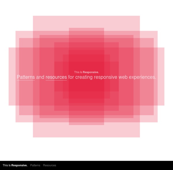
http://bradfrost.github.io/this-is-responsive/
Why tables for layout is stupid: problems defined, solutions offered: Everything on one page) There are certain things that CSS does not do as well as table layouts. For instance, say you have a black side nav bar that you want to extend the whole height of your content. With a table layout, this is a piece of cake: just give that <td> a black background. We can do this with CSS, but it requires a different way of thinking. Responsive Web Design Patterns Responsive Patterns A collection of patterns and modules for responsive designs. Submit a pattern Designing for Retina Display The devices on which the web can be displayed increases everyday. Rather recently Apple released its new set of Macbook Pros with retina display, so called because at a normal viewing distance users wont be able to see any pixels. Designing for such a high resolution however, can become a little more tricky than you would expect. Over the years the resolution of your average monitor has gotten bigger and bigger. If you’ve upgraded your monitor to a larger resolution but with the same physical monitor size you will probably notice that the elements (windows, icons, etc) will have reduced in size.
How to Make a Mobile-Friendly Website Regardless of the mobile configuration you end up using, there are some overarching mobile optimization takeaways that all marketers can benefit from. So, without further ado, here are 10 tips for creating a user-friendly, search-engine optimized mobile experience. 1. Work With a Designer Or at the very least, talk to a designer and get their professional input. At the end of the day, putting your website design in the hands of a qualified, experienced web designer will help ensure that you end up with a website that is not only mobile-friendly, but beautiful. A List Apart: The Topics Front and back end development for the web, mainly using open web standards. Markup, style, scripting, and server-side techniques and technologies. Cross-browser HTML, CSS, and JavaScript. Frameworks and preprocessors. Creating websites and applications.
ReView. The Responsive Viewport. Installation Include ReView.js in the head of your HTML document, just after your viewport meta tag. Note the lack of initial-scale in the viewport meta tag. This often allows for a cleaner viewport switch. ReView works without a meta tag, but providing one is recommended. 10 Best tools and resources for web and design professionals in 2015 Tools and resources for web and design professionals are available in abundance these days, unfortunately, not all those available are as useful as we’d like them to be. In order to help you weed out some of the tools that aren’t worth your time, we’ve compiled a list of what we think are the best tools and resources available right now. 1. Stamplia If you’re looking for a place to sell your email templates, then you’re looking for Stamplia. This marketplace has been around since 2013 and it has gathered more than 6000 members.
What's a Pattern - Design Pattern Library Accordion There are too many items to fit into a limited space without overwhelming the user. Add / Subscribe A person wants to subscribe to the content of another person and read it in an environment of their own choosing. Animate Transition Responsive web design If you’ve been working in the web design field for the past couple of years you should know that designing a fixed interface for a widescreen computer is not enough. Most of the clients you’ll be dealing with from now are going to request that their site is not only desktop-compliant but is also optimized for smartphones and tablets. This issue presents the necessity of working with different screen resolutions in order to guarantee that a website looks good in all sorts of devices. But if the devices’ production continues at the same speed that it has for the past couple of years, the amount of screen resolutions and formats that designers will have to deal with is going to become unbearable.
8 jQuery And CSS Parallax Scrolling Tutorials Parallax scrolling is a type of web design where different elements of a website move at different speeds. As a user navigates through parallax websites, images will float on top of other images in several layers. Parallax scrolling sites can be used in many different ways to create a variety of captivating effects which have the potential to keep viewers on your site for a great deal of time. So if you are bored using the plugin and challenged to create you own parallax scrolling effects using jQuery and CSS, you might want to try these tutorials below. With this tutorial, you’ll learn how to integrate a simple scrolling parallax. Since then, parallax has blown up. Foundation Icons Fonts - ZURB Playground - ZURB.com settings heart star plus minus checkmark remove mail calendar page tools globe cloud error right-arrow left-arrow up-arrow down-arrow trash add-doc edit lock unlock refresh paper-clip video photo graph idea mic cart address-book compass flag location clock folder inbox website smiley search phone General Enclosed Set Social Set thumb-up thumb-down facebook twitter pinterest github path linkedin dribbble stumble-upon behance reddit google-plus youtube vimeo clickr slideshare picassa skype instagram foursquare delicious chat torso tumblr video-chat digg wordpress Accessibility Set wheelchair speaker fontsize eject view-mode eyeball asl person question adult child glasses cc blind braille iphone-home w3c css key hearing-impaired male female network guidedog universal-access elevator
Designer's guide to DPI DPI or Dots Per Inch is a measure of spatial dot density initially used in print. It's the number of ink drops your printer can put in an inch. The more dots per inch, the sharper your image. Creating a Mobile-First Responsive Web Design Introduction We're going to walk through how to create an adaptive web experience that's designed mobile-first. This article and demo will go over the following: There is even more up to date responsive guidance on our new Web Fundamentals site.
Material Design Color Palette Generator - Material Palette material palette More Material Design chevron_right Palette preview Full Palette colors below Your Palette CSS SASS LESS SVG XML PNG POLYMER DOWNLOAD TWEET