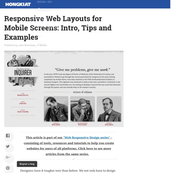
Responsive Web Layouts for Mobile Screens: Intro, Tips and Examples

A Simple Device Diagram for Responsive Design Planning
Updated for 2015! Check out Analytics-driven responsive web design planning At Metal Toad we're big fans of responsive design, but a common snag in the responsive planning process comes when choosing what device widths to design to. Just yesterday we had a big internal debate over what the best widths to design to are for 3 layout sites, 4 layout sites, etc. There are an ever-increasing number of devices with different screen resolutions to take into account with a responsive design, so we put together a simple but handy diagram that lists the most common device widths as of the present, along with overlays for potential device width ranges. The Diagram Here's the result! A couple of things to note: As the labeling indicates, the top of the diagram is portrait orientations and the bottom is landscape orientations for devices. Our Suggested Layouts 3 Layouts Design Targets: Layout 1: iPhone (320/640px) in Portrait is a good candidate for the PSDs. 4 Layouts 6 Layouts! Go big or go home, right?
8 Ways to Add a Responsive Navigation Menu on Your Site
By Jacob Gube There are plenty of techniques for implementing responsive navigation menus on your site. One of your options: Build your menu from scratch. There are many tutorials on the Web for that if you need to learn how. But some of us may just be interested in getting the task done as quickly and as painlessly as possible. In this post, I’ll discuss a few excellent open source projects for building responsive navigation menus. There are many options out there, so for convenience, I narrowed it down to just 8. At the end of the post, you’ll find a summary table that has links to the official site, demos, usage guide, and official open source repository for each project I’ll talk about. 1. This responsive navigation menu system is lightweight — less than 1KB when optimized. 2. Bootstrap has two components for building responsive menus. 3. menu-aim This jQuery plugin will allow you to make responsive mega-dropdown menus modeled after Amazon.com’s fast and responsive menus. 4. 5. 6. 7. 8.
Related:
Related:


